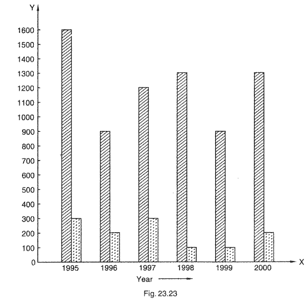
The following bar graph shows the number of
persons killed in industrial accidents in a country for some years (Figure)
Read the bar graph and choose the correct alternative
in each of the following:
The year which shows the maximum percentage
increase in the number of persons killed in coal mines over the preceding
year is:

1996
1997
1999
2000
The correct Answer is:D
Step by step video & image solution for The following bar graph shows the number of persons killed in industrial accidents in a country for some years (Figure) Read the bar graph and choose the correct alternative in each of the following: The year which shows the maximum percentage increase in the number of persons killed in coal mines over the preceding year is: by Maths experts to help you in doubts & scoring excellent marks in Class 6 exams.
Updated on:21/07/2023Topper's Solved these Questions
Similar Questions
Following pictograph shows the number of tractors in five villages. Observe the pictograph and answer the following questions. (i) Which village has the minimum number of tractors? (ii) Which village has the maximum number of tractors? (iii) How many more tractors village C has as compared to village B. (iv) What is the total number of tractors in all the five villages?
View SolutionGiven below are the ages of 25 students of class VIII in a school. Prepare a discrete frequency distribution. 15,16,16,14,17,17,16,15,15,16,16,17,15,16,16,14,16,15,14,15,16,16,15,14,15
View SolutionWhich of the following are correct chain isomers of butane ? (i)
View SolutionDetermine the point of symmetry of a regular hexagon.
View SolutionDtermine the images of the following figure about the given line :
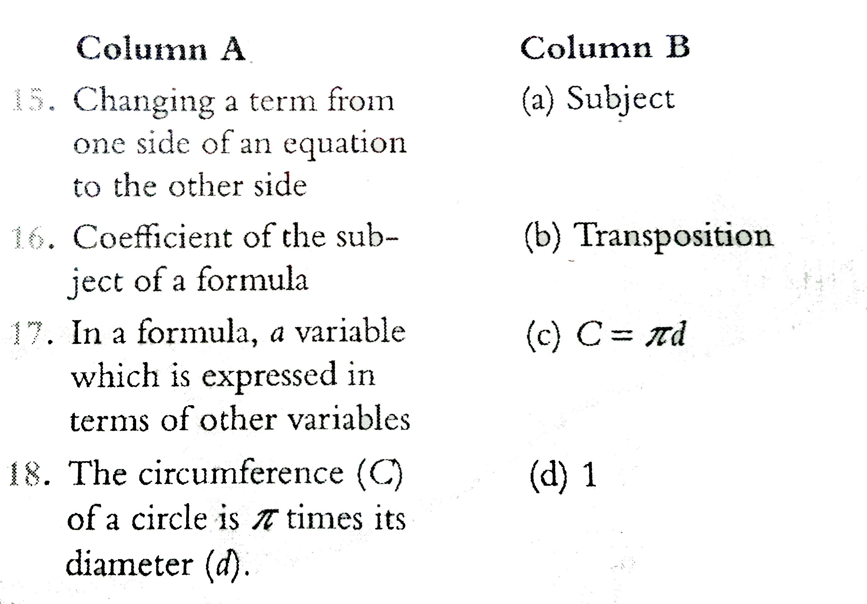
View SolutionMatch the following Column A to Column B

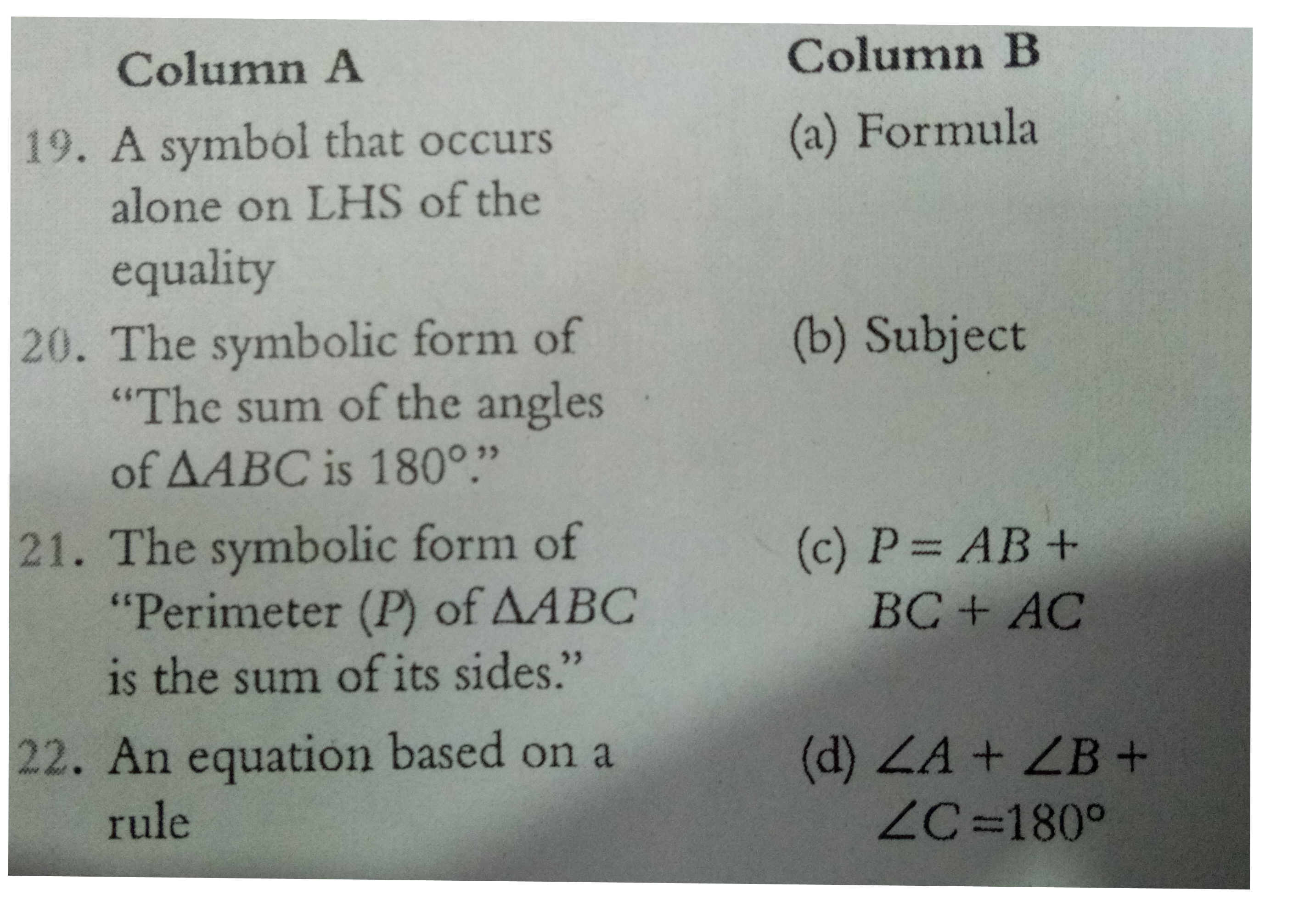
View SolutionMatch the following Column A to Column B

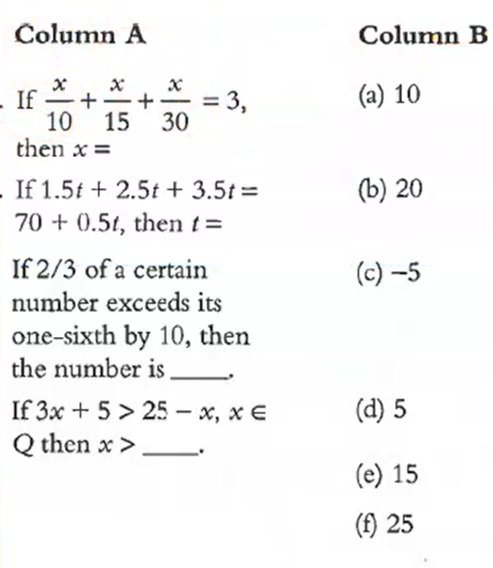
View SolutionMatch the following Column A to Column B

View SolutionThe inequation represented by the graph given below is :
View SolutionThe inequation that best describes the graph given below is _________
View SolutionThe inequation that best describes the following graph is _________
View SolutionWhich inequations represent the shaded region in the given figure
View SolutionIn the following figure, if O is the center of the circle and ¯¯¯¯¯¯AB is the diameter, then find ∠ACB.
ltimg src="https://d10lpgp6xz60nq.cloudfront.net/physics_images/PS_MATH_IX_C12_E02_009_Q01.png" width="80%"gt
View SolutionWhich of the following statement is not correc for following straight line graph :-
ltimg src="https://d10lpgp6xz60nq.cloudfront.net/physics_images/ALN_PHY_R04_E01_015_Q01.png" width="80%"gt
View SolutionFigure shows three vectors →a,→b and →c. If ¯¯¯¯¯¯RQ=2¯¯¯¯¯¯PR, which of the following relation is correct :-
ltimg src="https://d10lpgp6xz60nq.cloudfront.net/physics_images/ALN_PHY_R01_E02_013_Q01.png" width="80%"gt
View Solution
