The following line graph shows the number of students enrolled in two different courses (B.Tech & Medical) in a college during 2013 to 2017. Study the given graph carefully and answer the following questions.
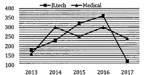
What is the ratio between students enrolled in B.tech in year 2014 and 2016 together to that of Medical-in year 2017 and 2016 together?
54:59
9:10
55:58
59:54
The correct Answer is:D
Step by step video, text & image solution for The following line graph shows the number of students enrolled in two different courses (B.Tech & Medical) in a college during 2013 to 2017. Study the given graph carefully and answer the following questions. What is the ratio between students enrolled in B.tech in year 2014 and 2016 together to that of Medical-in year 2017 and 2016 together? by Maths experts to help you in doubts & scoring excellent marks in Class 14 exams.
Topper's Solved these Questions
- BOOK - ADDA247CHAPTER - DATA INTERPRETATIONEXERCISE - Prelims Questions (Level-2)59videos
DATA INTERPRETATION
- BOOK - ADDA247CHAPTER - DATA INTERPRETATIONEXERCISE - Mains Questions33videos
DATA INTERPRETATION
- BOOK - ADDA247CHAPTER - DATA INTERPRETATIONEXERCISE - Basic Questions30videos
DATA INTERPRETATION
- BOOK - ADDA247CHAPTER - BOAT AND STREAM EXERCISE - Previous Year Question22videos
BOAT AND STREAM
- BOOK - ADDA247CHAPTER - DATA SUFFICIENCY EXERCISE - PREVIOUS YEAR QUESTIONS25videos
DATA SUFFICIENCY
Similar Questions
The following bar graph shows the number of students (in hundreds) who have opted for different courses A, B, C and D in 3 years in a college. Study the graph and answer the question.
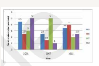 What is the ratio of the number of students who were admitted to course A in the year 2007 to that
of students who were admitted to course C in the year 2012? View Solution
What is the ratio of the number of students who were admitted to course A in the year 2007 to that
of students who were admitted to course C in the year 2012? View SolutionThe following bar graph shows the number of students (in hundreds) who have opted for different courses A, B, C and D in 3 years in a college. Study the graph and answer the question.
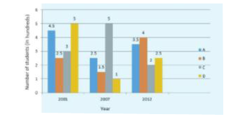
In the year 2007, the average number of students across the four courses is (in hundreds):View Solution
Knowledge Check
- Question 1 - Select One
The pie chart shows the number of students enrolled in the various engineering courses that a certain college offers. Studv the diagram and answer the following questions.
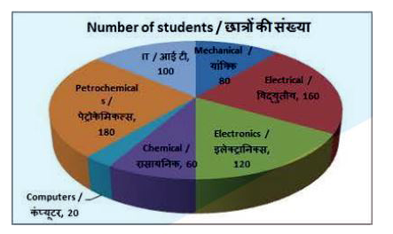
What is the total number of students enrolled in the college?Aa. 600Bb. 780Cc. 720Dd. 640 - Question 2 - Select One
Study the following graph carefully and answer the questions that follow
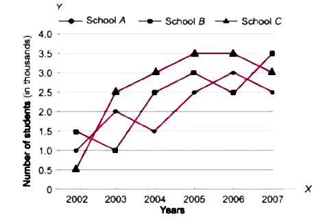
What was the average number of students in all schools together in the year 2006 ?A30000B9000C3000D6000 - Question 3 - Select One
The pie chart shows the number of students enrolled in the various engineering courses that a certain college offers. Study the diagram and answer the following questions.
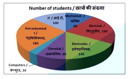
The most number of students are enrolled in which course?Aa. ITBb. ElectricalCc. ElectronicsDd. Petrochemicals
The following graph shows the number of students (in hundreds) in three different courses in four different institutes. Study the graph and answer the question.
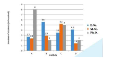
What is the total number of students (in hundreds) in M.Sc. course across all institutes?View SolutionStudy the following graph carefully to answer the questions that follow-----
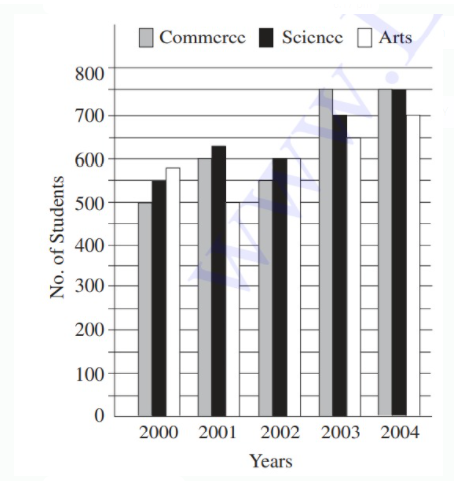
What is the total number of students studying Arts in all the years together ?View SolutionThe line graph shows the number of students who passed with distinction in the given years from a certain university. Study the diagram and answer the following questions.
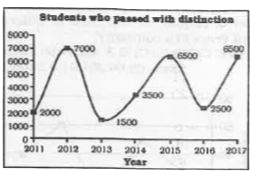
What was the difference between the number of students who passed with distinction between the years 2017 and 2014?View SolutionStudy the following graph carefully and answer the questions that follow
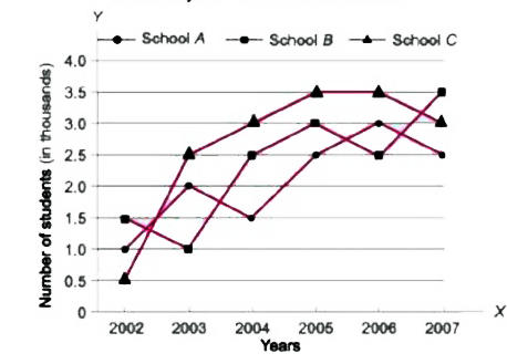
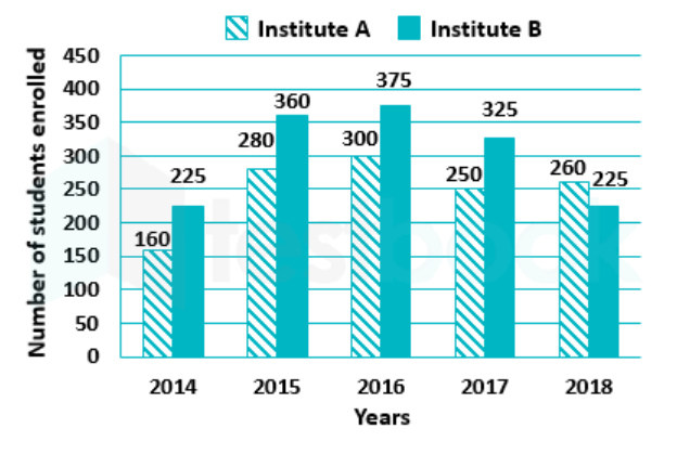
What was the approximate average number of students in school A over all the years together ?View SolutionWhat is the ratio of the total numbers of students enrolled in A during 2015 and 2018 to that of students enrolled in B during 2014 and 2016.
 View Solution

