The expenditure (in 10 crores of rupees) on health by the Government of India during the various five year plans is shown below: Plans:, I, II, III, IV, V, VI Expenditure on helath (in 10 crores of rupees), 7, 14, 23, 34, 76, 182 Construct a bar graph to represent the above data.
To construct a bar graph representing the expenditure on health by the Government of India during various five-year plans, follow these steps:
1. Identify the Data:
- Plans: I, II, III, IV, V, VI
- Expenditure (in 10 crores of rupees): 7, 14, 23, 34, 76, 182
2. Draw the Axes:
- Draw two perpendicular lines to represent the axes.
- The horizontal axis (x-axis) will represent the different five-year plans (I, II, III, IV, V, VI).
- The vertical axis (y-axis) will represent the expenditure on health (in 10 crores of rupees).
3. Label the Axes:
- Label the x-axis as "Five-Year Plans".
- Label the y-axis as "Expenditure on Health (in 10 crores of rupees)".
4. Determine the Scale for the Y-Axis:
- Since the highest expenditure is 182 (in 10 crores), choose a suitable scale for the y-axis. For example, you can use a scale of 25 units.
- Mark the y-axis with increments: 0, 25, 50, 75, 100, 125, 150, 175, 200.
5. Plot the Bars:
- For each plan, draw a bar whose height corresponds to the expenditure:
- Plan I: Height of 7 (draw a bar up to 7 on the y-axis)
- Plan II: Height of 14 (draw a bar up to 14 on the y-axis)
- Plan III: Height of 23 (draw a bar up to 23 on the y-axis)
- Plan IV: Height of 34 (draw a bar up to 34 on the y-axis)
- Plan V: Height of 76 (draw a bar up to 76 on the y-axis)
- Plan VI: Height of 182 (draw a bar up to 182 on the y-axis)
6. Final Touches:
- Ensure that the bars are of equal width and are spaced evenly apart.
- Optionally, you can color the bars for better visual representation.
- Add a title to the graph, such as "Expenditure on Health by Government of India (in 10 crores)".
- Plans: I, II, III, IV, V, VI
- Expenditure (in 10 crores of rupees): 7, 14, 23, 34, 76, 182
- Draw two perpendicular lines to represent the axes.
- The horizontal axis (x-axis) will represent the different five-year plans (I, II, III, IV, V, VI).
- The vertical axis (y-axis) will represent the expenditure on health (in 10 crores of rupees).
- Label the x-axis as "Five-Year Plans".
- Label the y-axis as "Expenditure on Health (in 10 crores of rupees)".
- Since the highest expenditure is 182 (in 10 crores), choose a suitable scale for the y-axis. For example, you can use a scale of 25 units.
- Mark the y-axis with increments: 0, 25, 50, 75, 100, 125, 150, 175, 200.
- For each plan, draw a bar whose height corresponds to the expenditure:
- Plan I: Height of 7 (draw a bar up to 7 on the y-axis)
- Plan II: Height of 14 (draw a bar up to 14 on the y-axis)
- Plan III: Height of 23 (draw a bar up to 23 on the y-axis)
- Plan IV: Height of 34 (draw a bar up to 34 on the y-axis)
- Plan V: Height of 76 (draw a bar up to 76 on the y-axis)
- Plan VI: Height of 182 (draw a bar up to 182 on the y-axis)
- Ensure that the bars are of equal width and are spaced evenly apart.
- Optionally, you can color the bars for better visual representation.
- Add a title to the graph, such as "Expenditure on Health by Government of India (in 10 crores)".
Topper's Solved these Questions
Similar Questions
The runs scored by a cricket team in first 10 over are given below:

Draw a graph depicting the data
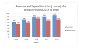
View SolutionThe given Bar Graph presents the Revenue and Expenditure (in crores of Rupees ) of a company during the five year period, 2014-2018.

The expenditure of the company in 2017 is what percentage less than the average revenue (per year) in 2014, 2015 and 2016 ?
View SolutionThe following data gives the amount of loans (in crores of rupees) disbursed by a bank during some years: Year, 1992, 1993, 1994, 1995, 1996 Loan (in crores of rupees), 28, 33, 55, 55, 80 Represent the above data with the help of a bar graph. With the help of the bar graph, indicate the year in which amount of loan is not increased over that of the preceding year.
View SolutionThe given Bar Graph presents the Revenue and Expenditure (in crores of Rupees ) of a company during the five year period, 2014-2018.

What is the ratio of the total revenue of the company in 2015 and 2018 to that of its expenditure in 2014 and 2018 ?
View SolutionDraw a pie-diagram to represent the following data on the proposed outlay during the fourth five-year plan. Items, Agriculture, Ind. and Minerals, Irrigation & Power, Communication, Miscellaneous Rupees (in crores), 6000, 4000, 2500, 4500, 3000
View SolutionThe given Bar Graph presents the Revenue and Expenditure (in crores of Rupees ) of a company during the five year period, 2014-2018.

The total expenditure of the company from 2016 to 2018 is what percentage (neatest to an integer) of the total revenue for the five year period?
View SolutionIn an economy , the investment expenditure is Rs. 70 crores and consumption functin is C= 60 + 0.80 Y . ("i) Determine the equilibrium level of income , (ii) Find the equilibrium income when planned investment expenditure is creased by Rs. 10 crores , (iii) Value of multiplier due to increase in investment expenditure.
View SolutionThe runs scored by a cricket team in first 15 overs are given below: Overs, I, II, III, IV, V, VI, VII, VIII, IX, X, XI, XII, XIII, XIV, XV Runs:, 2, 1, 4, 2, 6, 8, 10, 21, 5, 8, 3, 2, 6, 8, 12 Draw the graph representing the above data in two different ways as a graph and as a bar chart.
View SolutionExpenditure on education of a country during a five years period (2002-2006), in crore of rupees, is given below

Represent the information above by a bar graph.
View SolutionThe runs scored by two teams A and B in first 10 overs are given below: Overs, I, II, III, IV, V, VI, VII, VIII, IX, X Team A:, 2, 1, 8, 9, 4, 5, 6, 10, 6, 2 Team B:, 5, 6, 2, 10, 5, 6, 3, 4, 8, 10 Draw a graph depicting the data, making the graphs on the same axes in each case in two different ways as a graph and as a bar chart.
View Solution