The following table shows how a student spends his pocket money during the course of a month. Represent it by a pie-diagram. Items, Food, Entertainment, Other expenditure, Savings Expenditure, 40%, 25%, 20%, 15%
To represent the given data in a pie chart, we will follow these steps:
Step 1: Understand the Data
The table shows how a student spends his pocket money in percentages:
- Food: 40%
- Entertainment: 25%
- Other Expenditure: 20%
- Savings: 15%
Step 2: Confirm Total Percentage
Add up all the percentages to ensure they equal 100%.
- Total = 40% + 25% + 20% + 15% = 100%
Step 3: Calculate Central Angles
Since a pie chart represents a full circle, which is 360 degrees, we need to calculate the central angle for each expenditure category.
The formula to calculate the central angle for each category is:
Central Angle=(Percentage100)×360
For Food:
Central Angle for Food=(40100)×360=144∘
For Entertainment:
Central Angle for Entertainment=(25100)×360=90∘
For Other Expenditure:
Central Angle for Other Expenditure=(20100)×360=72∘
For Savings:
Central Angle for Savings=(15100)×360=54∘
Step 4: Draw the Pie Chart
1. Draw a Circle: Start by drawing a circle.
2. Use a Protractor: To measure the angles, use a protractor.
3. Mark the Angles:
- From the center of the circle, measure and mark a 144° angle for Food.
- Next, measure and mark a 90° angle for Entertainment.
- Then, measure and mark a 72° angle for Other Expenditure.
- Finally, measure and mark a 54° angle for Savings.
Step 5: Label the Sections
Label each section of the pie chart with the corresponding category (Food, Entertainment, Other Expenditure, Savings) and their respective percentages.
Final Pie Chart
The pie chart should now visually represent how the student spends his pocket money, with each section corresponding to the calculated angles.
---
The table shows how a student spends his pocket money in percentages:
- Food: 40%
- Entertainment: 25%
- Other Expenditure: 20%
- Savings: 15%
Add up all the percentages to ensure they equal 100%.
- Total = 40% + 25% + 20% + 15% = 100%
Since a pie chart represents a full circle, which is 360 degrees, we need to calculate the central angle for each expenditure category.
Central Angle=(Percentage100)×360
Central Angle for Food=(40100)×360=144∘
Central Angle for Entertainment=(25100)×360=90∘
Central Angle for Other Expenditure=(20100)×360=72∘
Central Angle for Savings=(15100)×360=54∘
1. Draw a Circle: Start by drawing a circle.
2. Use a Protractor: To measure the angles, use a protractor.
3. Mark the Angles:
- From the center of the circle, measure and mark a 144° angle for Food.
- Next, measure and mark a 90° angle for Entertainment.
- Then, measure and mark a 72° angle for Other Expenditure.
- Finally, measure and mark a 54° angle for Savings.
Label each section of the pie chart with the corresponding category (Food, Entertainment, Other Expenditure, Savings) and their respective percentages.
The pie chart should now visually represent how the student spends his pocket money, with each section corresponding to the calculated angles.
Topper's Solved these Questions
Similar Questions
The following data shows the expenditure of a person on different items during a month. Represent the data by a pie-chart. Items of expenditure, Rent, Education, Food, Clothing, Others Amount (in Rs.), 2700, 1800, 2400, 1500, 2400
View SolutionThe following table shows the expenditure incurred by a publisher in publishing a book: Items, Paper, Printing, Binding, Advertishing, Misc. Expenditure (in %), 35%, 20%, 10%, 5%, 30% Present the above data in the form of a pie-chart.
View Solution
Knowledge Check
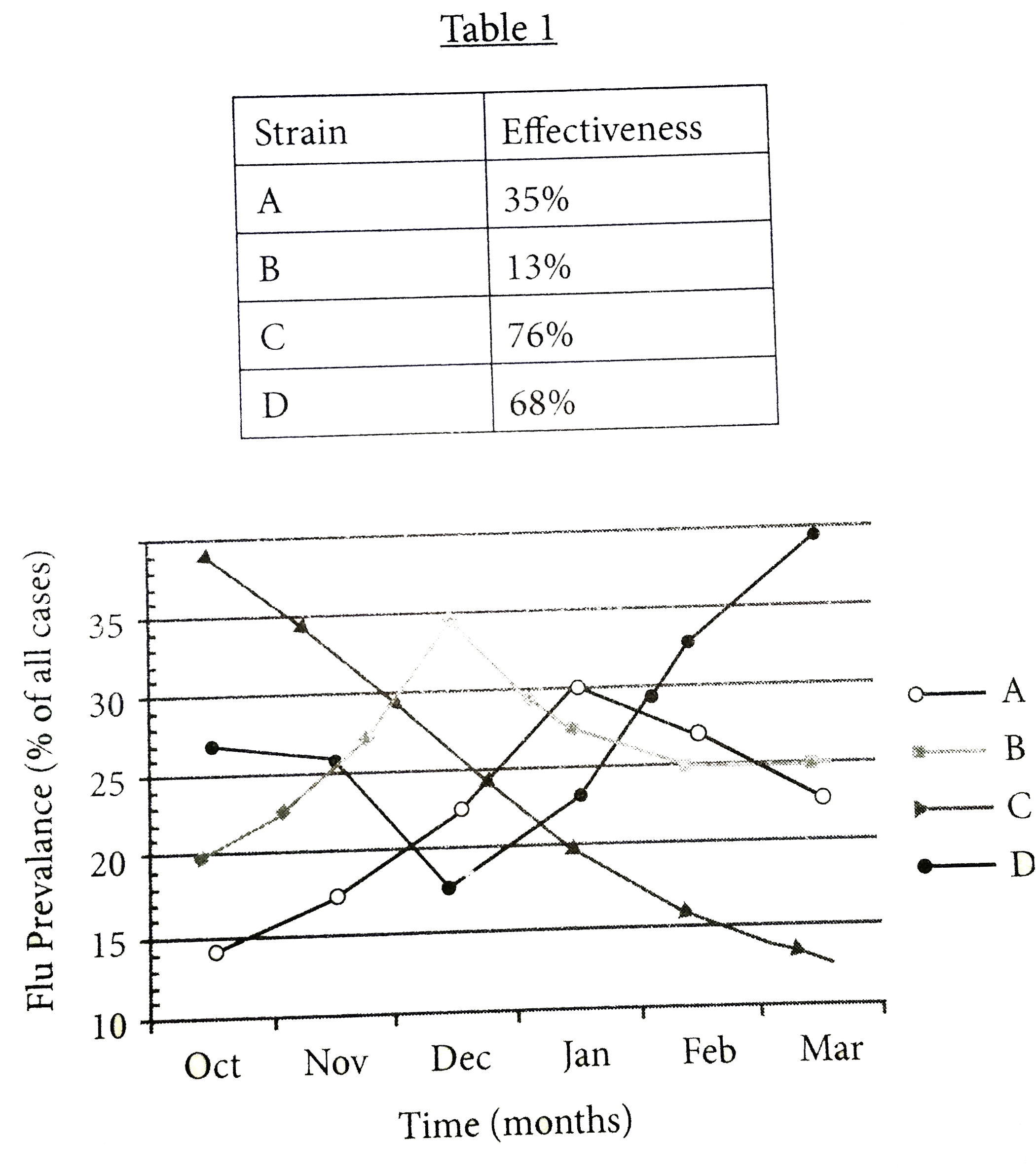
he flu shot for a flu seaons is created four strains of the flu virus, named Strain A,B,C and D, respectively. Medical researchers use the following data to determine the effectiveness of the vacine over the flu season. Table 1 shows the effectiveness of the vaccine against each of these strains individually. The graph below the table shows the prevalence of each of these strains during each month of the flu season, represented as a percentage of the overall cases of flu that month.

For the strain against which the flu shot was the most effective. approximately how effective was the shot overall during the month that strain was least prevalent?A0.13B0.2C0.27D0.48
Draw a pie-diagram for the following data of expenditure pattern in a family: Items, Food, Clothing, Rent, Education, Unforeseen events, Medicine Expenditure (in percent), 40%, 20%, 10%, 10%, 15%, 5%
View SolutionThe following data relates to the cost of construction of a house in Delhi.
Draw a pie-diagram to represent the given data.
ITEMS EXPENDITURE cements 30% Steel 10% Bricks 10% Timber 15% Labour 25% Misc. 10%
View SolutionMr Virmani saves 12% of his salary. If he receives Rs 15900 per month as salary, find his monthly expenditure.
View SolutionOut of her total income Mrs Sharma spends 20% on house rent and 70% of the rest on household expenditure. If she saves Rs 1800, what is the total income?
View SolutionThe following pie-chart shows the monthly expenditure of Shikha on various items. If she spends Rs. 16000 per month, answer the following questions: How much does she spend on rent? How much does she spend on education? What is the ratio of expenses on food and rent?
View SolutionThe pie-chart given in Figure, represents the expenditure on different items in constructing a flat in a metro city.
(i)Find the percentage expenditure on different items by reading the pie-chart. (ii) If the cost of flat is Rs. 5,40,000, Find the following: (i)The expenditure incurred on steel and cement separately. (ii)Difference of expenditure incurred on timber and bricks.
View SolutionThe monthly income of Mr. Amit Goel is Rs 30400. He saves 12.5% of his income and the rest he spends. How much does he spend each month ?
View Solution
