Draw a pie-diagram for the following data of the investment pattern in a five year plan: Agriculture , Irrigation and Power, Small Industries, Transport, Social service, Misc. 14%,16%,29%,17%,16%,8%
To draw a pie diagram for the investment pattern in a five-year plan based on the given percentages, we will follow these steps:
Step 1: Calculate the Total Percentage
First, we need to confirm that the total percentage of all categories adds up to 100%. The given percentages are:
- Agriculture: 14%
- Irrigation and Power: 16%
- Small Industries: 29%
- Transport: 17%
- Social Service: 16%
- Miscellaneous: 8%
Now, we add these percentages:
14+16+29+17+16+8=100%
Step 2: Convert Percentages to Angles
Since a pie chart represents data in terms of angles, we need to convert each percentage into an angle. The total angle in a circle is 360 degrees. Therefore, to find the angle for each category, we use the formula:
Angle=(Percentage100)×360
Now, we will calculate the angle for each category:
1. Agriculture:
Angle=(14100)×360=50.4 degrees
2. Irrigation and Power:
Angle=(16100)×360=57.6 degrees
3. Small Industries:
Angle=(29100)×360=104.4 degrees
4. Transport:
Angle=(17100)×360=61.2 degrees
5. Social Service:
Angle=(16100)×360=57.6 degrees
6. Miscellaneous:
Angle=(8100)×360=28.8 degrees
Step 3: Draw the Pie Chart
1. Draw a Circle: Start by drawing a circle using a compass.
2. Use a Protractor: To measure each angle calculated above, use a protractor to mark the angles on the circle.
3. Label Each Sector: After marking the angles, label each sector with the respective category name and percentage.
Final Representation
The pie chart will visually represent the investment distribution across the different sectors based on the angles calculated.
---
First, we need to confirm that the total percentage of all categories adds up to 100%. The given percentages are:
- Agriculture: 14%
- Irrigation and Power: 16%
- Small Industries: 29%
- Transport: 17%
- Social Service: 16%
- Miscellaneous: 8%
14+16+29+17+16+8=100%
Since a pie chart represents data in terms of angles, we need to convert each percentage into an angle. The total angle in a circle is 360 degrees. Therefore, to find the angle for each category, we use the formula:
Angle=(Percentage100)×360
Angle=(14100)×360=50.4 degrees
Angle=(16100)×360=57.6 degrees
Angle=(29100)×360=104.4 degrees
Angle=(17100)×360=61.2 degrees
Angle=(16100)×360=57.6 degrees
Angle=(8100)×360=28.8 degrees
1. Draw a Circle: Start by drawing a circle using a compass.
2. Use a Protractor: To measure each angle calculated above, use a protractor to mark the angles on the circle.
3. Label Each Sector: After marking the angles, label each sector with the respective category name and percentage.
The pie chart will visually represent the investment distribution across the different sectors based on the angles calculated.
Topper's Solved these Questions
Similar Questions
Knowledge Check
Connor invests a sum of money at an interest rate of 3% per year compounded annually. The value of the investment, y, after n years can be calculated using the equation y=A(x)n. If Connor invests $250 and wants to calculate the value of his investment after 10 years, assuming no further deposits or withdrawals, which of the following equations should be use?
Ay=250(0.97)10By=(250×0.03)10Cy=250(0.03)10Dy=250(1.03)10
Draw a pie-diagram to represent the following data on the proposed outlay during the fourth five-year plan. Items, Agriculture, Ind. and Minerals, Irrigation & Power, Communication, Miscellaneous Rupees (in crores), 6000,4000,2500,4500,3000
View SolutionThe percentages of various categories of workers in a state are given in the following table. Categories, Cultivators, Agricultural Labourers, Industrial Workers, Commercial Workers, Others % of workers, 40, 25, 12.5, 10, 12.5 Present the information in the form a pie-chart.
View SolutionThe following table shows the expenditure incurred by a publisher in publishing a book: Items, Paper, Printing, Binding, Advertishing, Misc. Expenditure (in %), 35%, 20%, 10%, 5%, 30% Present the above data in the form of a pie-chart.
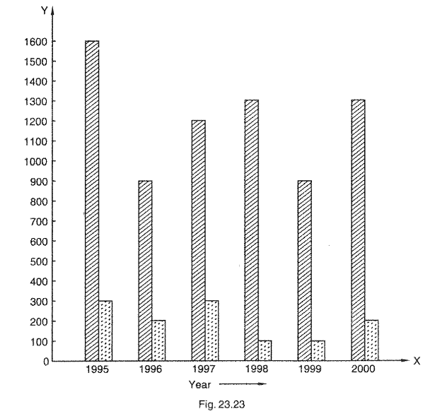
View SolutionThe following bar graph shows the number of persons killed in industrial accidents in a country for some years (Figure) Read the bar graph and choose the correct alternative in each of the following: The year which shows the maximum percentage increase in the number of persons killed in coal mines over the preceding year is:

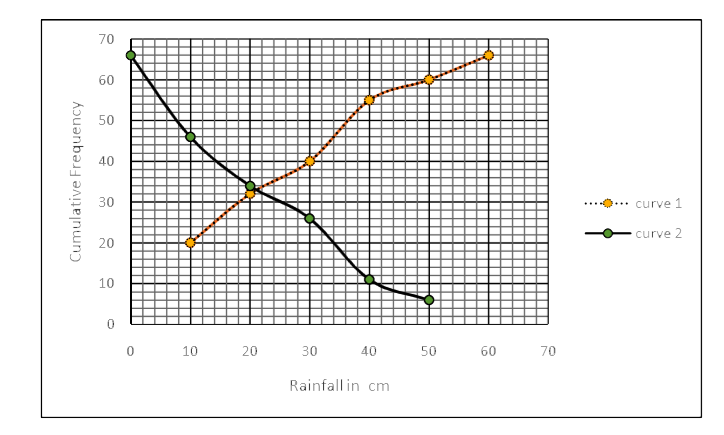
View SolutionA TV reporter was given a task to prepare a report on the rainfall of the city Dispur of India in a particular year. After collecting the data, he analyzed the data and prepared a report on the rainfall of the city. Using this report, he drew the following graph for a particular time period of 66 days

Based on the above graph, answer the following questions
(i) Identify less than type ogive and more than type ogive from the given graph.
(ii) Find the median rainfall of Dispur
(iii) Obtain the Mode of the data if mean rainfall is 23.4cm
View SolutionThe following table shows how a student spends his pocket money during the course of a month. Represent it by a pie-diagram. Items, Food, Entertainment, Other expenditure, Savings Expenditure, 40%, 25%, 20%, 15%
View SolutionDraw a pie-diagram representing the relative frequencies (expressed as percentage) of the eight classes as given below: 12.6, 18.2, 17.5, 20.3, 2.8, 4.2, 9.8, 14.7
View Solution
