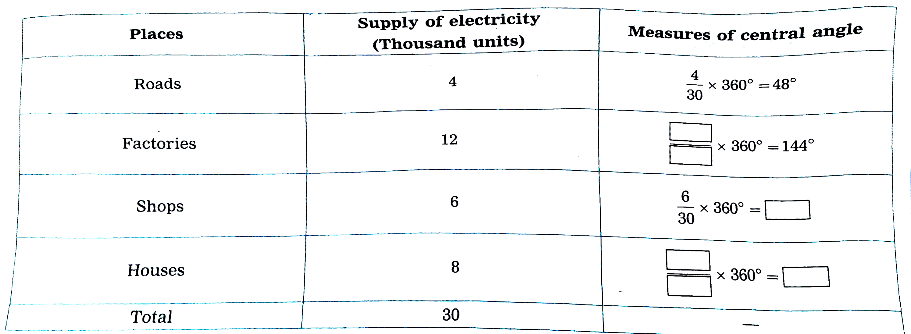
The following table shows the daily supply of electricity to different places in a town. Show the information by a pie diagram.

Step by step video & image solution for The following table shows the daily supply of electricity to different places in a town. Show the information by a pie diagram. by Maths experts to help you in doubts & scoring excellent marks in Class 10 exams.
Updated on:21/07/2023Topper's Solved these Questions
- STATISTICSBOOK - TARGET PUBLICATIONCHAPTER - STATISTICSEXERCISE - Apply your knowledge
5 Videos
- STATISTICSBOOK - TARGET PUBLICATIONCHAPTER - STATISTICSEXERCISE - Chapter Assessment
15 Videos
- STATISTICSBOOK - TARGET PUBLICATIONCHAPTER - STATISTICSEXERCISE - Multiple Choice Questions
14 Videos
- SIMILARITY BOOK - TARGET PUBLICATIONCHAPTER - SIMILARITY EXERCISE - Chapter Assessment
19 Videos
- TRIGONOMETRY BOOK - TARGET PUBLICATIONCHAPTER - TRIGONOMETRY EXERCISE - Chapter Assessment
18 Videos
Similar Questions
The following table shows the daily supply of electricity to different places in a town. To show the information by a pie diagram measure of central angles of sectors are to be decided. Complete the following activity to find the measures:

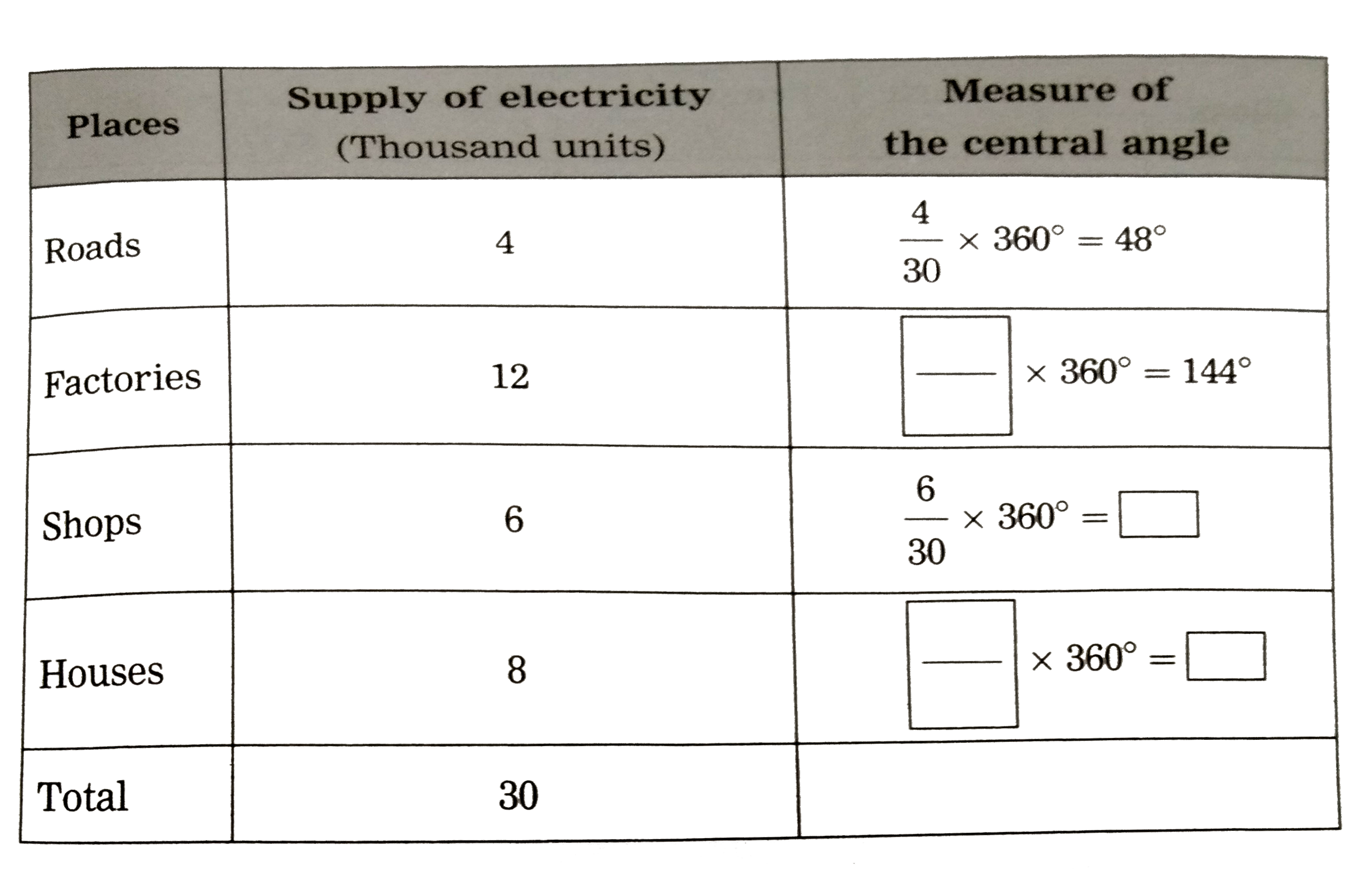
View SolutionThe following table shows the daily supply of electricity to differenet places in a town. To show the information by a pie diagram, measures of central angles of sectors are to be decided. Complete the following activity to find the measures.

View SolutionThe following table shows the percentages of demands for different fruits registered with a fruit vendor. Show the information by a pie diagram.

View SolutionThe following table shows the percentages of demands for different fruits registered with a fruit vendor. Show the information by a pie diagram.

View SolutionThe following table shows the average rainfall in 150 towns. Towns. Show the information by a ferquency polygon.

View SolutionIn a bicycle shop, number of bicycles purchased and choice of their colours was as follows. Find the measures of sectors of a circle to show the information by a pie diagram.

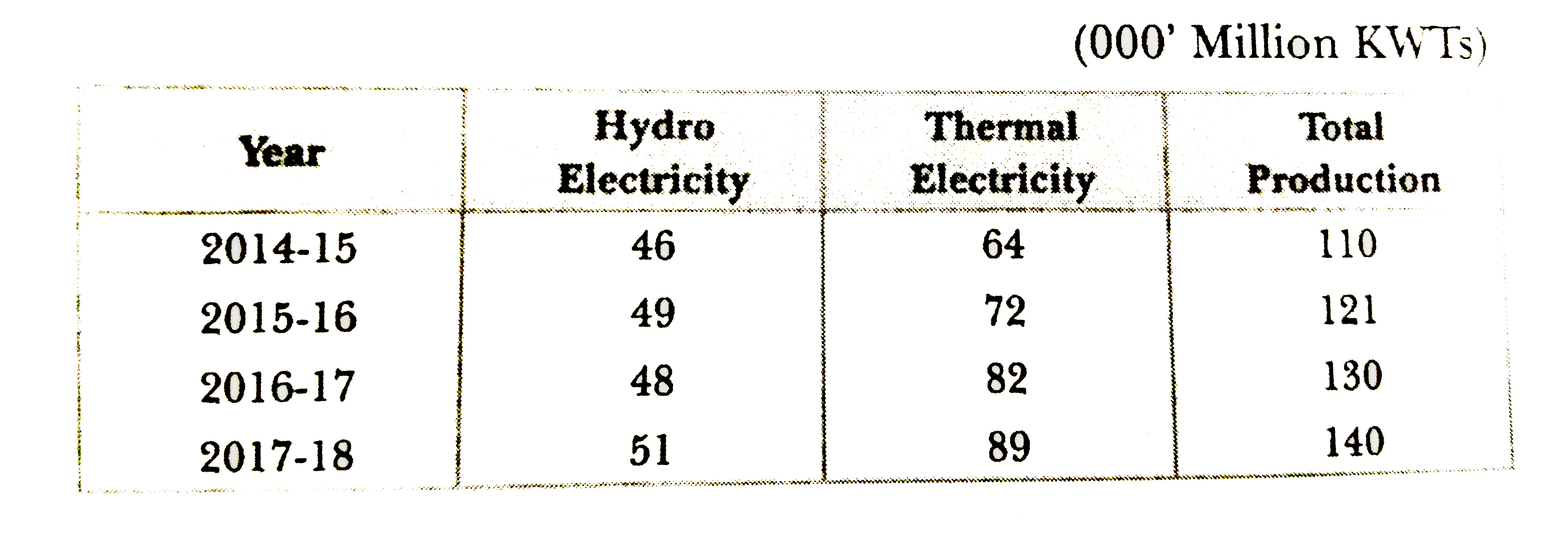
View SolutionThe following table shows Production of Electricity from different Sources in India during 2014-15 to 2017-18 (hypothetical data).
Present the data in a sub-divided bar diagram.

View SolutionThe following table shows the percentage of buyers of four different brands of bathing soaps.

Represent the above data by a pie chart.
View SolutionThe following table shows the monthly expenditure of different families on different items :

Represent the data in the form of a sub-divided bar diagram.
View SolutionThe following table shows the interest of students of a school in different games :

Represent the data by using a simple bar diagram.
View Solution
