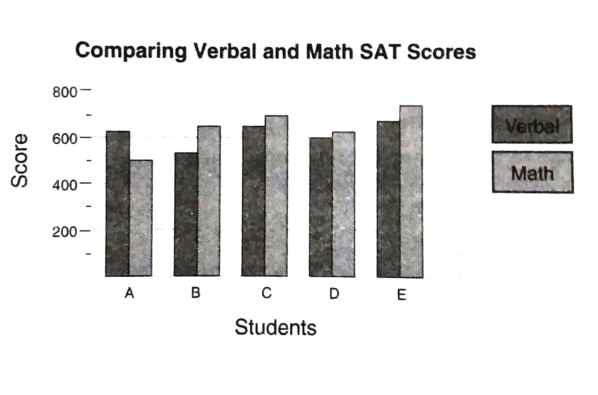
The bar graph above shows the verbal and math SAT scores for five students labeled A through E. If a scatterplot of the data in the bar graph is made such that the math SAT score for each student is plotted along the x-axis and their verbal SAT score is plotted along the y-axis, how many of the data points would lie above the line y=x?
The correct Answer is:A
Step by step video, text & image solution for The bar graph above shows the verbal and math SAT scores for five students labeled A through E. If a scatterplot of the data in the bar graph is made such that the math SAT score for each student is plotted along the x-axis and their verbal SAT score is plotted along the y-axis, how many of the data points would lie above the line y=x? by Maths experts to help you in doubts & scoring excellent marks in Class 12 exams.
Updated on:21/07/2023Topper's Solved these Questions
- PROBLEM SOLVING AND DATA ANALYSISBOOK - ENGLISH SATCHAPTER - PROBLEM SOLVING AND DATA ANALYSISEXERCISE - Grib-In
40 Videos
- PROBLEM SOLVING AND DATA ANALYSISBOOK - ENGLISH SATCHAPTER - PROBLEM SOLVING AND DATA ANALYSISEXERCISE - Grib-In
40 Videos
- PROBLEM SOLVING AND DATA ANALYSISBOOK - ENGLISH SATCHAPTER - PROBLEM SOLVING AND DATA ANALYSISEXERCISE - EXERICSE
80 Videos
- PROBLEMS IN CONTEXT BOOK - ENGLISH SATCHAPTER - PROBLEMS IN CONTEXT EXERCISE - PRACTICE TEST
10 Videos
Similar Questions
Knowledge Check

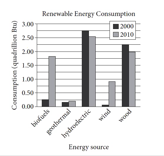
The bar graph above shows renewable energy consumption in quadrillions of British thermal units (Btu) in the United States, by energy source, for several energy sources in the years 2000 and 2010.
In a scatterplot of this data, where renewable energy consumption in the year 2000 is plotted along the x-axis and renewable energy consumption in the year 2010 is plotted along the y-axis for each of the given energy sources, how many data points would be above the line y=x ?A1B2C3D4
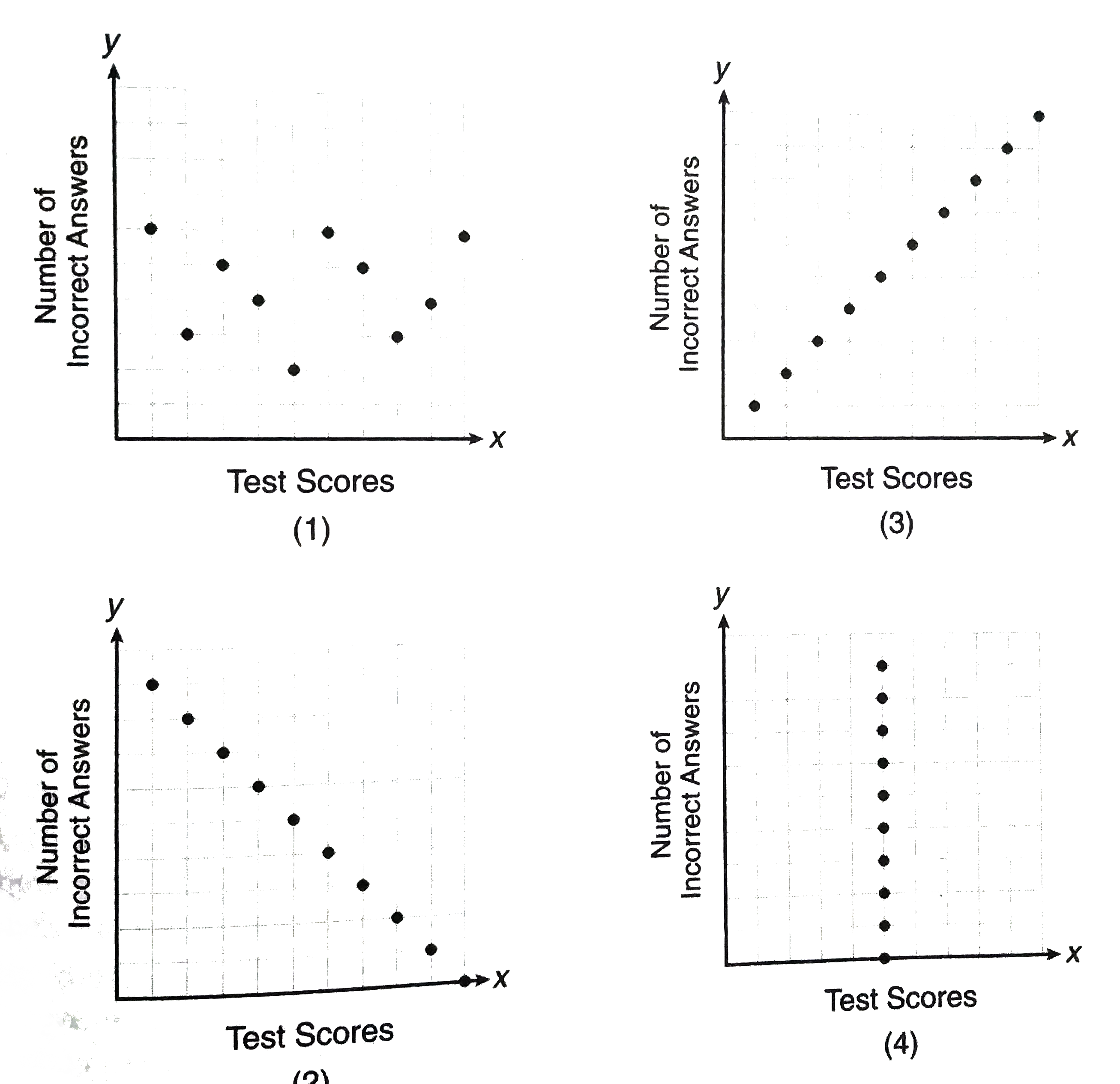
Which of the four graphs above best shows the relationship between x and y if x represents a student score on a test and y represents the number of incorrect answers a student received on the same test?AGraph (1)BGraph (2)CGraph (3)DGraph (4)Scientists plotted data for two animal populations on a scatterplot: population A, which they graphed along the x-axis, and population B, which they graphed along the y-axis. The data showed a strong negative correlation. Which of the following statements is justified ?
AThe rise in population A caused the decline in population B.BThe decline in population B caused the rise in population A.CBecause the correlation is negative, there cannot be causation between the two populations.DThe rise in populatin A is correlated to the decline in population B, but causation is unknown.
Student in a finance class surveyed 20 percent of the account holders at Docven Bank to determine whether the bank's "Stock Market Special" savings account actually paid account holders the promised 10 percent annual interest rate. The scatterplot above shows the data the students collected from account holders about how long ago they opened their accounts and their current balances. The students calculated a lone of best fit with the equation y=120(1+.0812)12x, whihc means that the bank was actually paying account holders only an 8 percent annual interest rate. Which of the following best explains how the number 120 in the equation relates to the scatterplot?
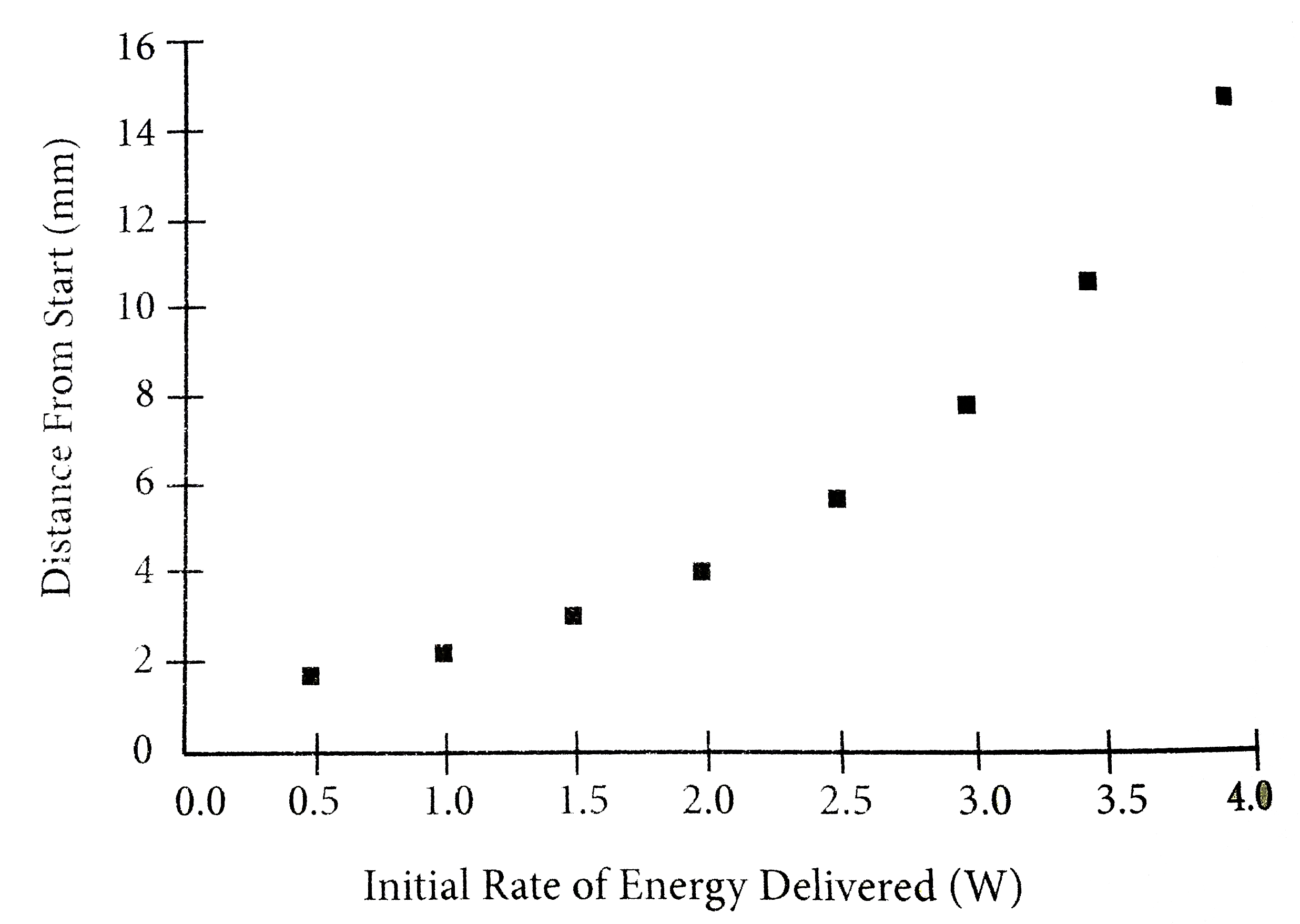
View SolutionMr. Lastorka's science class is running experiments with an energy efficient model electric car, As the initial rate of energy delivered to the car, measured in watt, increases, the number of millimeters moved by the car from its starting positions increases exponentially . The results the several trial runs are shown on the scatterplot graph below.

Based on the data, the students in Mr . Lastroka's class determine the exact equation involving Watts, x and total distance from start,y. They call the function y=f(x) over the x-axis. He challenges each student to determine the new function and what it would mean from a physics perspective. Four students pairs gave their answers below. Who is correct, and for what reasons?
View SolutionWe've all heard the adage: practice makes perfect! In other words, acquiring skills takes time and effort. But how exactly does one go about learning a complex subject such as tennis, calculus, or how to play the violin? An age-old answer is: practice one skill at a time. A beginning pianist might rehearse scales before chords. A tennis player practices the forehand before the backhand. Learning researchers call this "blocking," and because it is commonsensical and easy to schedule, blocking is dominant in schools and training programs.
However, another strategy promises improved results. Enter "interleaving," a largely unheard of technique that is capturing the attention of cognitive psychologists and neuroscientists. Whereas blocking involves practicing one skill at a time before the next (for example, "skill A" before "skill B" and so on, forming the pattern "AAABBBCCC"), in interleaving one mixes, or interleaves, practice on several related skills together (forming for example the pattern "ABCABCABC"). For instance, a pianist alternates practice between scales, chords, and arpeggios, while a tennis player alternates practice between forehands, backhands, and volleys. Given interleaving's promise, it is surprising then that few studies have investigated its utility in everyday applications. However, a new study by cognitive psychologist Doug Rohrer takes a step towards addressing that gap. Rohrer and his team are the first to implement interleaving in actual classrooms. The location: middle schools in Tampa, Florida. The target skills: algebra and geometry.
The three-month study involved teaching 7th graders slope and graph problems. Weekly lessons were largely unchanged from standard practice. Weekly homework worksheets, however, featured an interleaved or blocked design. When interleaved, both old and new problems of different types were mixed together. Of the nine participating classes, five used interleaving for slope problems and blocking for graph problems, the reverse occurred in the remaining four. Five days after the last lesson, each class held a Teview session for all students. A surprise final test occurred one day or one month later. The result? When the test was one day later, scores were 25 percent better for problems trained with interleaving, at one month later, the interleaving advantage grew to 76 percent.
These results are important for a host of reasons. First, they show that interleaving works in real-world, extended use. It is highly effective with an almost ubiquitous subject, math. The interleaving effect is long-term and the advantage over blocking actually increases with the passage of time. The benefit even persists when blocked materials receive additional review. Overall, the interleaving effect can be strong, stable, and long lasting Researchers are now working to understand why interleaving yields such impressive results. One prominent explanation is that it improves the brain's ability to tell apart concepts. With blocking, once you know what solution to use, the hard part is over. With interleaving, each practice attempt is different from the last, so rote responses don't work. Instead, your brain must continuously focus on searching for different solutions. That process can improve your ability to learn critical features of skills.
A second explanation is that interleaving strengthens memory associations. With blocking, a single strategy, temporarily held in short-term memory, is sufficient. That's not the case with interleaving-the correct solution changes from one practice attempt to the next. As a result, your brain is continually engaged at retrieving different responses and bringing them into short term memory. Both of these accounts imply that increased effort during training is needed when interleaving is used. This corresponds to a potential drawback of the technique, namely that the learning process often feels more gradual and difficult at the outset. However, that added effort can generate better, longer lasting results.
For each word given below choose the correct meaning (as used in the passage) from the options provided:
yields
View SolutionWe've all heard the adage: practice makes perfect! In other words, acquiring skills takes time and effort. But how exactly does one go about learning a complex subject such as tennis, calculus, or how to play the violin? An age-old answer is: practice one skill at a time. A beginning pianist might rehearse scales before chords. A tennis player practices the forehand before the backhand. Learning researchers call this "blocking," and because it is commonsensical and easy to schedule, blocking is dominant in schools and training programs.
However, another strategy promises improved results. Enter "interleaving," a largely unheard of technique that is capturing the attention of cognitive psychologists and neuroscientists. Whereas blocking involves practicing one skill at a time before the next (for example, "skill A" before "skill B" and so on, forming the pattern "AAABBBCCC"), in interleaving one mixes, or interleaves, practice on several related skills together (forming for example the pattern "ABCABCABC"). For instance, a pianist alternates practice between scales, chords, and arpeggios, while a tennis player alternates practice between forehands, backhands, and volleys. Given interleaving's promise, it is surprising then that few studies have investigated its utility in everyday applications. However, a new study by cognitive psychologist Doug Rohrer takes a step towards addressing that gap. Rohrer and his team are the first to implement interleaving in actual classrooms. The location: middle schools in Tampa, Florida. The target skills: algebra and geometry.
The three-month study involved teaching 7th graders slope and graph problems. Weekly lessons were largely unchanged from standard practice. Weekly homework worksheets, however, featured an interleaved or blocked design. When interleaved, both old and new problems of different types were mixed together. Of the nine participating classes, five used interleaving for slope problems and blocking for graph problems, the reverse occurred in the remaining four. Five days after the last lesson, each class held a Teview session for all students. A surprise final test occurred one day or one month later. The result? When the test was one day later, scores were 25 percent better for problems trained with interleaving, at one month later, the interleaving advantage grew to 76 percent.
These results are important for a host of reasons. First, they show that interleaving works in real-world, extended use. It is highly effective with an almost ubiquitous subject, math. The interleaving effect is long-term and the advantage over blocking actually increases with the passage of time. The benefit even persists when blocked materials receive additional review. Overall, the interleaving effect can be strong, stable, and long lasting Researchers are now working to understand why interleaving yields such impressive results. One prominent explanation is that it improves the brain's ability to tell apart concepts. With blocking, once you know what solution to use, the hard part is over. With interleaving, each practice attempt is different from the last, so rote responses don't work. Instead, your brain must continuously focus on searching for different solutions. That process can improve your ability to learn critical features of skills.
A second explanation is that interleaving strengthens memory associations. With blocking, a single strategy, temporarily held in short-term memory, is sufficient. That's not the case with interleaving-the correct solution changes from one practice attempt to the next. As a result, your brain is continually engaged at retrieving different responses and bringing them into short term memory. Both of these accounts imply that increased effort during training is needed when interleaving is used. This corresponds to a potential drawback of the technique, namely that the learning process often feels more gradual and difficult at the outset. However, that added effort can generate better, longer lasting results.
For each word given below choose the correct meaning (as used in the passage) from the options provided:
Retrieving
View SolutionWe've all heard the adage: practice makes perfect! In other words, acquiring skills takes time and effort. But how exactly does one go about learning a complex subject such as tennis, calculus, or how to play the violin? An age-old answer is: practice one skill at a time. A beginning pianist might rehearse scales before chords. A tennis player practices the forehand before the backhand. Learning researchers call this "blocking," and because it is commonsensical and easy to schedule, blocking is dominant in schools and training programs.
However, another strategy promises improved results. Enter "interleaving," a largely unheard of technique that is capturing the attention of cognitive psychologists and neuroscientists. Whereas blocking involves practicing one skill at a time before the next (for example, "skill A" before "skill B" and so on, forming the pattern "AAABBBCCC"), in interleaving one mixes, or interleaves, practice on several related skills together (forming for example the pattern "ABCABCABC"). For instance, a pianist alternates practice between scales, chords, and arpeggios, while a tennis player alternates practice between forehands, backhands, and volleys. Given interleaving's promise, it is surprising then that few studies have investigated its utility in everyday applications. However, a new study by cognitive psychologist Doug Rohrer takes a step towards addressing that gap. Rohrer and his team are the first to implement interleaving in actual classrooms. The location: middle schools in Tampa, Florida. The target skills: algebra and geometry.
The three-month study involved teaching 7th graders slope and graph problems. Weekly lessons were largely unchanged from standard practice. Weekly homework worksheets, however, featured an interleaved or blocked design. When interleaved, both old and new problems of different types were mixed together. Of the nine participating classes, five used interleaving for slope problems and blocking for graph problems, the reverse occurred in the remaining four. Five days after the last lesson, each class held a Teview session for all students. A surprise final test occurred one day or one month later. The result? When the test was one day later, scores were 25 percent better for problems trained with interleaving, at one month later, the interleaving advantage grew to 76 percent.
These results are important for a host of reasons. First, they show that interleaving works in real-world, extended use. It is highly effective with an almost ubiquitous subject, math. The interleaving effect is long-term and the advantage over blocking actually increases with the passage of time. The benefit even persists when blocked materials receive additional review. Overall, the interleaving effect can be strong, stable, and long lasting Researchers are now working to understand why interleaving yields such impressive results. One prominent explanation is that it improves the brain's ability to tell apart concepts. With blocking, once you know what solution to use, the hard part is over. With interleaving, each practice attempt is different from the last, so rote responses don't work. Instead, your brain must continuously focus on searching for different solutions. That process can improve your ability to learn critical features of skills.
A second explanation is that interleaving strengthens memory associations. With blocking, a single strategy, temporarily held in short-term memory, is sufficient. That's not the case with interleaving-the correct solution changes from one practice attempt to the next. As a result, your brain is continually engaged at retrieving different responses and bringing them into short term memory. Both of these accounts imply that increased effort during training is needed when interleaving is used. This corresponds to a potential drawback of the technique, namely that the learning process often feels more gradual and difficult at the outset. However, that added effort can generate better, longer lasting results.
The main effect of the words "adage" and "age old" is to:
View Solution
