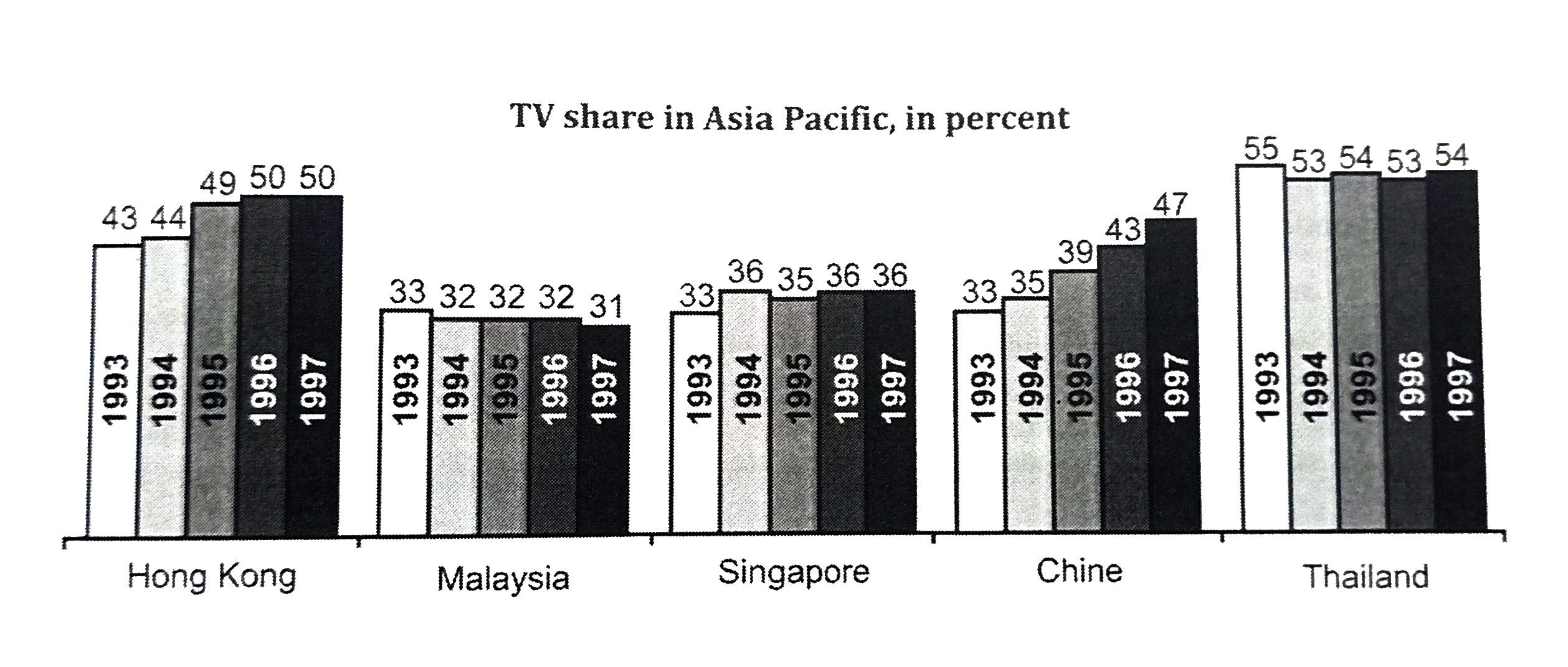
The graph shows the percenatge of population owining TV sets in various countries .
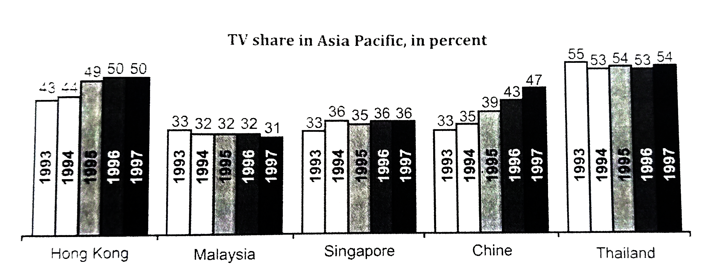
Which of the following countries has shown the highest percent decline in the percent share of TV sets from 19993 to 1997 ?
Hong Kong
Thailnad
Singapore
Malaysis
The correct Answer is:D
Step by step video, text & image solution for The graph shows the percenatge of population owining TV sets in various countries . Which of the following countries has shown the highest percent decline in the percent share of TV sets from 19993 to 1997 ? by Maths experts to help you in doubts & scoring excellent marks in Class 12 exams.
Topper's Solved these Questions
Similar Questions
Between 1985 and 2003, data were collected every three years on the amount of plastic produced annually in the United States, in billions of pounds. The graph below shows the data and a line of best fit. The equation of the line of best fit is y = 3.39x + 46.89, where x is the number of years since 1985 and y is the amount of plastic produced annually, in billions of pounds.
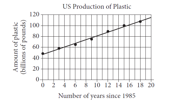
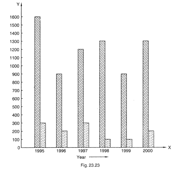
Which of the following is closest to the percent increase in the billions of pounds of plastic produced in the United States from 2000 to 2003?View SolutionThe following bar graph shows the number of persons killed in industrial accidents in a country for some years (Figure) Read the bar graph and choose the correct alternative in each of the following: The year which shows the maximum percentage increase in the number of persons killed in coal mines over the preceding year is:
 View Solution
Knowledge Check
- Question 1 - Select One
The graph shows the percenatge of population owining TV sets in various countries .
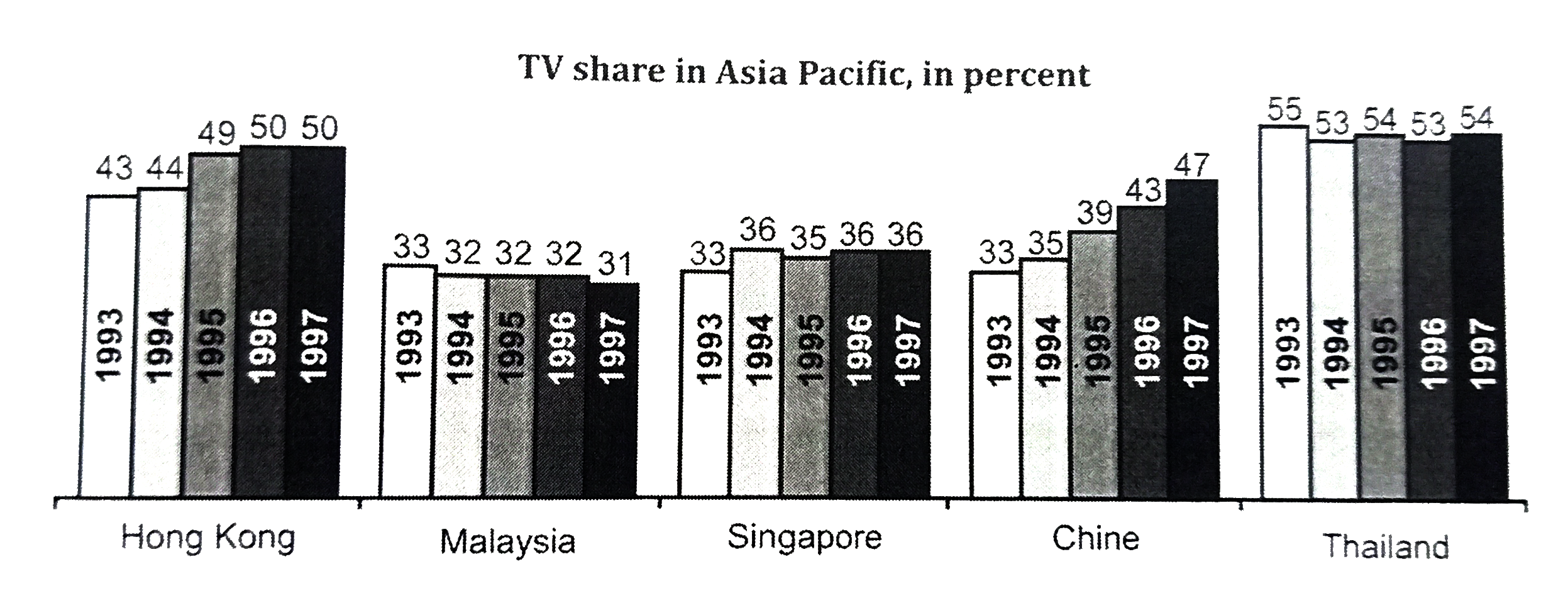
Which country has shown a nearly constant TV share for the 5 yearsAHong KongBMalaysisCSingaporeDChina - Question 2 - Select One
The graph shows the percenatge of population owining TV sets in various countries .
By what " percentage points" has the share of TV sets in Hong kong grown from 1993 to 1997 ?A7B15C16D21 - Question 3 - Select One
The graph shows the percenatge of population owining TV sets in various countries .
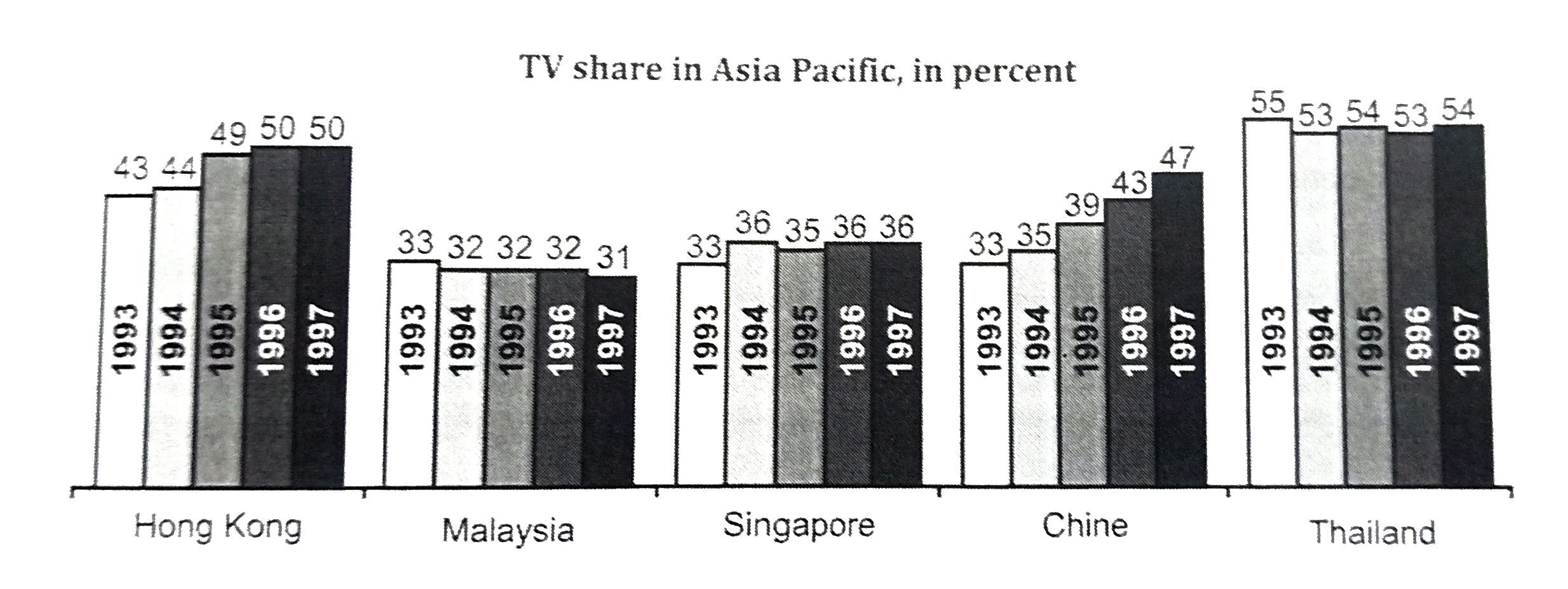
Assuming that the population of all the countries is the same and remains constant for the given years, which fo the following opitons in INCORRECT ?ANumber of TV sets in Hong Kong has increased by approximately 16.3% form 1993 to 1997.BNumber of TV sets in Singapore and China is the same for 1993CNumber of TV sets increasen by 12.5% for Singapore from 1993 to 1997.DNumber of TV sets for China increased by approximately 42.4% from 1993to 1997.
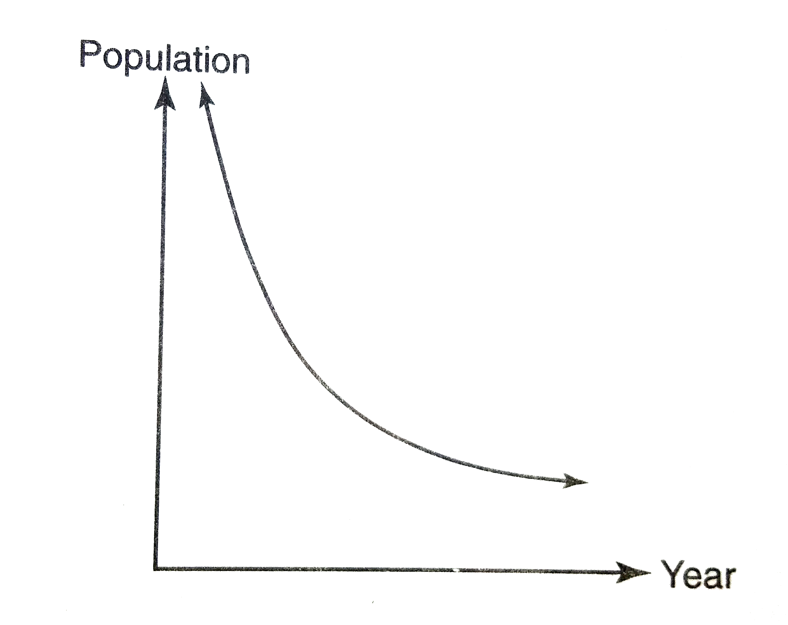
The graph above shows how the size of a country's population has changed over time. Which of the following are the most likely underlying reasons for the type of graph shown?View SolutionIn the 1990s, the park rangers at Yellowstone National park implemented a program aimed at increasing the dwindling coyote population in Montana. Results of studies of the coyote population in the park are shown in the scatterplot below.
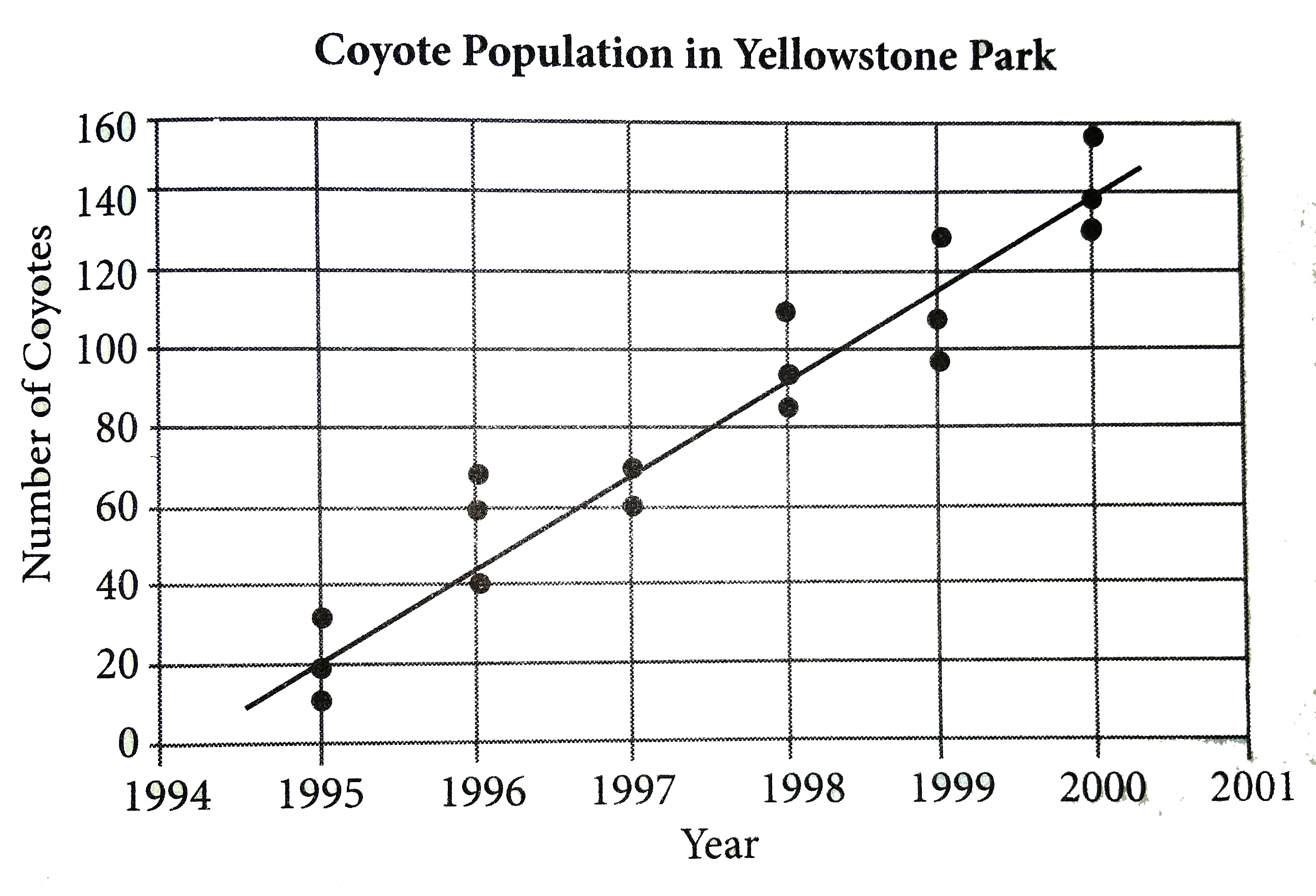
According to the data in the scatterplot, which of the following best represents the percent increase between the median of the results of the studies from 1995 and the median of the results of the studies from 1996?View Solution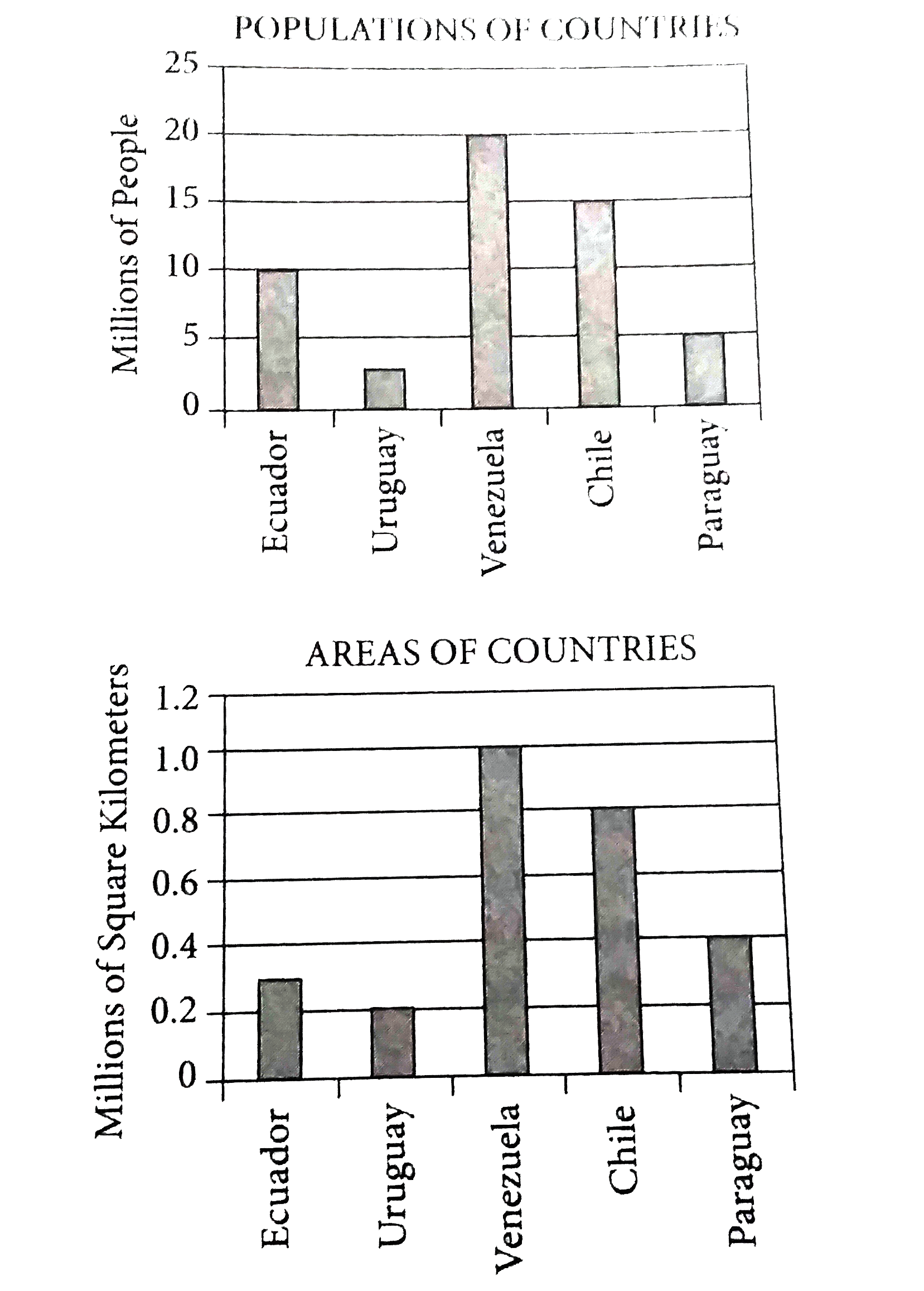
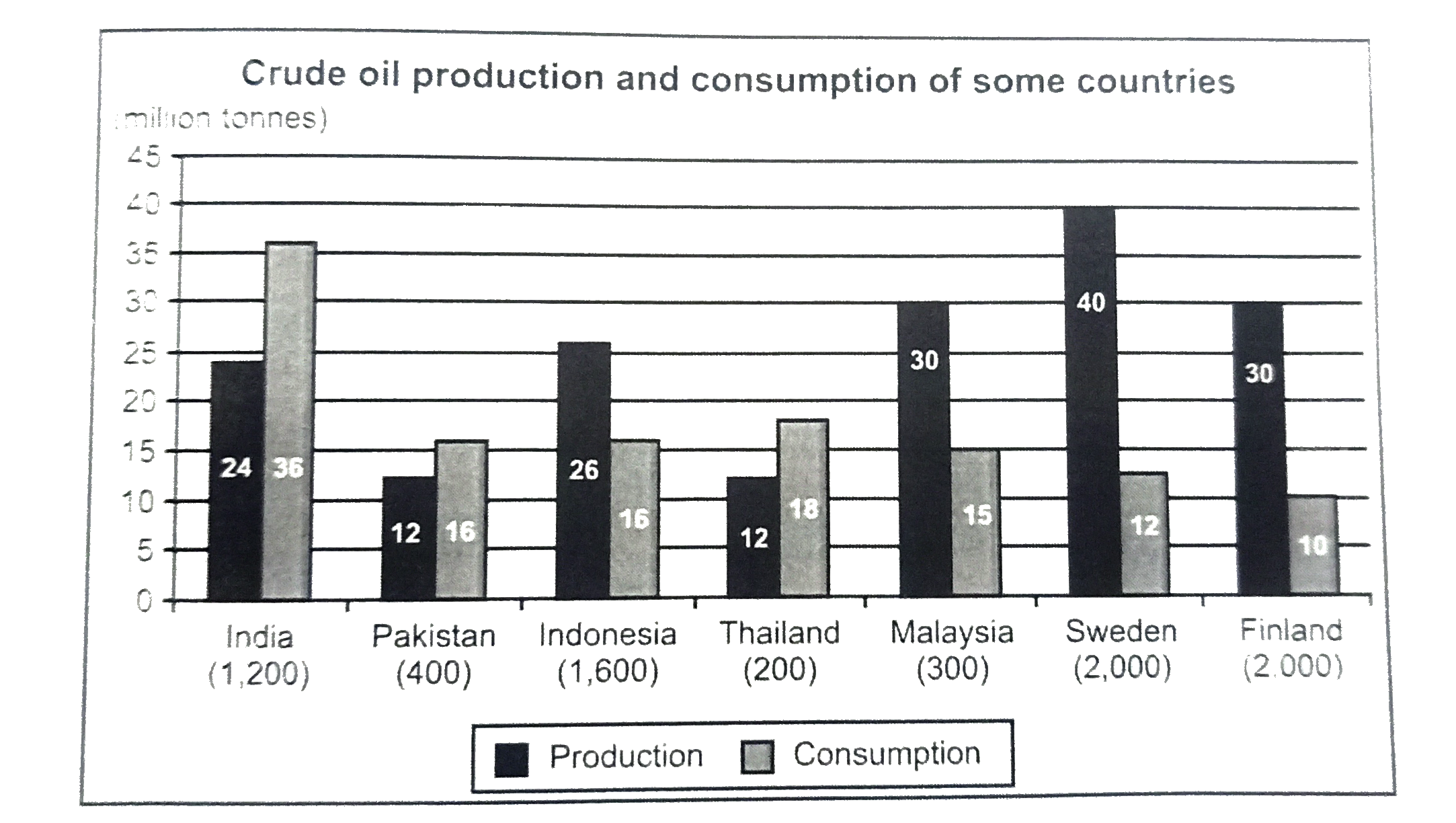
The populations and areas of five countries are shown in the graph above. If population density is defined as popa––tionarea, which of the five countries has the highest population density?View SolutionThe graph below gives the production and consumption of crude oil in certain countries of the world. Answer the following question based on the graph below.
Figures below the names of the coutries indincation crude reserves in million tonnes.
Shortfall / (excess) between production and consumption is met by imports / (exports).
Which country has the maximum percenatge difference between its production and consumption ?
 View Solution
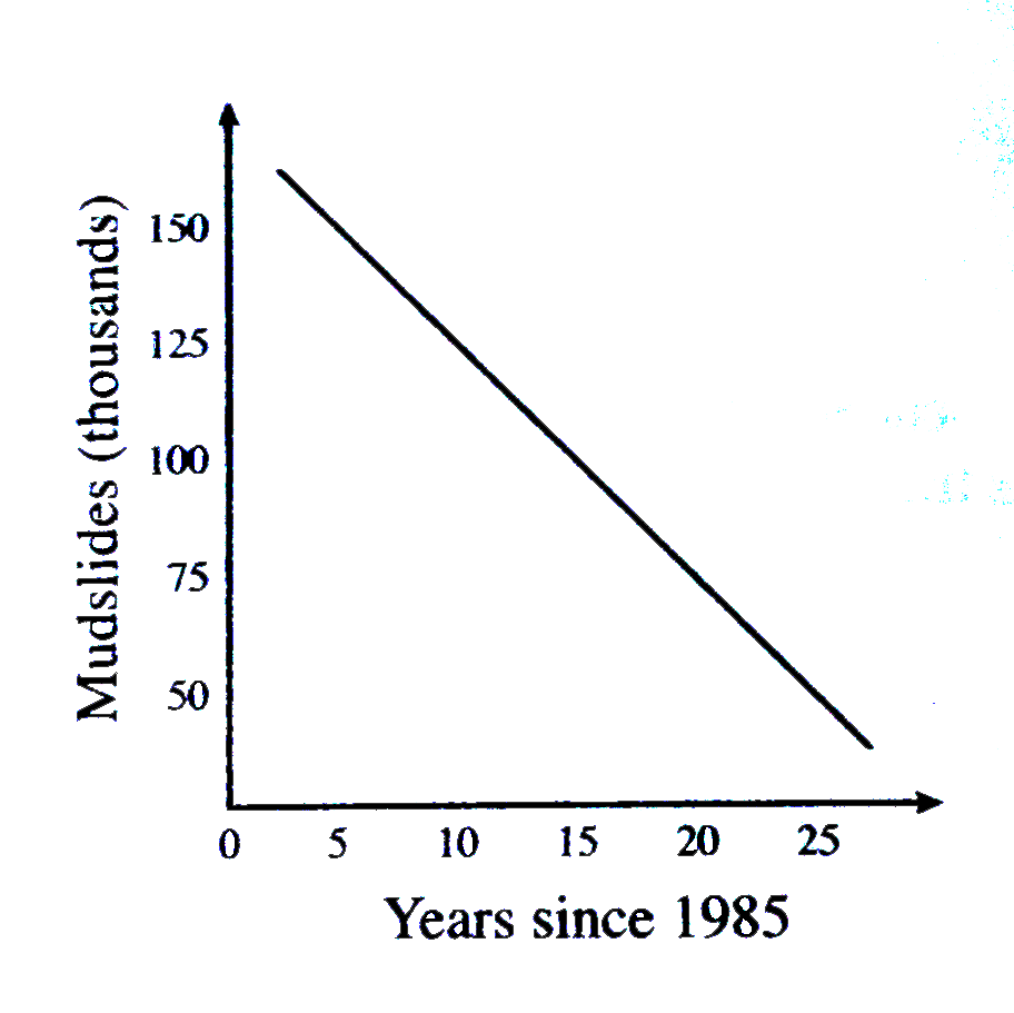
The number of mudslides in a certain country for the past 25 years is approximated by the graph shown above . The graph displays the number of mudslides (in thousands) from 1985 to 2010. Based on the graph , which of the following is closest to the average yearly decrease in the number of mudslides ?View Solution
