Reading the bar graph containing the average exports for a given period
To find the average export of pulses from the bar graph for the years 2001 to 2007, we can follow these steps:
1. Identify the Exports for Each Year:
- From the bar graph, we note the exports for each year:
- 2001: 5.2 crores
- 2002: 6.5 crores
- 2003: 7.8 crores
- 2004: 9.9 crores
- 2005: 10.8 crores
- 2006: 9.5 crores
- 2007: 11.4 crores
2. Sum the Exports:
- Add all the exports together:
5.2+6.5+7.8+9.9+10.8+9.5+11.4
- Calculating this gives:
5.2+6.5=11.7
11.7+7.8=19.5
19.5+9.9=29.4
29.4+10.8=40.2
40.2+9.5=49.7
49.7+11.4=61.1 crores
3. Count the Number of Years:
- The total number of years from 2001 to 2007 is 7.
4. Calculate the Average:
- Use the formula for average:
Average=Sum of exportsNumber of years=61.17
- Performing the division:
61.1÷7≈8.73 crores
5. Conclusion:
- The average export of pulses from 2001 to 2007 is approximately 8.73 crores.
- From the bar graph, we note the exports for each year:
- 2001: 5.2 crores
- 2002: 6.5 crores
- 2003: 7.8 crores
- 2004: 9.9 crores
- 2005: 10.8 crores
- 2006: 9.5 crores
- 2007: 11.4 crores
- Add all the exports together:
5.2+6.5+7.8+9.9+10.8+9.5+11.4
- Calculating this gives:
5.2+6.5=11.7
11.7+7.8=19.5
19.5+9.9=29.4
29.4+10.8=40.2
40.2+9.5=49.7
49.7+11.4=61.1 crores
- The total number of years from 2001 to 2007 is 7.
- Use the formula for average:
Average=Sum of exportsNumber of years=61.17
- Performing the division:
61.1÷7≈8.73 crores
- The average export of pulses from 2001 to 2007 is approximately 8.73 crores.
Similar Questions
Knowledge Check
Study the following graph carefully and answer given below ------
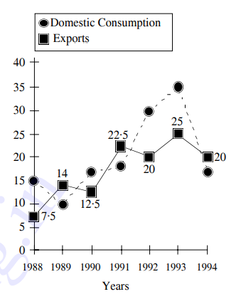
What was the difference between the average domestic consumption and the average exports of the given years ?A2000 tonnesB3000 tonnesC2500 tonnesDNone of theseStudy the following graph carefully and answer the questions given below it -----
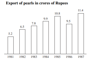
In how many years was the export above the average for the given period ?A2B3C4D5The Bar graph given below presents the production of wheat (in tonnes) by a big farm during the years 2011-2018. In how many of the given years was the production of wheat greater than the average production of the period?
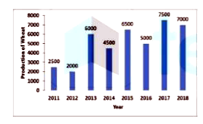 A4B3C2D5
Reading of line graphs containing the production and sales of a company in a period
View Solution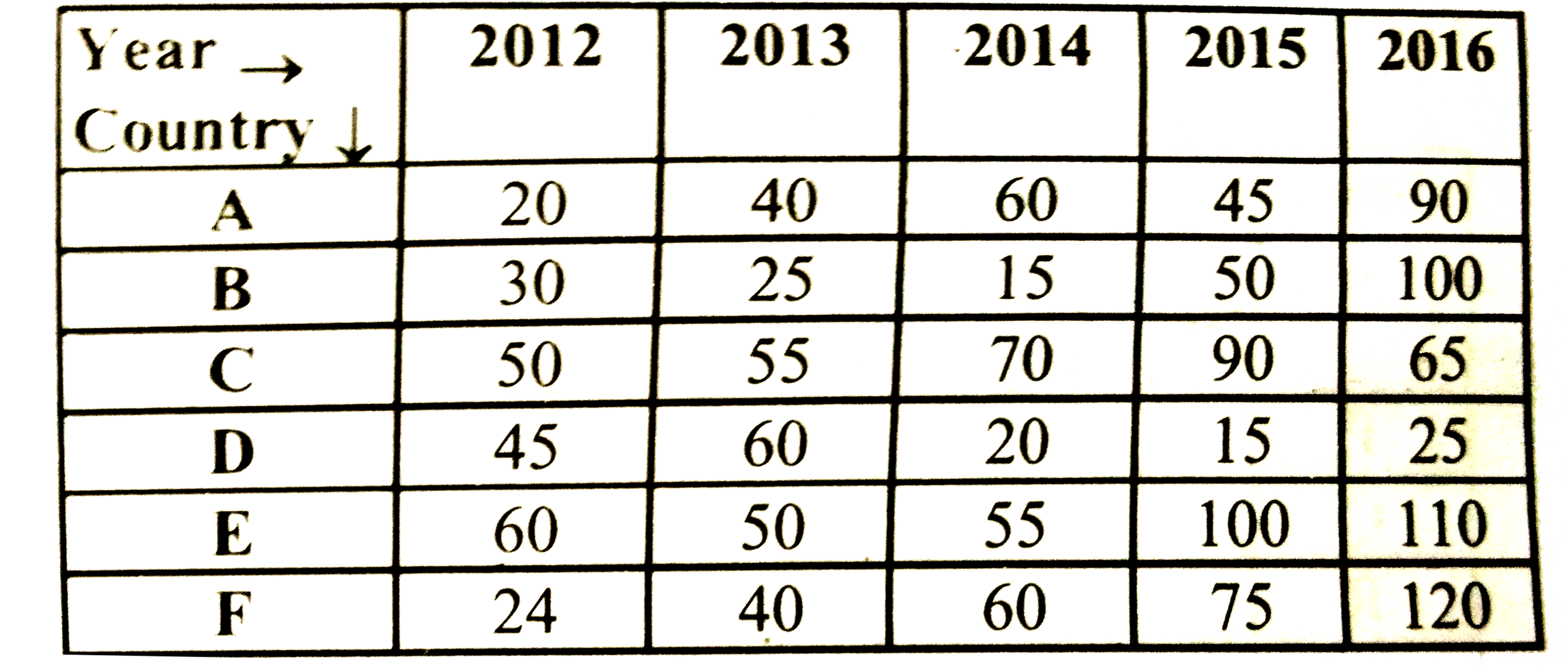
By what percent the average export of country E over all the given year more than the average export of country C over all the given years ?
View SolutionReading of line graphs containing the no of girls in a three different school in a given period
View SolutionDirections (Questions 24-28): Study the following graphs and answer the questions given below which are based on these graphs (FIGURE) Average annual exports during the given period for Company Y is approximately what percent of the average annual exports for Company Z ? (a) 87.12% (b) 89.64% (c) 91.21% (d) 93.33% (e) 95.15%
View SolutionStudy the graph and answer the question
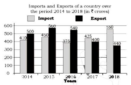
In how many years were the exports of the country more than the average imports during the given year
View Solution
