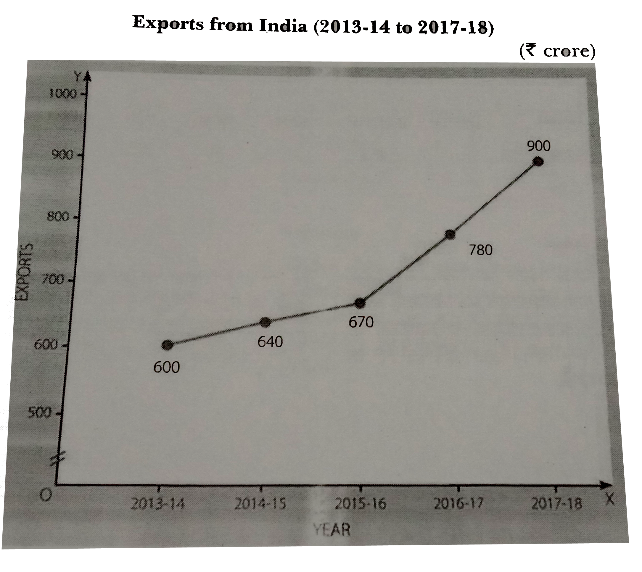
Following table gives hypothetical figures of exports from India during the years 2013-14 to 2017-18. Present the information in the form of a suitable graph.
Year2013−142014−152015−162016−172017−18Exports (Rs. core)600640670780900
Presentation of these data involves the contruction of a false line. Because: (i) difference between the minimum export value and zero is very large, and (ii) various values of exports show large difference. Data are presented in a graph with a false base line as under :

Topper's Solved these Questions
- BOOK - TARUN JAIN & VK OHRICHAPTER - ARITHMETIC LINE-GRAPHS OR TIME SERIES GRAPHSEXERCISE - A. Mupltiple Choice Questions6videos
ARITHMETIC LINE-GRAPHS OR TIME SERIES GRAPHS
- BOOK - TARUN JAIN & VK OHRICHAPTER - ARITHMETIC LINE-GRAPHS OR TIME SERIES GRAPHSEXERCISE - B. Fill in the blank4videos
ARITHMETIC LINE-GRAPHS OR TIME SERIES GRAPHS
- BOOK - TARUN JAIN & VK OHRICHAPTER - CENSUS AND SAMPLE METHODS OF COLLECTION OF DATAEXERCISE - NCERT Question9videos
CENSUS AND SAMPLE METHODS OF COLLECTION OF DATA
Similar Questions
Plot the annual profits of a firm on a time series graph:
Year201320142015201620172018Profit ('000 Rs.)607275658095View SolutionFollowing information relates to the exports form India to USSR and UK in the year 2015, 2016, 2017 and 2018 (hypothetical figures). Present it in the form of a table.
 View Solution
Knowledge Check
- Question 1 - Select One
The following table shows the pass percentage of results of four schools in the past four year .

In which academic year did all the schools have pass percentage as more than 80?
A)2012-13
B)2014-15
C)2015-16
D) 2013-14A2012-13B2014-15C2015-16D2013-14 - Question 2 - Select One
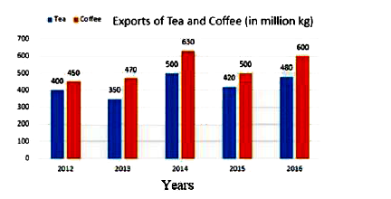
The given Bar graph presents the Export of Tea and Coffe ( in million kg ) for the years 2012 to 2016.

What is thr ratio of total export of tea in 2012 , 2014 and 2015 to the total export of coffee in 2013 and 2014 ?A6:5B10:9C9:10D5:6
Represent the following data (hypothetical data) graphically:
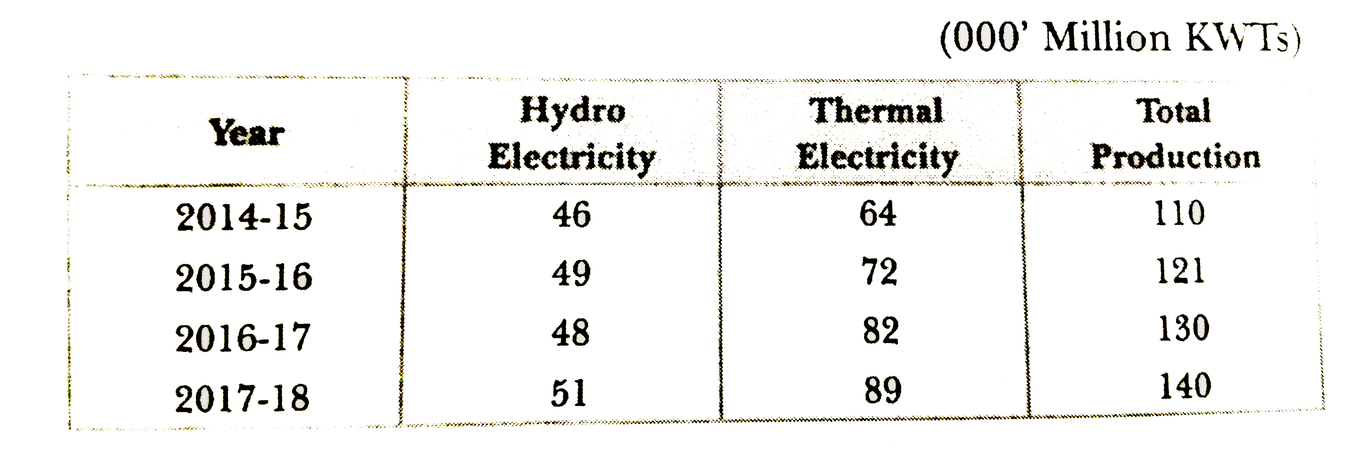
Year2012201320142015201620172018Production of Wheat (in million tonnes)581316201722View SolutionThe following table shows Production of Electricity from different Sources in India during 2014-15 to 2017-18 (hypothetical data).
Present the data in a sub-divided bar diagram.
 View Solution
Taking 2004 as base year, construct the index numbers of the year 2014 and 2018.
Year200420142015201620172018Prices (Rs.) 10 14 16 20 22 24View SolutionRepresent the following data related to export and imports to India (hypothetical figures) graphically:
Year2012201320142015201620172018Exports (in Rs. crore)300350400380450280250Imports (in Rs. crore)420460600480550450400View SolutionRepresent the following data related to population (in thousands) of men and women in a village in different years graphically:
Year2012201320142015201620172018Number of Men10131514171821Number of Women12181617202224View SolutionPlot the following hypothetical figures on time series graphs:
YearImports(Rs. thousand crore)Exports (Rs. thousand crore)2013−14 123 1062014−15 178 1402015−16 215 1592016−17 231 2032017−18 245 209View Solution

