The number of Mathematics books sold by a shopkeeper on six consecutive days is shown below Draw a bar graph to represent the above information choosing the scale of your choice.
To draw a bar graph representing the number of Mathematics books sold by a shopkeeper over six consecutive days, follow these step-by-step instructions:
Step 1: Gather the Data
First, we need the data for the number of Mathematics books sold on each day. Let's assume the data is as follows:
- Sunday: 65 books
- Monday: 40 books
- Tuesday: 30 books
- Wednesday: 50 books
- Thursday: 20 books
- Friday: 70 books
Step 2: Determine the Scale
Next, we need to determine the scale for our graph. The minimum number of books sold is 20 and the maximum is 70. We can choose a scale that makes it easy to read the graph. For this example, we will use a scale of 5 books per unit on the y-axis.
Step 3: Draw the Axes
Now, we will draw the axes for our bar graph:
- Draw a vertical line (y-axis) for the number of books sold.
- Draw a horizontal line (x-axis) for the days of the week.
- Label the y-axis with numbers from 0 to 70, marking every 5 units (0, 5, 10, 15, ..., 70).
- Label the x-axis with the days of the week: Sunday, Monday, Tuesday, Wednesday, Thursday, and Friday.
Step 4: Plot the Bars
Now, we will plot the bars for each day based on the number of books sold:
- For Sunday (65 books), draw a bar that reaches up to the 65 mark on the y-axis.
- For Monday (40 books), draw a bar that reaches up to the 40 mark on the y-axis.
- For Tuesday (30 books), draw a bar that reaches up to the 30 mark on the y-axis.
- For Wednesday (50 books), draw a bar that reaches up to the 50 mark on the y-axis.
- For Thursday (20 books), draw a bar that reaches up to the 20 mark on the y-axis.
- For Friday (70 books), draw a bar that reaches up to the 70 mark on the y-axis.
Step 5: Label the Bars
Finally, label each bar with the corresponding number of books sold to make the graph easier to read.
Step 6: Review the Graph
Check your graph to ensure that all bars are correctly drawn and labeled according to the data provided.
First, we need the data for the number of Mathematics books sold on each day. Let's assume the data is as follows:
- Sunday: 65 books
- Monday: 40 books
- Tuesday: 30 books
- Wednesday: 50 books
- Thursday: 20 books
- Friday: 70 books
Next, we need to determine the scale for our graph. The minimum number of books sold is 20 and the maximum is 70. We can choose a scale that makes it easy to read the graph. For this example, we will use a scale of 5 books per unit on the y-axis.
Now, we will draw the axes for our bar graph:
- Draw a vertical line (y-axis) for the number of books sold.
- Draw a horizontal line (x-axis) for the days of the week.
- Label the y-axis with numbers from 0 to 70, marking every 5 units (0, 5, 10, 15, ..., 70).
- Label the x-axis with the days of the week: Sunday, Monday, Tuesday, Wednesday, Thursday, and Friday.
Now, we will plot the bars for each day based on the number of books sold:
- For Sunday (65 books), draw a bar that reaches up to the 65 mark on the y-axis.
- For Monday (40 books), draw a bar that reaches up to the 40 mark on the y-axis.
- For Tuesday (30 books), draw a bar that reaches up to the 30 mark on the y-axis.
- For Wednesday (50 books), draw a bar that reaches up to the 50 mark on the y-axis.
- For Thursday (20 books), draw a bar that reaches up to the 20 mark on the y-axis.
- For Friday (70 books), draw a bar that reaches up to the 70 mark on the y-axis.
Finally, label each bar with the corresponding number of books sold to make the graph easier to read.
Check your graph to ensure that all bars are correctly drawn and labeled according to the data provided.
Topper's Solved these Questions
- DATA HANDLINGBOOK - NCERT ENGLISHCHAPTER - DATA HANDLINGEXERCISE - EXERCISE 9.1
7 Videos
- DATA HANDLINGBOOK - NCERT ENGLISHCHAPTER - DATA HANDLINGEXERCISE - EXERCISE 9.3
3 Videos
- BASIC GEOMETRICAL IDEASBOOK - NCERT ENGLISHCHAPTER - BASIC GEOMETRICAL IDEASEXERCISE - EXERCISE 4.6
4 Videos
- DECIMALSBOOK - NCERT ENGLISHCHAPTER - DECIMALSEXERCISE - EXERCISE 8.3
2 Videos
Similar Questions
Number of persons in various age groups in a town is given in the following tableDraw a bar graph to represent the above information and answer the following questions. (take 1 unit length = 20 thousands)(a) Which two age groups have same population?(b) All persons in the age group of 60 and above are called senior citizens. How many senior citizens are there in the town?
View SolutionGiven below is the data of school going students (boys and girls):

Draw the bar graph to represent the above data.
View Solution
Knowledge Check
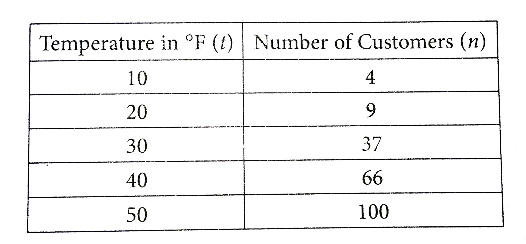
A coffee shop noticed that the outside temperature affected the number of customers who came to the shop that day, as shown in the table above. Which of the following graphs best represents the relationship between the outside temperature t, and the number of customers,n, as indicated by the table?A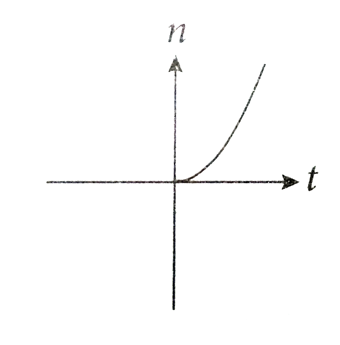 B
B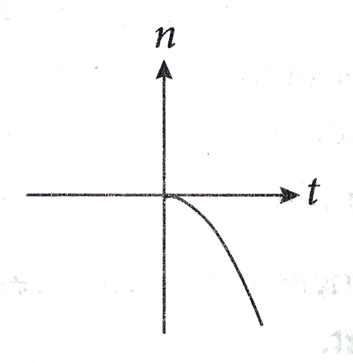 C
C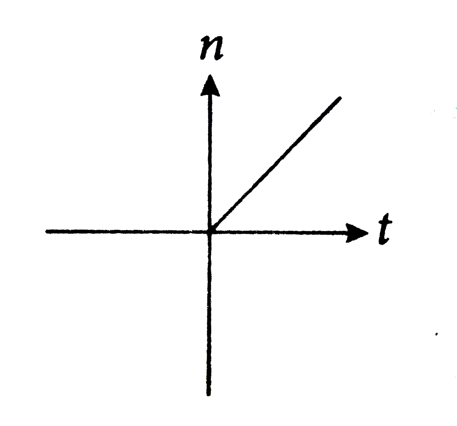 D
D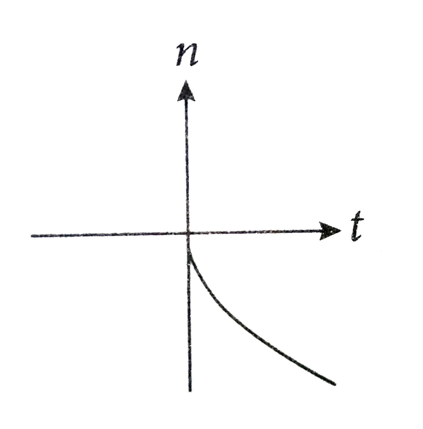
The expenditure of a family of different heads in a month is given below

Draw a bar graph to represent the data above.
View SolutionThe production of saleable steel in some of the steel plants of our country during 1999 is given below: Plant, Bhilai, Durgapur, Rourkela, Bokaro Production (In thousand tonnes), 160, 80, 200, 150 Construct a bar graph to represent the above data on a graph paper by using the scale 1 big divisions = 20 thousand tonnes.
View SolutionManoj appeared for ICSE examination 2018 and secured percentage of marks as shown in the following table :

Represent the above data by drawing a suitable bar graph.
View SolutionThe table given below shows the number of visitors (in hundreds) to a certain exhibition over a period of two weeks:

Calculate 6-day moving averages and illustrate these and original information on the same graph using the some scales.
View SolutionThe marks obtained by 120 students in a Mathematics test are given below:

Using the informations, given above, draw an ogive on a graph sheet. Take a suitable scale for your ogive. Use the ogive drawn to estimate :
(i) the median.
(ii) the number of students who obtained more than 75% marks in the test.
(iii) the number of students who did not pass in the test if the pass percentage was 40.
View SolutionFollowing table represents the lengths of six different ribbons.

f the given data has to be represented as a bar graph, then select the most appropriate scale from the given options that can be used to draw the bar graph.
1 unit = 5 cm
View SolutionFollowing table represents the lengths of six different ribbons.

f the given data has to be represented as a bar graph, then select the most appropriate scale from the given options that can be used to draw the bar graph.
1 unit = 1 cm
View Solution
