The pie chart given below represents the sales of mobile phones of the leading companies of the world in India. Summarise and analyse the chart in your own language in about 150-200 words. Give all necessary details and compare the segments where relevant.
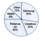
The given pie graph above illustrates the percentages of the sales of mobile phones of the leading companies of the world in India. The overall trend shows that domination of Samsung is still intact. Thirty five percent of mobile users in India use the established brand, Samsung. Reliance.s Jio is a strong contender and challenger in this race. It has grabbed 30 percent of the market. Another leading and popular brand, Vodafone hold 20 percent share of the market. Nokia which used to be an old favourite, is losing ground to all other popular brands. Its market share has been reduced to a marginal 5 percent. Other brands hold the remaining 10 percent of the market share. The emergence of Jio as a popular local brand has posed a big challenge to the foreign brands, including the leader, Samsung. Nokia has been marginalised and it holds just one seventh of the market share of the leader Samsung.
Topper's Solved these Questions
- COMPOSITION - II (WRITING ANALYTICAL PARAGRAPH ON MAP/CHART/REPORT/ LINE GRAPH)BOOK - FULL MARKSCHAPTER - COMPOSITION - II (WRITING ANALYTICAL PARAGRAPH ON MAP/CHART/REPORT/ LINE GRAPH)EXERCISE - NUMERICAL TABLES
5 Videos
- COMPOSITION - II (WRITING ANALYTICAL PARAGRAPH ON MAP/CHART/REPORT/ LINE GRAPH)BOOK - FULL MARKSCHAPTER - COMPOSITION - II (WRITING ANALYTICAL PARAGRAPH ON MAP/CHART/REPORT/ LINE GRAPH)EXERCISE - ANALYTIC STUDY OF REPORTS
3 Videos
- COMPOSITION - II (WRITING ANALYTICAL PARAGRAPH ON MAP/CHART/REPORT/ LINE GRAPH)BOOK - FULL MARKSCHAPTER - COMPOSITION - II (WRITING ANALYTICAL PARAGRAPH ON MAP/CHART/REPORT/ LINE GRAPH)EXERCISE - MAKING A BAR GRAPH/CHART
6 Videos
- CLOZE PASSAGEBOOK - FULL MARKSCHAPTER - CLOZE PASSAGEEXERCISE - Fill in the most appropriate option in each blank from those given below to complete the following passage.
112 Videos
- COMPOSITION-IBOOK - FULL MARKSCHAPTER - COMPOSITION-IEXERCISE - IV. OFFICIAL LETTERS ON ALL SITUATIONS (SOLVED EXAMPLES)
29 Videos
Similar Questions
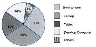
The pie-chart given below illustrates how internet users of aged 17+ prefer to browse the web. Summarise by writing an analytic paragraph in 150-200 words given necessary details and the general trend. Compare where relevant.
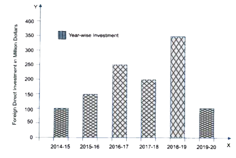
View SolutionThe bar chart given below illustrates the total Foreign Direct Investment (FDI) into India from all over the world. Summarise and write an analytic paragraph selecting the main features and giving all the necessary details. Compare where you find it relevant.
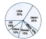
View SolutionThe following pie chart shows the foreign Direct Investment in India during 2019-2020. Write an analytic paragraph showing the general trends and the necessary details. Compare the segments where relevant.
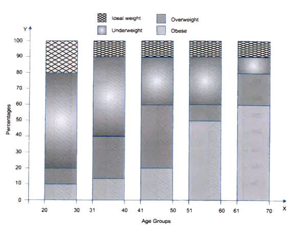
View SolutionThe chart given below illustrates the weight measurements of people in the United States of America in 2020. Summarise the information in an analytic paragraph of 150-200 words by selecting and reporting the main features. Make comparisons where relevant.
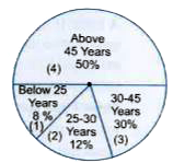
View SolutionThe following pie chart represents the distribution of the overseas tourists and their age profile respectively. Study the chart carefully and write an analytic paragraph (150- 200 words) giving the general trends and other necessary details. Don' forget to compare the segments where relevant.
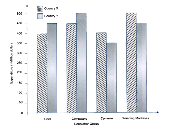
View SolutionThe chart below shows the expenditure of two countries X and Y on consumer goods in 2020 in US million dollars.
Summarise and write an analytic paragraph highlighting main features and necessary details in 150-200 words. Compare where relevant.
View SolutionThe Bar graph given above illustrates the popular games and sports that are played in India and Pakistan. Summarise by writing an analytic paragraph (150-200 words) selecting the main features and details. Compare wherever relevant.
View SolutionThe given report presented by Times News Network illustrates the average salaries of India Inc. to its employees for 2020. Summarise by writing an analytic paragraph (150-200 words) highlighting the main features and details. Compare wherever relevant.

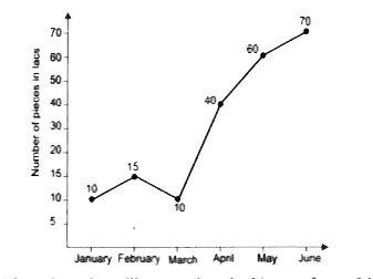
View SolutionThe line-graph chart given below breaks down the sales history of the famous Lifebuoy brand in soap in the first six months of the year, from January to June. Write an analytic paragraph in 150–200 words after selecting and reporting the main features. Make comparions where necessary.
View SolutionGiven above is the bar graph that represents the Total Sales Turnover of four major corporate giants of India. The figures shown record the total sales turnover in 3rd Quarter (September to December) and 4th Quarter (January to March). Summarise and write an analytic paragraph highlighting the general features and necessary details. Compare where you feel relevant.
View Solution
