The line-graph chart given below breaks down the sales history of the famous Lifebuoy brand in soap in the first six months of the year, from January to June. Write an analytic paragraph in 150–200 words after selecting and reporting the main features. Make comparions where necessary.
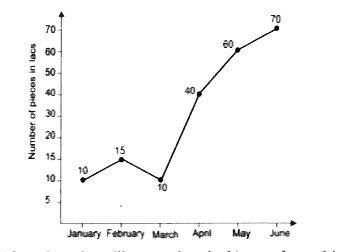
The line-graph/chart given above illustrates the sales history of one of the most popular and prestigious Lifebuoy brands of soap in the first six months of the year. The general trend that emerges out is quite simple. The first three months of winter exhibit rather a subdued sale. On the other hand, the months of summer show quite a brisk sale. The month of January, the coldest mouth of the year in India. So, the number of bathers is significantly reduced. With the reduced number of bathers, the use of soap is also reduced proportionally. Hence, the sale of Lifebuoy. brand of soap is at its lowest, only 10 lac pieces in January. Things improve and the numbers show a considerable rise of 50 per cent in February. Then again a slump is seen and the sales in March slip back to the numbers in January. The severity of winter is almost over in April. Frequent bathing leads to a dramatic rise in the sale of Lifebuoy.. This demand goes on rising. 40 lac pieces of Lifebuoy were sold in April. The number rose steadily to 60 lac in May and the sales reached at its peak in the hottest month of the year, June. The sales in June touched the unprecedented figures of 70 lacs. It will not be out of place to conclude that sales of soap depends up to a considerable extent on the weather. The summer months exhibit greater demand and brisker sales numbers.
Topper's Solved these Questions
- COMPOSITION - II (WRITING ANALYTICAL PARAGRAPH ON MAP/CHART/REPORT/ LINE GRAPH)BOOK - FULL MARKSCHAPTER - COMPOSITION - II (WRITING ANALYTICAL PARAGRAPH ON MAP/CHART/REPORT/ LINE GRAPH)EXERCISE - MAKING A BAR GRAPH/CHART
6 Videos
- COMPOSITION - II (WRITING ANALYTICAL PARAGRAPH ON MAP/CHART/REPORT/ LINE GRAPH)BOOK - FULL MARKSCHAPTER - COMPOSITION - II (WRITING ANALYTICAL PARAGRAPH ON MAP/CHART/REPORT/ LINE GRAPH)EXERCISE - PIE CHARTS
4 Videos
- CLOZE PASSAGEBOOK - FULL MARKSCHAPTER - CLOZE PASSAGEEXERCISE - Fill in the most appropriate option in each blank from those given below to complete the following passage.
112 Videos
- COMPOSITION-IBOOK - FULL MARKSCHAPTER - COMPOSITION-IEXERCISE - IV. OFFICIAL LETTERS ON ALL SITUATIONS (SOLVED EXAMPLES)
29 Videos
Similar Questions
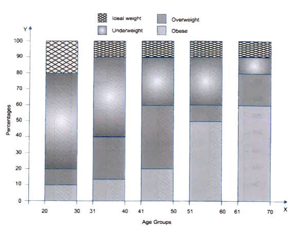
The chart given below illustrates the weight measurements of people in the United States of America in 2020. Summarise the information in an analytic paragraph of 150-200 words by selecting and reporting the main features. Make comparisons where relevant.
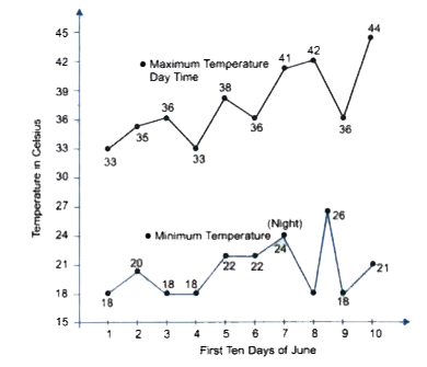
View SolutionThe line graph given above illustrates the maximum and minimum temperatures in the first ten days of June. Summarise the information by selecting and reporting the main features. Make comparisons where necessary.
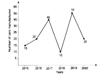
View SolutionThe line graph given below breaks down the number of cars produced in Standard Automobile Company from 2015 to 2020. Summarise the information by selecting and reporting the main features. Make comparisons where necessary.
View SolutionThe Bar graph given above illustrates the popular games and sports that are played in India and Pakistan. Summarise by writing an analytic paragraph (150-200 words) selecting the main features and details. Compare wherever relevant.
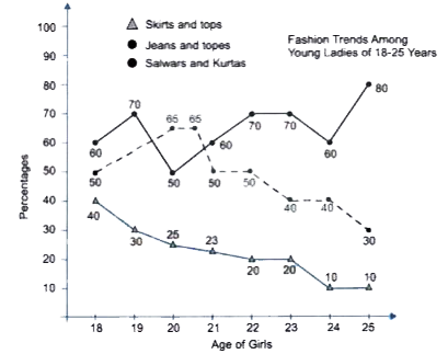
View SolutionThe line graph shown below illustrates the main trends in garments of young ladies of 18 to 25 years. Summarise and write an analytic paragraph in your own words highlighting the main features and details. Compare wherever relevant.
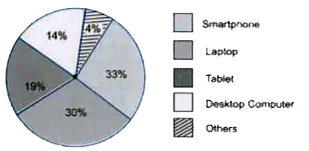
View SolutionThe pie-chart given below illustrates how internet users of aged 17+ prefer to browse the web. Summarise by writing an analytic paragraph in 150-200 words given necessary details and the general trend. Compare where relevant.
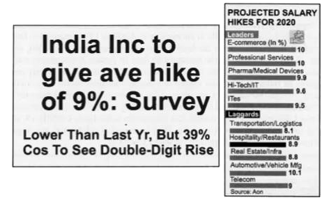
View SolutionThe given report presented by Times News Network illustrates the average salaries of India Inc. to its employees for 2020. Summarise by writing an analytic paragraph (150-200 words) highlighting the main features and details. Compare wherever relevant.
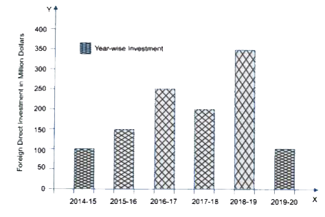
View SolutionThe bar chart given below illustrates the total Foreign Direct Investment (FDI) into India from all over the world. Summarise and write an analytic paragraph selecting the main features and giving all the necessary details. Compare where you find it relevant.
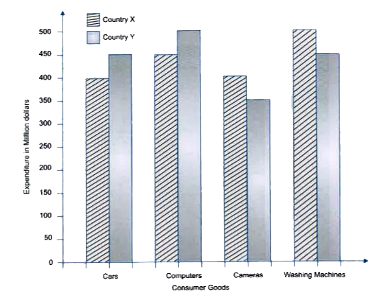
View SolutionThe chart below shows the expenditure of two countries X and Y on consumer goods in 2020 in US million dollars.
Summarise and write an analytic paragraph highlighting main features and necessary details in 150-200 words. Compare where relevant.
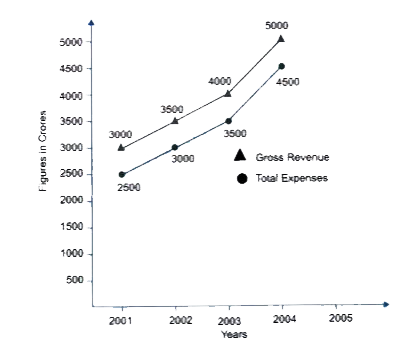
View SolutionThe Line graph given below represents Railway Finance from 2001-2002 to 2004-2005 (Northern Zone). It breaks down the gross revenue collected as well as the total expenses incurred during these years. Summarise and write an analytic paragraph highlighting the general trend and necessary details. Compare wherever relevant.
View Solution
