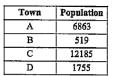
The populations of four towns A, B, C and D as on 2001 are as follows:

What is the most appropriate diagram to present the above data?
Pie diagram
Bar chart
Cubic chart
Histogram
The correct Answer is:B
Bar chart is most appropriate.
Topper's Solved these Questions
- SETS, RELATIONS, FUNCTIONS AND NUMBER SYSTEM BOOK - NDA PREVIOUS YEARSCHAPTER - SETS, RELATIONS, FUNCTIONS AND NUMBER SYSTEM EXERCISE - MCQ
271 Videos
- TRIGONOMETRY - RATIO & IDENTITY , TRIGONOMETRIC EQUATIONSBOOK - NDA PREVIOUS YEARSCHAPTER - TRIGONOMETRY - RATIO & IDENTITY , TRIGONOMETRIC EQUATIONSEXERCISE - MCQ
238 Videos
Similar Questions
Knowledge Check
The populations of four towns A, B, C and D as on 2001 are as follows:

What is the most appropriate diagram to present the above data?Apie chartBBar chartCHistogramDLine graphThe population of four towns A,B,C and D as on 2011 are as follows:what is the most appropriate diagram to present the above data?
 APie chartBBar chartCHistogramDLine graph
The present population of a town is 26010. It increases annually at the rate of 2%. What was the population of town 2 years ago ?
A25000B25100C25200D25500
The data for the reaction A+B→C is

The rate law corresponds to the above data is
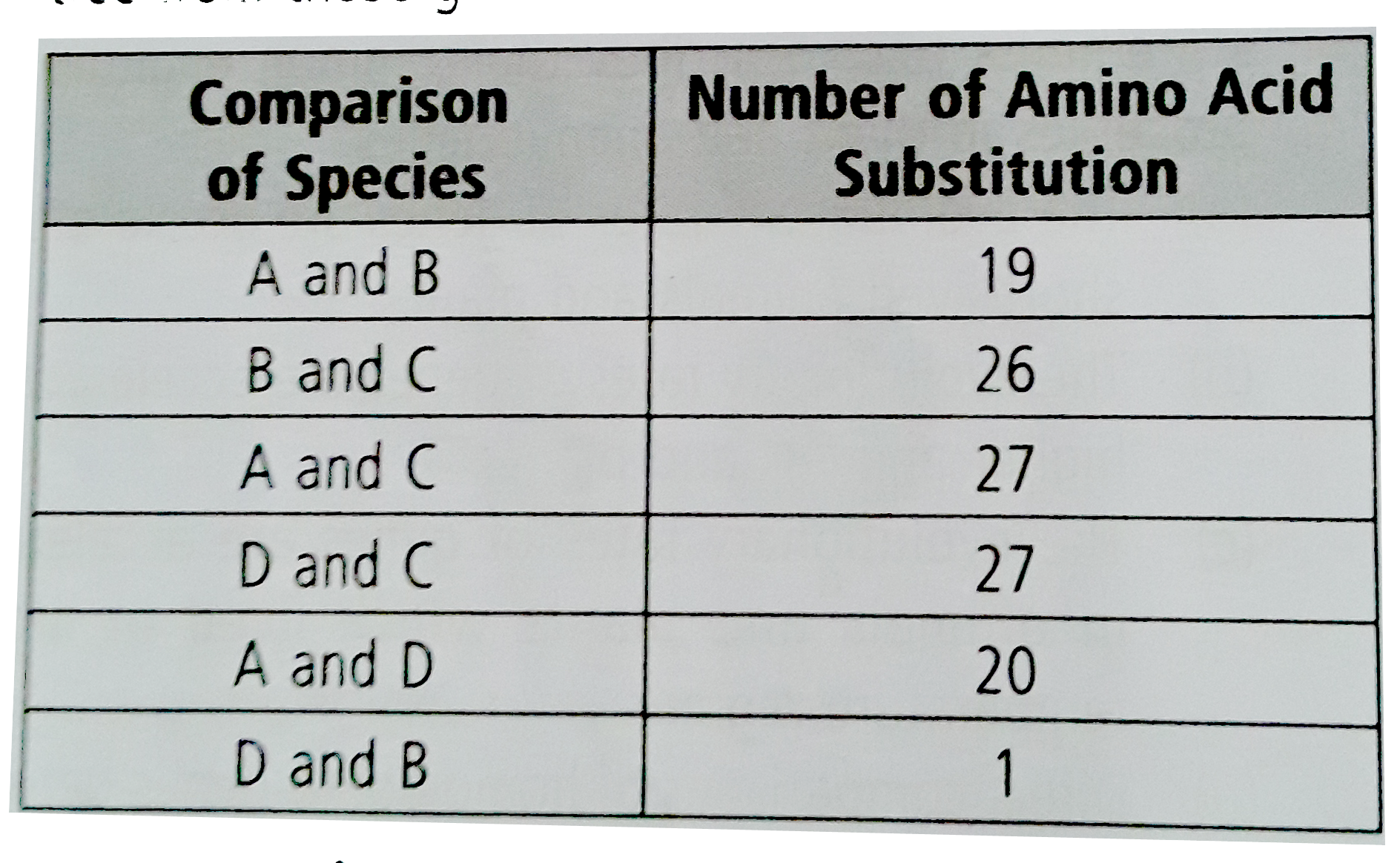
View SolutionFollowing table shows data on amino acid substitution in the α chain of haemoglobin in four different mammalian species A,B,C and D on the basis of the data shown in the table. Choose the most appropriate evolutionary tree from those given below.

View SolutionRead the information given below and answer the questions that follow:
A, B, C, D and E are five towns out of which two are hill stations and the rest are in plains. Two towns, which are in plain, are harbours. Four towns out of five are capitals and two are industrial towns. Population of two towns is less than 5 lacs. It is 20 lacs of one town and more than 50 lacs of two towns. Two towns are on the same latitudes and other two are on the same longitudes. Latitudes and longitudes of both harbours are different and out of these one is an industrial town. The population of both industrial towns is more than 50 lacs. The longitudes of one hill station and one of the industrial towns are same. The latitudes and longitudes of the other hill station and other harbour are different. One industrial town is neither a hill station nor a harbour. None of the hill stations is an industrial town. The hill station, of which longitudes are same as that of a harbour, is a capital. B is a hill station while the longitudes of A and E are same. E is a harbour. The latitudes of D and C are same and the population of Dis 20 lacs. Both the harbours are capitals and one of them is an industrial town.
Which of the following two towns are those whose population is less than 5 lacs ?
View SolutionRead the information given below and answer the questions that follow:
A, B, C, D and E are five towns out of which two are hill stations and the rest are in plains. Two towns, which are in plain, are harbours. Four towns out of five are capitals and two are industrial towns. Population of two towns is less than 5 lacs. It is 20 lacs of one town and more than 50 lacs of two towns. Two towns are on the same latitudes and other two are on the same longitudes. Latitudes and longitudes of both harbours are different and out of these one is an industrial town. The population of both industrial towns is more than 50 lacs. The longitudes of one hill station and one of the industrial towns are same. The latitudes and longitudes of the other hill station and other harbour are different. One industrial town is neither a hill station nor a harbour. None of the hill stations is an industrial town. The hill station, of which longitudes are same as that of a harbour, is a capital. B is a hill station while the longitudes of A and E are same. E is a harbour. The latitudes of D and C are same and the population of Dis 20 lacs. Both the harbours are capitals and one of them is an industrial town.
Which of the following towns have population more than 50 lacs ?
View SolutionThe present population of a town is 26010. It increases annually at the rate of 2%. What was the population of town two years ago ?
View Solution


