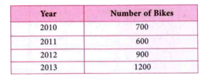
Prepare a bar graph of the data given in question 28.
To prepare a bar graph based on the data provided, follow these steps:
Step 1: Gather the Data
First, we need to collect the data that we will represent in the bar graph. The data includes the names of the crops and the corresponding area of land in million hectares.
- Rice: 50 million hectares
- Wheat: 30 million hectares
- Pulses: 20 million hectares
- Sugarcane: 25 million hectares
- Cotton: 15 million hectares
Step 2: Set Up the Axes
Draw two perpendicular lines to create the axes of the graph.
- The horizontal line (x-axis) will represent the different crops.
- The vertical line (y-axis) will represent the area of land in million hectares.
Step 3: Label the Axes
Label the x-axis with the names of the crops:
- R (Rice)
- W (Wheat)
- P (Pulses)
- S (Sugarcane)
- C (Cotton)
Label the y-axis with appropriate intervals. For this data, we can use intervals of 10 million hectares, going from 0 to 50.
Step 4: Mark the Scale on the Y-Axis
On the y-axis, mark the following values:
- 0
- 10
- 20
- 30
- 40
- 50
Step 5: Draw the Bars
Now, we will draw bars for each crop based on the area of land:
- Rice: Draw a bar that reaches up to 50 on the y-axis.
- Wheat: Draw a bar that reaches up to 30 on the y-axis.
- Pulses: Draw a bar that reaches up to 20 on the y-axis.
- Sugarcane: Draw a bar that reaches up to 25 on the y-axis.
- Cotton: Draw a bar that reaches up to 15 on the y-axis.
Step 6: Color the Bars (Optional)
You can color each bar differently to make the graph more visually appealing.
Step 7: Title the Graph
Finally, give your bar graph a title, such as "Area of Land for Different Crops".
Summary of the Bar Graph
- The height of each bar corresponds to the area of land used for each crop.
- The x-axis represents the crops, while the y-axis represents the area in million hectares.
---
First, we need to collect the data that we will represent in the bar graph. The data includes the names of the crops and the corresponding area of land in million hectares.
- Wheat: 30 million hectares
- Pulses: 20 million hectares
- Sugarcane: 25 million hectares
- Cotton: 15 million hectares
Draw two perpendicular lines to create the axes of the graph.
- The vertical line (y-axis) will represent the area of land in million hectares.
Label the x-axis with the names of the crops:
- R (Rice)
- W (Wheat)
- P (Pulses)
- S (Sugarcane)
- C (Cotton)
On the y-axis, mark the following values:
- 0
- 10
- 20
- 30
- 40
- 50
Now, we will draw bars for each crop based on the area of land:
- Wheat: Draw a bar that reaches up to 30 on the y-axis.
- Pulses: Draw a bar that reaches up to 20 on the y-axis.
- Sugarcane: Draw a bar that reaches up to 25 on the y-axis.
- Cotton: Draw a bar that reaches up to 15 on the y-axis.
You can color each bar differently to make the graph more visually appealing.
Finally, give your bar graph a title, such as "Area of Land for Different Crops".
- The height of each bar corresponds to the area of land used for each crop.
- The x-axis represents the crops, while the y-axis represents the area in million hectares.
Topper's Solved these Questions
Similar Questions
Knowledge Check
Question Stimulus :-
A .....is a bar graph that shows data in intervals.AHistogramBBar graphCLine graphDLinear graph
The following data shows the number of students born in different months of a particular year of class VI. Make the bar graph based on the given information.

View SolutionRead the bar graph and answer the following questons.
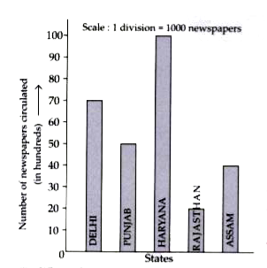
What information is given by graph ?
View SolutionNumber of wrist watches manufactured by a factory in six days of a particular week is given below.
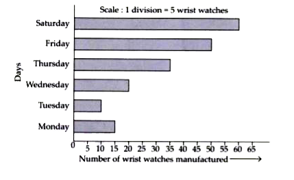
Read the bar graph and answer the following questions.
What information does the bar graph gives ?
View SolutionThe bar graph given below represents the circulation of newspapers in different languages in a town. Study the bar graph and answer the following questions:
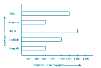
What is the circulation of English newspaper?
View SolutionThe bar graph given below represents the circulation of newspapers in different languages in a town. Study the bar graph and answer the following questions:
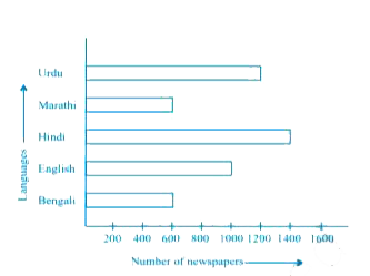
Name the two languages in which circulation of newspaper is the same.
View SolutionThe bar graph given below represents approximate length (in kilometres) of some National Highways in India. Study the bar graph and answer the following questions:
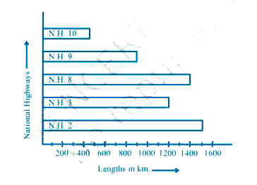
Which National Highway is the shortest among the above?
View SolutionThe bar graph given below represents approximate length (in kilometres) of some National Highways in India. Study the bar graph and answer the following questions:

What is the length of National Highway 9?
View Solution


