Given here is a pie chart showing the cost of gold in 2010, 2011, 2012 and 2013. Study the chart and answer the following questions.
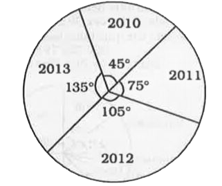
If the price of gold in 2013 is Rs. 31,500 per 10 gram, then the price of gold in 2011 per 10 gram is
Rs. 17000
Rs. 17500
Rs. 18000
Rs. 18500
The correct Answer is:B
Step by step video, text & image solution for Given here is a pie chart showing the cost of gold in 2010, 2011, 2012 and 2013. Study the chart and answer the following questions. If the price of gold in 2013 is Rs. 31,500 per 10 gram, then the price of gold in 2011 per 10 gram is by Maths experts to help you in doubts & scoring excellent marks in Class 14 exams.
Topper's Solved these Questions
- BOOK - KIRAN PUBLICATIONCHAPTER - STATISTICS AND DATA INTERPRETATIONEXERCISE - TYPE-VIII8videos
STATISTICS AND DATA INTERPRETATION
- BOOK - KIRAN PUBLICATIONCHAPTER - STATISTICS AND DATA INTERPRETATIONEXERCISE - TYPE-VI86videos
STATISTICS AND DATA INTERPRETATION
- BOOK - KIRAN PUBLICATIONCHAPTER - SIMPLIFICATIONEXERCISE - TEST YOURSELF25videos
SIMPLIFICATION
- BOOK - KIRAN PUBLICATIONCHAPTER - TIME AND DISTANCEEXERCISE - Type -XI74videos
TIME AND DISTANCE
Similar Questions
The following Pie Chart shows the export of different foodgrains from India in 2010. Study the chart and answer the questions :
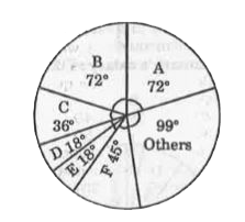
Of the total export of foodgrains, the percentage of crop B exported isView SolutionThe pie chart shows the breakup of expenditure of a college for the year 2017. Study the diagram and answer the following questions.
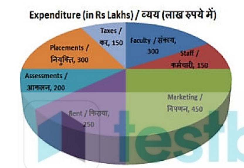
What is the total expenditure (in Rs lakhs)?View Solution
Knowledge Check
- Question 1 - Select One
Given here is a pie chart showing the cost of gold in 2010, 2011, 2012 and 2013. Study the chart and answer the following questions.
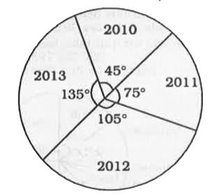
The ratio of the price of gold in the two years 2010 and 2013 isA1:2B1:3C1:4D1:5 - Question 2 - Select One
Given here is a pie chart showing the cost of gold in 2010, 2011, 2012 and 2013. Study the chart and answer the following questions.
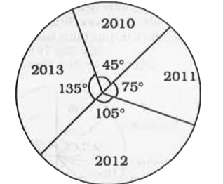
The percentage increase in the price of gold from the year 2011 to 2013 isA50%B60%C70%D80% - Question 3 - Select One
Given here is a pie chart showing the cost of gold in 2010, 2011, 2012 and 2013. Study the chart and answer the following questions.
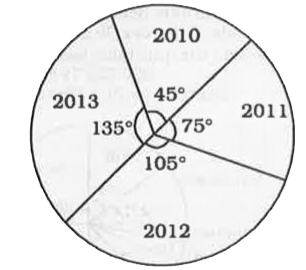
The rato of percentage increase in the price of gold from 2011 to 2012 and 2012 to 2013 isA6:5B7:5C8:5D9:5
The pie chart shows the breakup of expenditure of a mining company for the year 2017. Study the diagram and answer the following questions.
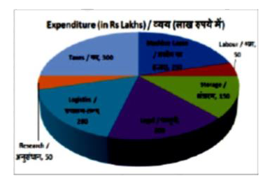
What is the total expenditure (in Rs lakhs)?View SolutionThe pie chart shows the value of the total annual production of dry fruits of a country. Study the diagram and answer the following questions.
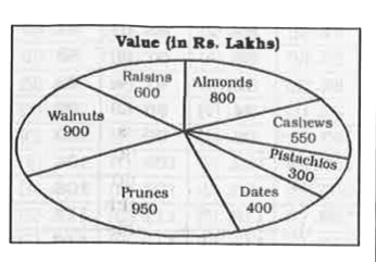
If the average of almonds produced is Rs. 800 per kg., how many kgs. Of almonds were produced?View SolutionThe pie chart shows the value of the total annual agricultural production of a country. Study the diagram and answer the following questions.
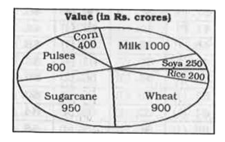
If the value of wheat is Rs. 15,000 per tonne, how many tonnes of wheat was produced?View SolutionThe pie chart shows the value of the total annual agricultural production of a country. Study the digram and answer the following questions.
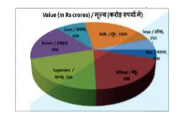
If the value of wheat is Rs. 15,000 per tonne, then how many tonnes of wheat was produced?View SolutionThe pie chart shows the breakup of expendoture of a software company for the year 2017. Study the diagram and answer the following questions.
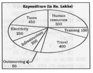
What is the total expenditure (in Rs. lakhs)?View Solution

