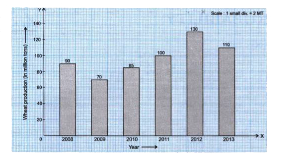
Read the bar graph given below :
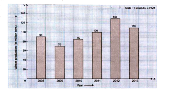
In which year the production was minimum?
2008
2009
2010
2011
The correct Answer is:B
Step by step video & image solution for Read the bar graph given below : In which year the production was minimum? by Maths experts to help you in doubts & scoring excellent marks in Class 7 exams.
Topper's Solved these Questions
Similar Questions
Read the bar graph given below :
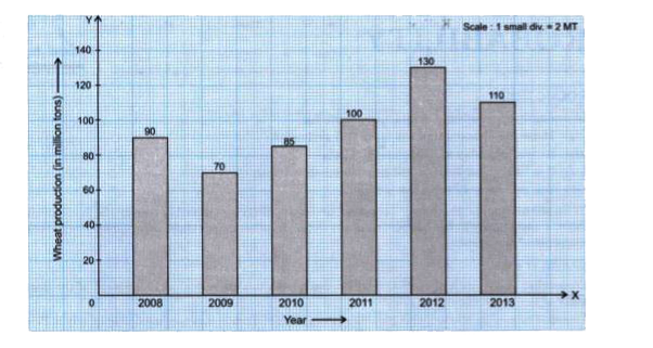
In which year there was maximum increase in production of wheat?View SolutionRead the bar graph given below :
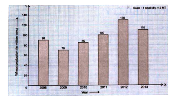
What was the wheat production in 2010?View SolutionRead the bar graph given below :
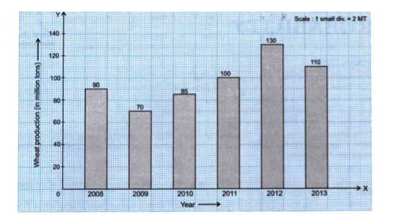
Find the percentage increase in wheat production in the year 2012.View SolutionRead the following bar graph and answer the following questions: What information is given by the bar graph? In which year the export is minimum ? In which year the import is maximum ? In which year the difference of the values of export and import is maximum?
View SolutionRead the bar graph given below :
What information is given by the bar graph?View SolutionRead the bar graph given in Figure and answer the following questions: What information is given by the bar graph? What was the crop-production of rice in 1970-71? What is the difference between the maximum and minimum production of rice?
View SolutionRead the bar graph given in Figure and answer the following questions: What information is given by the bar graph? In which years the areas under the sugarcane crop were the maximum and the minimum? State whether true or false: The area under the sugarcane crop in the year 1982-83 is three times that of the year 1950-51
View SolutionRead the bar graph given in Figure and answer the following questions: What information is given by the bar graph? What was the expenditure on health and family planning in year 1982-83 In which year is the increase in expenditure maximum over the expenditure in previous year? What is the maximum increase?
View SolutionLook at the bar graph given below.
Read it care fully and answer the following questions.
(i) What information does the bar graph give?
(ii) In which subject is the student very good?
(iii) In which subject is the poor? (iv) What is the average of his marks?View SolutionRead the bar graph given in Figure and answer the following questions: What information is given by the bar graph? Which Doordarshan centre covers maximum area? Also tell the covered area. What is the difference between the areas covered by the centres at Delhi and Bombay? Which Doordarshan centres are in U.P. State? What are the areas covered by them?
View Solution

