The following table shows the household expenditure of family on different items. Draw a pie chart to represent the given data.
To draw a pie chart representing the household expenditure of a family on different items, we need to follow these steps:
Step 1: Understand the Data
We have the following data on household expenditure:
- Rent: 25%
- Food: 30%
- Clothing: 10%
- Education: 15%
- Others: 20%
Step 2: Calculate the Angles for the Pie Chart
To represent each percentage as an angle in the pie chart, we use the formula:
Angle=(Percentage100)×360∘
Calculation of Angles:
1. Rent (25%):
Angle=(25100)×360=90∘
2. Food (30%):
Angle=(30100)×360=108∘
3. Clothing (10%):
Angle=(10100)×360=36∘
4. Education (15%):
Angle=(15100)×360=54∘
5. Others (20%):
Angle=(20100)×360=72∘
Step 3: Summarize the Angles
Now we have the angles for each item:
- Rent: 90°
- Food: 108°
- Clothing: 36°
- Education: 54°
- Others: 72°
Step 4: Draw the Pie Chart
1. Start with a circle.
2. Use a protractor to measure and draw the angles from the center of the circle:
- Draw a 90° angle for Rent.
- From the end of the Rent angle, measure and draw a 108° angle for Food.
- Continue this process for Clothing (36°), Education (54°), and Others (72°).
3. Label each section of the pie chart with the corresponding item.
Step 5: Finalize the Chart
- You can use different colors or shades for each section to make the pie chart visually appealing.
- Ensure that each section is clearly labeled.
We have the following data on household expenditure:
- Rent: 25%
- Food: 30%
- Clothing: 10%
- Education: 15%
- Others: 20%
To represent each percentage as an angle in the pie chart, we use the formula:
Angle=(Percentage100)×360∘
1. Rent (25%):
Angle=(25100)×360=90∘
Angle=(30100)×360=108∘
Angle=(10100)×360=36∘
Angle=(15100)×360=54∘
Angle=(20100)×360=72∘
Now we have the angles for each item:
- Rent: 90°
- Food: 108°
- Clothing: 36°
- Education: 54°
- Others: 72°
1. Start with a circle.
2. Use a protractor to measure and draw the angles from the center of the circle:
- Draw a 90° angle for Rent.
- From the end of the Rent angle, measure and draw a 108° angle for Food.
- Continue this process for Clothing (36°), Education (54°), and Others (72°).
3. Label each section of the pie chart with the corresponding item.
- You can use different colors or shades for each section to make the pie chart visually appealing.
- Ensure that each section is clearly labeled.
Topper's Solved these Questions
- BOOK - PEARSON IIT JEE FOUNDATIONCHAPTER - STATISTICSEXERCISE - CONCEPT APPLICATION5videos
STATISTICS
- BOOK - PEARSON IIT JEE FOUNDATIONCHAPTER - STATISTICSEXERCISE - ASSESSMENT TEST10videos
STATISTICS
- BOOK - PEARSON IIT JEE FOUNDATIONCHAPTER - STATISTICSEXERCISE - TEST YOUR CONCEPTS (VERY SHORT ANSWER TYPE QUESTION )11videos
STATISTICS
- BOOK - PEARSON IIT JEE FOUNDATIONCHAPTER - SETSEXERCISE - Crossword1videos
SETS
Similar Questions
The following table shows the monthly expenditure of different families on different items :

Represent the data in the form of a sub-divided bar diagram.View SolutionThe following table shows the percentage of people having different blood groups. Draw a pie chart to represent the given data.
Blood groupABCDPercentage of people20452015View Solution
Knowledge Check
- Question 1 - Select One or More
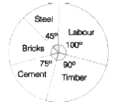
The following pie chart represents a total expenditure of 540000 on different items in constructing a flat in a town. The percentage of the total expenditure spent on steel and cement is
 A0.3323B0.25C3313%D30%
The following data shows the expenditure of a person on different items during a month. Represent the data by a pie-chart. Items of expenditure, Rent, Education, Food, Clothing, Others Amount (in Rs.), 2700, 1800, 2400, 1500, 2400
View SolutionThe following data represents the approximate percentage of water in various oceans. Prepare a pie chart for the given data.
Pacific40%Atlantic30%Indian20%Others10%View SolutionThe following table shows how a student spends his pocket money during the course of a month. Represent it by a pie-diagram. Items, Food, Entertainment, Other expenditure, Savings Expenditure, 40%, 25%, 20%, 15%
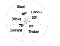
View SolutionThe following pie chart represents a total expenditure of 540000 on different items in constructing a flat in a town. Which is the item of maximum expenditure?
 View Solution
Following is the break up of the expenditure of a family on different items of consumption.: Items, Food, Clothing, Rent, Education, Fuel etc., Medicine, Misc. Expenditure (in Rs), 1600, 200, 600, 150, 100, 80, 270 Draw a pie-diagram to represent the above data.
View SolutionThe following table shows the expenditure incurred by a publisher in publishing a book: Items, Paper, Printing, Binding, Advertishing, Misc. Expenditure (in %), 35%, 20%, 10%, 5%, 30% Present the above data in the form of a pie-chart.
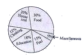
View SolutionThe following pie-chart shows the monthly expenditure of a family on food, house rent clothing, education, fuel and miscellaneous Study the pie-chart

Total percentage of expenditure on house rent, clothing and fuel is greater than the percentage of expenditure on food byView Solution

