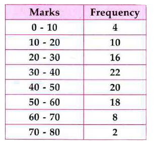
The following table shows the marks secored by a student in annual examination in various subjects. Draw a histogram to represent the given data.
SubjectTeluguHindiEnglishMathsScienceSocial StudiesMarks807482949088
To draw a histogram representing the marks scored by a student in various subjects, we can follow these steps:
Step 1: Prepare the Data
We have the following data:
| Subject | Marks |
|------------------|-------|
| Telugu | 80 |
| Hindi | 74 |
| English | 82 |
| Maths | 94 |
| Science | 90 |
| Social Studies | 88 |
Step 2: Set Up the Axes
- Draw two perpendicular lines to represent the axes.
- The horizontal axis (x-axis) will represent the subjects.
- The vertical axis (y-axis) will represent the marks.
Step 3: Determine the Scale
- Choose a scale for the y-axis. For example, we can use 1 cm = 10 marks. This means:
- 10 marks will be represented by 1 cm on the graph.
Step 4: Mark the Subjects on the x-axis
- Label the x-axis with the subjects:
- Telugu
- Hindi
- English
- Maths
- Science
- Social Studies
Step 5: Plot the Marks
- For each subject, draw a bar that corresponds to the marks:
- Telugu: 80 marks → 8 cm high
- Hindi: 74 marks → 7.4 cm high
- English: 82 marks → 8.2 cm high
- Maths: 94 marks → 9.4 cm high
- Science: 90 marks → 9 cm high
- Social Studies: 88 marks → 8.8 cm high
Step 6: Draw the Bars
- Using a ruler, draw vertical bars for each subject according to the heights calculated:
- Draw a bar for Telugu up to 8 cm.
- Draw a bar for Hindi up to 7.4 cm.
- Draw a bar for English up to 8.2 cm.
- Draw a bar for Maths up to 9.4 cm.
- Draw a bar for Science up to 9 cm.
- Draw a bar for Social Studies up to 8.8 cm.
Step 7: Label the Histogram
- Write the title of the histogram at the top (e.g., "Marks Scored by a Student in Various Subjects").
- Label the y-axis as "Marks" and the x-axis as "Subjects".
Step 8: Review the Histogram
- Ensure that all bars are drawn correctly and are proportional to the marks scored.
Final Histogram
You should now have a complete histogram that visually represents the marks scored by the student in each subject.
---
We have the following data:
|------------------|-------|
| Telugu | 80 |
| Hindi | 74 |
| English | 82 |
| Maths | 94 |
| Science | 90 |
| Social Studies | 88 |
- Draw two perpendicular lines to represent the axes.
- The horizontal axis (x-axis) will represent the subjects.
- The vertical axis (y-axis) will represent the marks.
- Choose a scale for the y-axis. For example, we can use 1 cm = 10 marks. This means:
- 10 marks will be represented by 1 cm on the graph.
- Label the x-axis with the subjects:
- Telugu
- Hindi
- English
- Maths
- Science
- Social Studies
- For each subject, draw a bar that corresponds to the marks:
- Telugu: 80 marks → 8 cm high
- Hindi: 74 marks → 7.4 cm high
- English: 82 marks → 8.2 cm high
- Maths: 94 marks → 9.4 cm high
- Science: 90 marks → 9 cm high
- Social Studies: 88 marks → 8.8 cm high
- Using a ruler, draw vertical bars for each subject according to the heights calculated:
- Draw a bar for Telugu up to 8 cm.
- Draw a bar for Hindi up to 7.4 cm.
- Draw a bar for English up to 8.2 cm.
- Draw a bar for Maths up to 9.4 cm.
- Draw a bar for Science up to 9 cm.
- Draw a bar for Social Studies up to 8.8 cm.
- Write the title of the histogram at the top (e.g., "Marks Scored by a Student in Various Subjects").
- Label the y-axis as "Marks" and the x-axis as "Subjects".
- Ensure that all bars are drawn correctly and are proportional to the marks scored.
You should now have a complete histogram that visually represents the marks scored by the student in each subject.
Topper's Solved these Questions
- STATISTICSBOOK - PEARSON IIT JEE FOUNDATIONCHAPTER - STATISTICSEXERCISE - CONCEPT APPLICATION
5 Videos
- STATISTICSBOOK - PEARSON IIT JEE FOUNDATIONCHAPTER - STATISTICSEXERCISE - ASSESSMENT TEST
10 Videos
- STATISTICSBOOK - PEARSON IIT JEE FOUNDATIONCHAPTER - STATISTICSEXERCISE - TEST YOUR CONCEPTS (VERY SHORT ANSWER TYPE QUESTION )
11 Videos
- SETSBOOK - PEARSON IIT JEE FOUNDATIONCHAPTER - SETSEXERCISE - Crossword
1 Videos
Similar Questions
Knowledge Check
The following pie chart shows the marks obtained by a student in an examination, who scored 720 marks in all. Study the diagram and answer the questions given below.
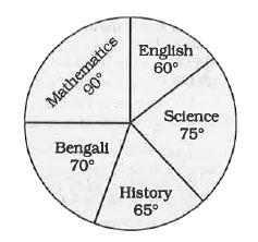
The marks scored in Science areA200B300C75D150
The following table gives the data on the marks obtained by two students 'A and B' in five subjects :

Represent the data by a multiple bar diagram.
View SolutionThe following frequency distribution table shows marks obtained by 180 students in Mathematics examination :
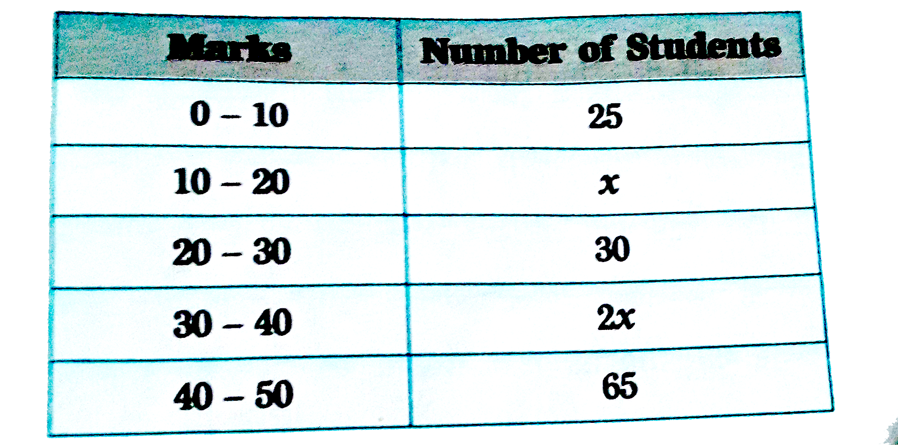
Find the value of x.
Also draw a histogram representing the above informations.
View SolutionThe following table shows various sports played by students in a school. Draw a pie chart to represent the given data.
SportsChessCricketCarromsFootballNumber of students35704263
View SolutionThe following table shows the number of students in different classes of a high school. Draw a histogram to represent the given data.
ClassesVIVIIVIIIIXXNumber of students3742355048
View SolutionThe table shows the marks Porpu obtained in an Examination.Subject Math Science English Hindi. Science Computer. Represent the above data by a pie chart.97
View SolutionThe bar graph shows the marks obtained by Kashish in half-yearly examination in various subjects.
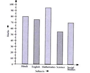
Draw a pictograph for the above data and then answer the following questions.
Find the total marks scored by Kashish.
View SolutionThe marks obtained by a student in an examination are given below: The total marks out of 100 obtained in various subjects are as follows:
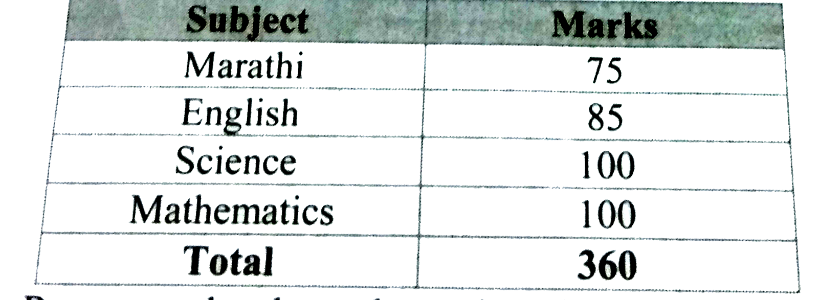
Represent the data using pie diagram.
View Solution

