The following table shows the number of toys sold by a mart during a week. Draw a line graph to represent the given data.
WeekMonTueWedThursFriSatSunNumber of Toys21101724101620
To draw a line graph representing the number of toys sold by a mart during a week, follow these steps:
Step 1: Prepare the Axes
- Draw two perpendicular lines to represent the axes. The vertical line (y-axis) will represent the number of toys sold, and the horizontal line (x-axis) will represent the days of the week.
Step 2: Label the Axes
- Label the y-axis as "Number of Toys Sold" and the x-axis as "Days of the Week".
- Mark the days of the week on the x-axis: Monday, Tuesday, Wednesday, Thursday, Friday, Saturday, and Sunday.
Step 3: Create a Scale for the Y-Axis
- Decide on a scale for the y-axis. For example, you can use 1 cm = 2 toys. This means that 10 toys will be represented by 5 cm on the graph.
Step 4: Plot the Points
- Now, plot the points based on the number of toys sold each day:
- Monday: 21 toys (10.5 cm)
- Tuesday: 10 toys (5 cm)
- Wednesday: 17 toys (8.5 cm)
- Thursday: 24 toys (12 cm)
- Friday: 10 toys (5 cm)
- Saturday: 16 toys (8 cm)
- Sunday: 20 toys (10 cm)
Step 5: Draw the Points on the Graph
- For each day, mark a point at the corresponding height on the y-axis. For example, for Monday, mark a point at 10.5 cm on the y-axis.
Step 6: Connect the Points
- Use a ruler to connect the points with straight lines. This will create the line graph that represents the data.
Step 7: Title the Graph
- Finally, give your graph a title, such as "Number of Toys Sold During the Week".
- Draw two perpendicular lines to represent the axes. The vertical line (y-axis) will represent the number of toys sold, and the horizontal line (x-axis) will represent the days of the week.
- Label the y-axis as "Number of Toys Sold" and the x-axis as "Days of the Week".
- Mark the days of the week on the x-axis: Monday, Tuesday, Wednesday, Thursday, Friday, Saturday, and Sunday.
- Decide on a scale for the y-axis. For example, you can use 1 cm = 2 toys. This means that 10 toys will be represented by 5 cm on the graph.
- Now, plot the points based on the number of toys sold each day:
- Monday: 21 toys (10.5 cm)
- Tuesday: 10 toys (5 cm)
- Wednesday: 17 toys (8.5 cm)
- Thursday: 24 toys (12 cm)
- Friday: 10 toys (5 cm)
- Saturday: 16 toys (8 cm)
- Sunday: 20 toys (10 cm)
- For each day, mark a point at the corresponding height on the y-axis. For example, for Monday, mark a point at 10.5 cm on the y-axis.
- Use a ruler to connect the points with straight lines. This will create the line graph that represents the data.
- Finally, give your graph a title, such as "Number of Toys Sold During the Week".
Topper's Solved these Questions
- BOOK - PEARSON IIT JEE FOUNDATIONCHAPTER - STATISTICSEXERCISE - CONCEPT APPLICATION5videos
STATISTICS
- BOOK - PEARSON IIT JEE FOUNDATIONCHAPTER - STATISTICSEXERCISE - ASSESSMENT TEST10videos
STATISTICS
- BOOK - PEARSON IIT JEE FOUNDATIONCHAPTER - STATISTICSEXERCISE - TEST YOUR CONCEPTS (VERY SHORT ANSWER TYPE QUESTION )11videos
STATISTICS
- BOOK - PEARSON IIT JEE FOUNDATIONCHAPTER - SETSEXERCISE - Crossword1videos
SETS
Similar Questions
The following table shows various sports played by students in a school. Draw a pie chart to represent the given data.
SportsChessCricketCarromsFootballNumber of students35704263View SolutionThe following table shows the number of students in different classes of a high school. Draw a histogram to represent the given data.
ClassesVIVIIVIIIIXXNumber of students3742355048View SolutionThe following table shows the household expenditure of family on different items. Draw a pie chart to represent the given data.
ItemRentFoodClotingEducationOthersExpenditure25%30%10%15%20%View SolutionThe given table presents the number of illiterate males in the age group (10-34) in a town.

Draw a histogram to represent the above data.View SolutionThe following table shows the number of illitrate persons in the age group (10-58 Years) in a town. Represents the given data by means of a histogram.
 View Solution
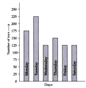
The bar graph shows the number of toys produced by a factory during a certain week.

What is the total number of toys produced during the week ?View SolutionThe number of runs given by a bowler in a one-day match in 10 overs is given below.
Draw the line graph for given data.
Overs12345678910Number of runs28510472012711View SolutionThe given table shows the number of tourists who visited Taj Mahal during different months. Month

Draw a bar graph to represent the above information by using appropriate scale.View SolutionDraw a histogram representing the following information :
NAV( Rupees)8−1010−1212−1414−1616−18Number of mutual funds2040302515View SolutionThe following table shows marks obtained by the students of a class in their test in English:
Marks0−1010−2020−3030−4040−50Number of Students 20 24 40 36 20
Calculate arithmetic mean using Step-deviation method.View Solution

