The following table shows the percentage of buyers of four different brands of bathing soaps.

Represent the above data by a pie chart.
Step by step video & image solution for The following table shows the percentage of buyers of four different brands of bathing soaps. Represent the above data by a pie chart. by Maths experts to help you in doubts & scoring excellent marks in Class 8 exams.
Updated on:21/07/2023Topper's Solved these Questions
- PIE CHARTS BOOK - RS AGGARWALCHAPTER - PIE CHARTS EXERCISE - Exercise 24B
4 Videos
- PIE CHARTS BOOK - RS AGGARWALCHAPTER - PIE CHARTS EXERCISE - Exercise 24B
4 Videos
- PERCENTAGEBOOK - RS AGGARWALCHAPTER - PERCENTAGEEXERCISE - TEST PAPER -9 ( TRUE AND FALSE )
4 Videos
- PLAYING WITH NUMBERSBOOK - RS AGGARWALCHAPTER - PLAYING WITH NUMBERSEXERCISE - Test Paper-5
11 Videos
Similar Questions
The following data shows the expenditure of a person on different items during a month. Represent the data by a pie-chart. Items of expenditure, Rent, Education, Food, Clothing, Others Amount (in Rs.), 2700, 1800, 2400, 1500, 2400
View SolutionThe following table shows the percentage of people having different blood groups. Draw a pie chart to represent the given data.
Blood groupABCDPercentage of people20452015
View Solution
Knowledge Check
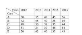
The table shows the production of different types of cars (in thousands).
यह तालिका अलग-अलग प्रकार के कारों का उत्पादन ( हज़ार में) दर्शाती है | If the data related to the production of cars of type E is represented by a pie chart, then the central angle of the sector
representing the data of production of cars in 2013 will be:
यदि E प्रकार की कारों के उत्पादन से संबंधित आंकड़ों को एक पाई-चार्ट के द्वारा प्रदर्शित किया जाए, तो 2013 में कारों के उत्पादन के आंकड़ों को दर्शाने वाले खंड का केंद्रीय कोण होगा :A102∘B84∘C70∘D80∘
The following table shows the percentages of demands for different fruits registered with a fruit vendor. Show the information by a pie diagram.

View SolutionThe following table shows the percentages of demands for different fruits registered with a fruit vendor. Show the information by a pie diagram.

View SolutionThe following table shows the expenditure of a family whose monthly income is * 22,000.Represent the above data by a pie chart.
View SolutionGiven below is the result of an annual examination of a class, showing the percentage of students in each category .

Represent the above data by a pie chart.
View SolutionThe following table shows the monthly expenditure of different families on different items :

Represent the data in the form of a sub-divided bar diagram.
View SolutionThe following table shows the household expenditure of family on different items. Draw a pie chart to represent the given data.
ItemRentFoodClotingEducationOthersExpenditure25%30%10%15%20%
View SolutionThe following table shows the number of fruits in a fruit shop. Represent the above data by a bar graph
View Solution
