The following data shows the average age of men in varicus countries in a certain year: Country, India, Nepal, China, Pakistan, U.K., U.S.A Average age (in years), 55, 52, 60, 50, 70, 75 Represent the above information by a bar graph.
Step by step video & image solution for The following data shows the average age of men in varicus countries in a certain year: Country, India, Nepal, China, Pakistan, U.K., U.S.A Average age (in years), 55, 52, 60, 50, 70, 75 Represent the above information by a bar graph. by Maths experts to help you in doubts & scoring excellent marks in Class 7 exams.
Updated on:21/07/2023Topper's Solved these Questions
Similar Questions
. The following data shows the year wise strength of a school.Represent the the above data by bar graph:
View SolutionThe following data gives the amount of loans (in crores of rupees) disbursed by a bank during some years: Year, 1992, 1993, 1994, 1995, 1996 Loan (in crores of rupees), 28, 33, 55, 55, 80 Represent the above data with the help of a bar graph. With the help of the bar graph, indicate the year in which amount of loan is not increased over that of the preceding year.
View Solution
Knowledge Check
The average age of 6 persons in a committee is increased by 2 years, when two men aged 55 years and 60 years are substituted by two women. The average age of these two women is
A127 yearsB103 yearsC63.5 yearsD51.5 years
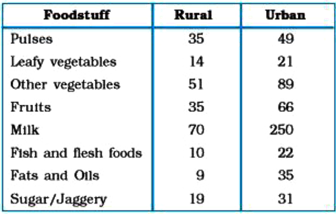
The following table shows the average intake of nutrients in calories by rural and urban groups in a particular year. Using a suitable scale for the given data, draw a double bar graph to compare the data.

View SolutionThe following data shows the agriculture production in India during a certain year.| Food grain | Rice, Wheat Pulses Maize Coarse Cereals Production 106, 74, 24, 4, 20| (in millions of tons)Draw a pie chart to represent the above data.
View SolutionExpenditure on education of a country during a five years period (2002-2006), in crore of rupees, is given below

Represent the information above by a bar graph.
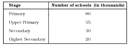
View SolutionThe following table gives the data of number of schools (stage-wise) of a country in the year 2002.

Draw a bar graph to represent the above data:
View SolutionThe following table gives the route length (in thousand kilometres) of the Indian Railways in some of the years: Year, 1960-61, 1970-71, 1980-81, 1990-91, 2000-2001 Route length (in thousand kilometres), 56, 60, 61, 74, 98 Represent the above data with the help of a bar graph.
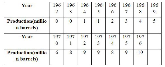
View SolutionThe following table shows the production of gasoline in U.S.A. for the years 1962 to 1976. Obtain trend values for the above data using 5-yearly moving averages.

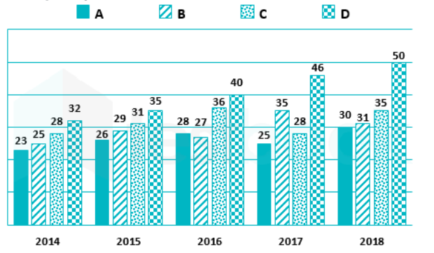
View SolutionThe following bar graph shows the data of the production of an item (in thousand tonnes) from four different companies A, B, C and D during the years mentioned.

In the five years given, the average production is highest in company _____ and lower in company _______ respectively.
View Solution
