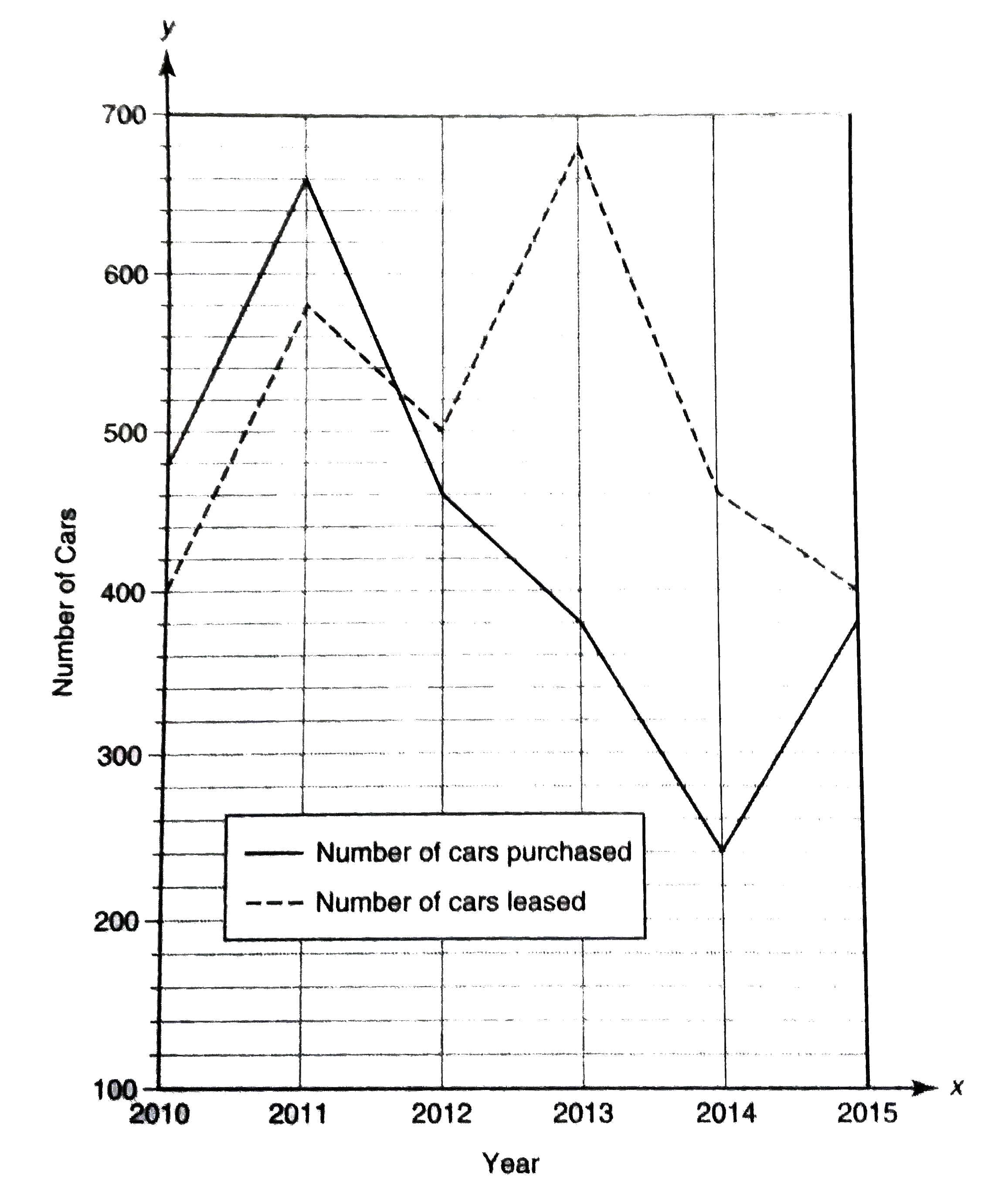
Question 11 and 12 refer to the gaph above.
Q. Which of the following is the best approximation for the decrease in the number of cars purchased per year between 2011 and 2014?
105
140
300
420
The correct Answer is:B
Topper's Solved these Questions
- PROBLEM SOLVING AND DATA ANALYSISBOOK - ENGLISH SATCHAPTER - PROBLEM SOLVING AND DATA ANALYSISEXERCISE - Grib-In
40 Videos
- PROBLEM SOLVING AND DATA ANALYSISBOOK - ENGLISH SATCHAPTER - PROBLEM SOLVING AND DATA ANALYSISEXERCISE - Grib-In
40 Videos
- PROBLEM SOLVING AND DATA ANALYSISBOOK - ENGLISH SATCHAPTER - PROBLEM SOLVING AND DATA ANALYSISEXERCISE - EXERICSE
80 Videos
- PROBLEMS IN CONTEXT BOOK - ENGLISH SATCHAPTER - PROBLEMS IN CONTEXT EXERCISE - PRACTICE TEST
10 Videos
Similar Questions
743 children from the United States, aged 6 through 11, were tested to see if they were overweight . The data are shown in the table below.
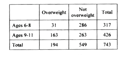
In 2014 the total population of children between 6 and 11 years old, inclusive , in the United States was about 74.3 million. If the test results are used to estimate information about children across the country, which of the following is the best estimate of the total number of children between 9 and 11 years old in the United States who were overweight in 2014 ?
View SolutionThe line graph shows the number of vacancies for management trinees in a certain company. Study the diagram and the answer the following questions.
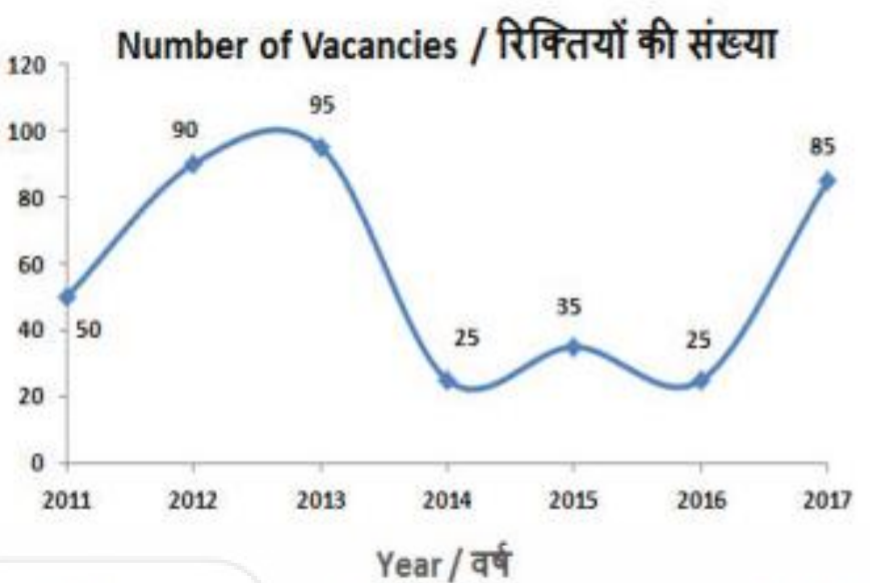
What was the difference in the number of vacancies between the years 2011 and 2014?
View Solution
Knowledge Check
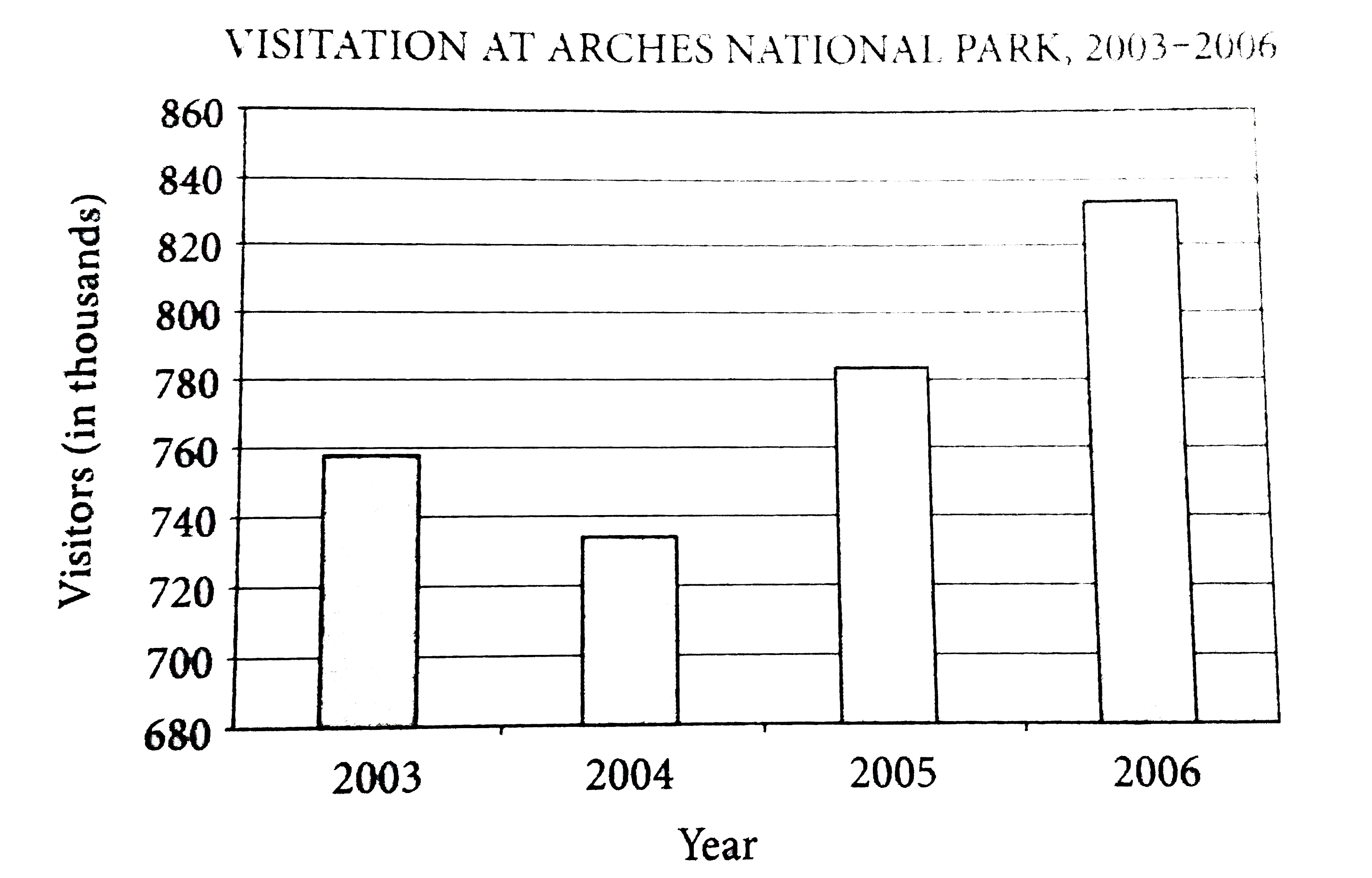
The chart above shows the number of visits, in thousands, at Arches National park for the years 2003 to 2006. Which of the following is the closest approximation of the percent increase in the number of visits from 2004 to 2006?A0.05B0.15C0.2D1.15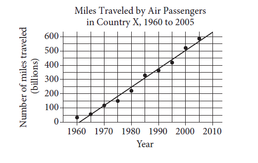
According to the line of best fit in the scatterplot above, which of the following best approximates the year in which the number of miles traveled by air passengers in Country X was estimated to be 550 billion?A1997B2000C2003D2008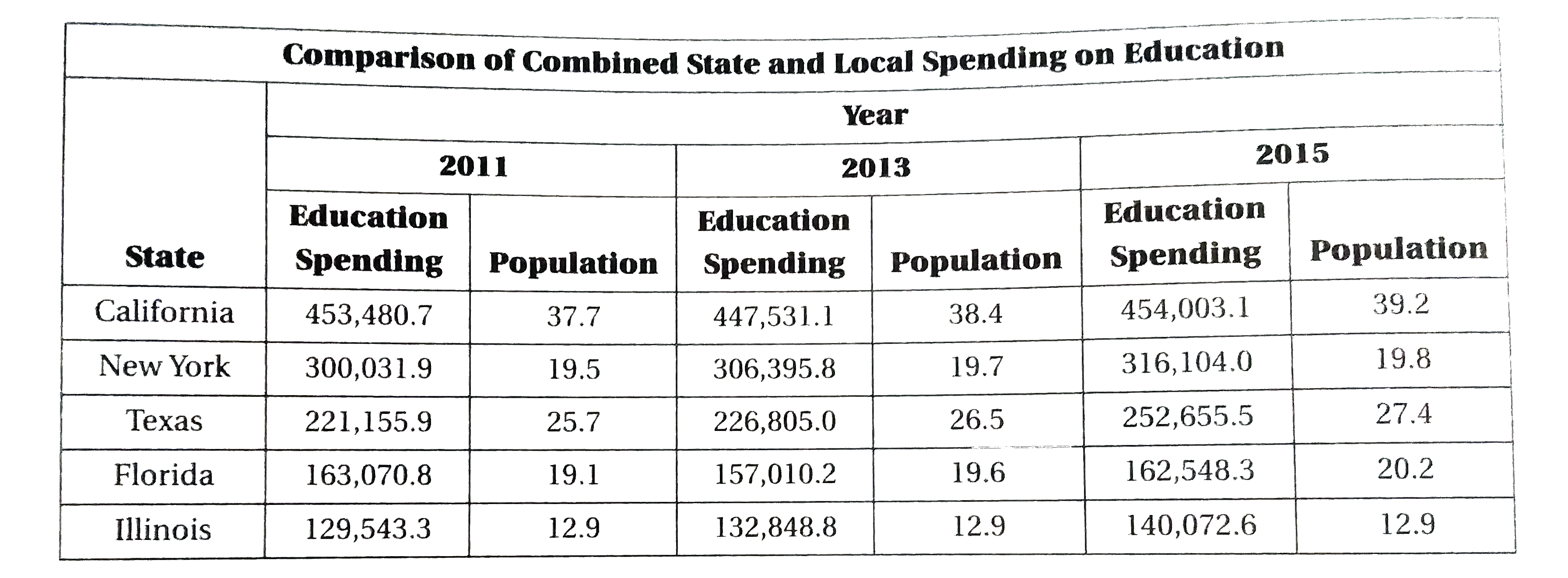
Question 16 and 17 refer to the above table, that shows the population (in millions) and education spending (in millions) and by state for each of the states listed for the years 2011, 2013, and 2015.
Q. Which of the following best approximates the average rate of change in education spending in Texas from 2011 to 2015?A3.2 billion per yearB6.3 billion per yearC10.5 per yearD7.9 billion per year
The line graph shows the number of deaths due to road accidents in a certain state. Study the diagram and answer the following questions.
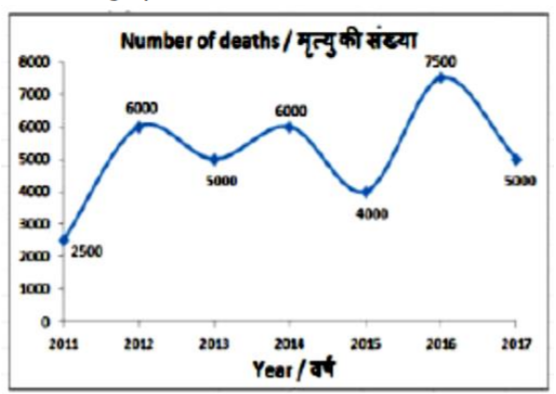
What was the difference in the number of deaths between the years 2011 and 2013?
View SolutionThe line graphs shows the number of deaths due to dengiue in acertain state. Study the diagram and answer the following questions.
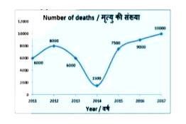
What was the difference in the number of deaths between the years 2012 and 2014?
View Solution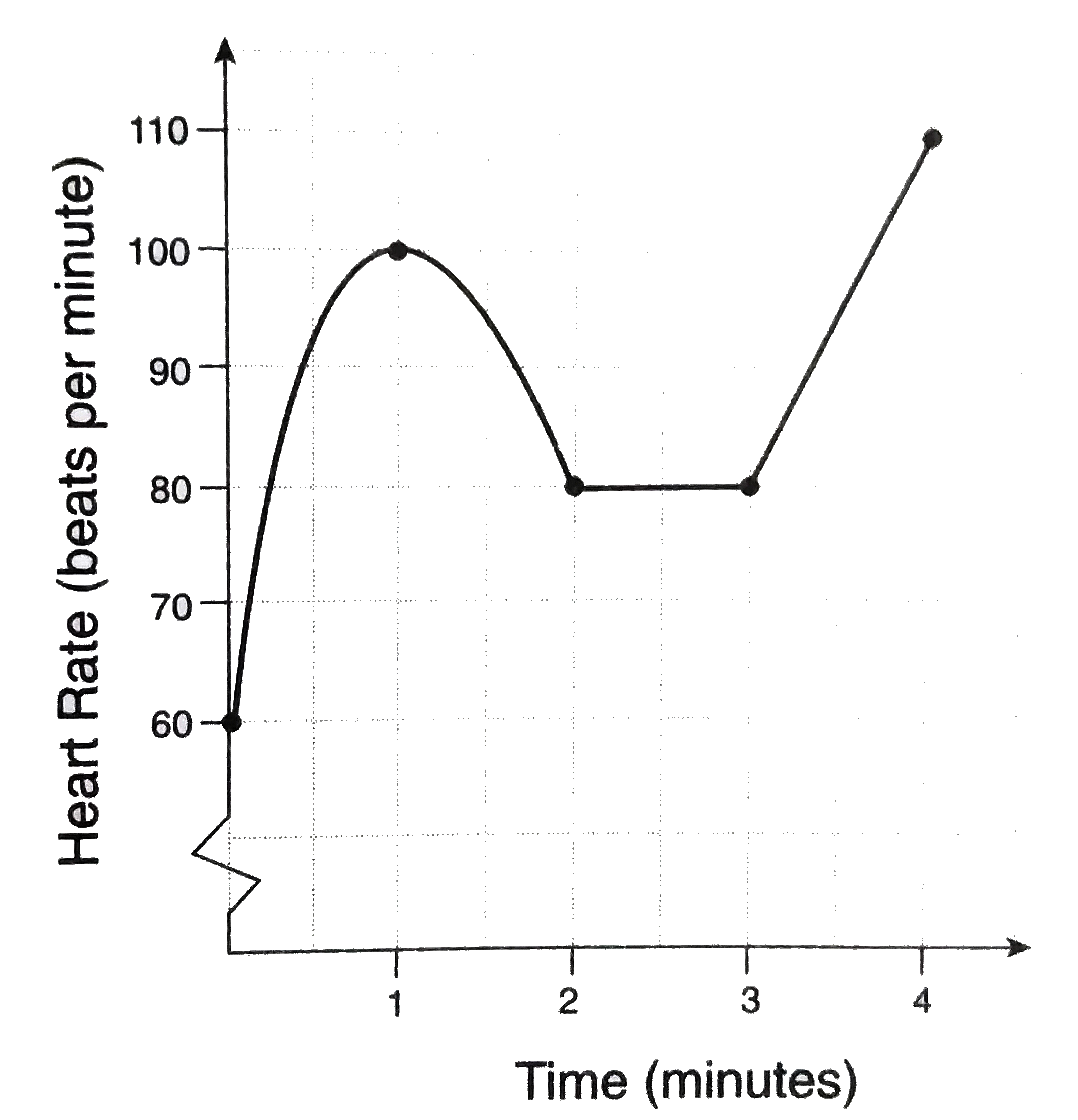
Question 13 and 14 refer to the gaph above which shows the heart rate, in veats per minutes, of a jogger during a 4-minutes interval.
Q. The greatest percent of increase in the jogger's heart rate occured over what interval of time, in minutes?
View SolutionThe line graph shows the number of vacancies for executives in a certain company. Study the diagram and answer the following questions.
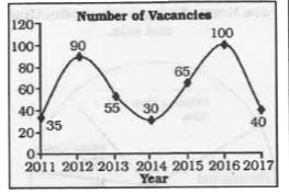
What was the difference in the number of vacancies between the years 2016 and 2014?
View SolutionThe line graph shows the number of vacancies for executives in a certain company. Study the diagram and answer the following questions.

What was the difference in the number of vacancies between the years 2016 and 2014?
View Solution
