The following data gives the amount of manure (in thousand
tonnes) manufactured by a company during some
years:

(i)Represent the
above data with the help of a bar graph.
(ii)Indicate with
the help of the bar graph the year in which the amount of manufactured by the
company was maximum.
(iii)Choose the
correct alternative:
The consecutive years during which there was
maximum decrease in manure production are:
(a)
1994 and
1995 (b) 1992 and 1993
(c)
1996 and
1997 (d) 1995 and 1996
(i)
(ii) The amount of manufactured by the company was maximum in the year 1994
(iii)The maximum decrease in manure production are 1996-97
Topper's Solved these Questions
Similar Questions
The following data gives the amount of manure (in thousand tonnes) manufactured by a company during some years: Year, 1992, 1993, 1994, 1995, 1996, 1997 Manure (In thousand tonnes), 15, 35, 45, 30, 40, 20 Represent the above data with the help of a bar graph. Indicate with the help of the bar graph the year in which the amount of manure manufactured by the company was maximum. Choose the correct alternative: The consecutive years during which there was maximum decrease in manure production are: 1994 to 1995 (b) 1992 and 1993 1996-1997 (d) 1995 and 1996
View SolutionThe following data gives the amount of loans (in crores of rupees) disbursed by a bank during some years: Year, 1992, 1993, 1994, 1995, 1996 Loan (in crores of rupees), 28, 33, 55, 55, 80 Represent the above data with the help of a bar graph. With the help of the bar graph, indicate the year in which amount of loan is not increased over that of the preceding year.
View Solution
Knowledge Check
The following graph gives the amount of manure (in thousand tonnes) manufactured by a company during some years.
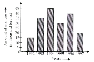
In which year the amount of manure manufactured by the company was maximum?A1993B1994C1996D1997The following graph gives the amount of manure (in thousand tonnes) manufactured by a company during some years.
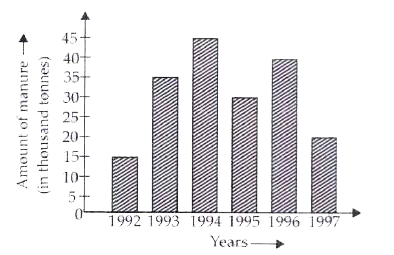
In which year the amonnt of manure manufactured by the company was minimum?A1992B1993C1995D1997The following graph gives the amount of manure (in thousand tonnes) manufactured by a company during some years.
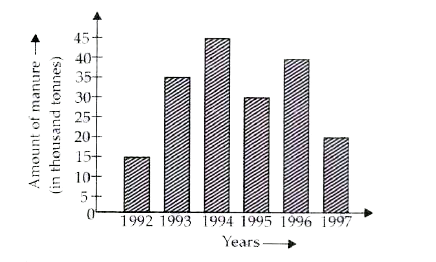
The consecutive years during which there was maximum decrease in manure production are:A1994 and 1995B1992 and 1993C1996 and 1997D1995 and 1996
The following table gives the data of number of schools (stage-wise) of a country in the year 2002.
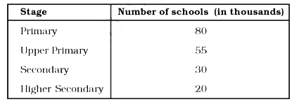
Draw a bar graph to represent the above data:
View SolutionThe following data gives the production of food grains (in thousand tonnes) for some years: Year 1995 1996 1997 1998 1999 2000 Production (in thousand tonnes) 120 150 140 180 170 190 Represent the above data with the help of a bar graph.
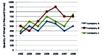
View SolutionPercent rise in exports from the previous years was the maximum during which year of the company B?
View SolutionThe following data gives the number of students of Delhi state who went abroad for study during some years: year: 1995 1996 1997 1998 1999 2000 No. of Students 1400 1600 1250 1000 2000 2200 Represent the above data with the help of a bar graph.
View SolutionThe following data gives the number of students of Delhi state who went abroad for study during some years: year 1995 1996 1997 1998 1999 2000 No. of Students 1400 1600 1250 1000 2000 2200 Represent the above data with the help of a bar graph.
View Solution
