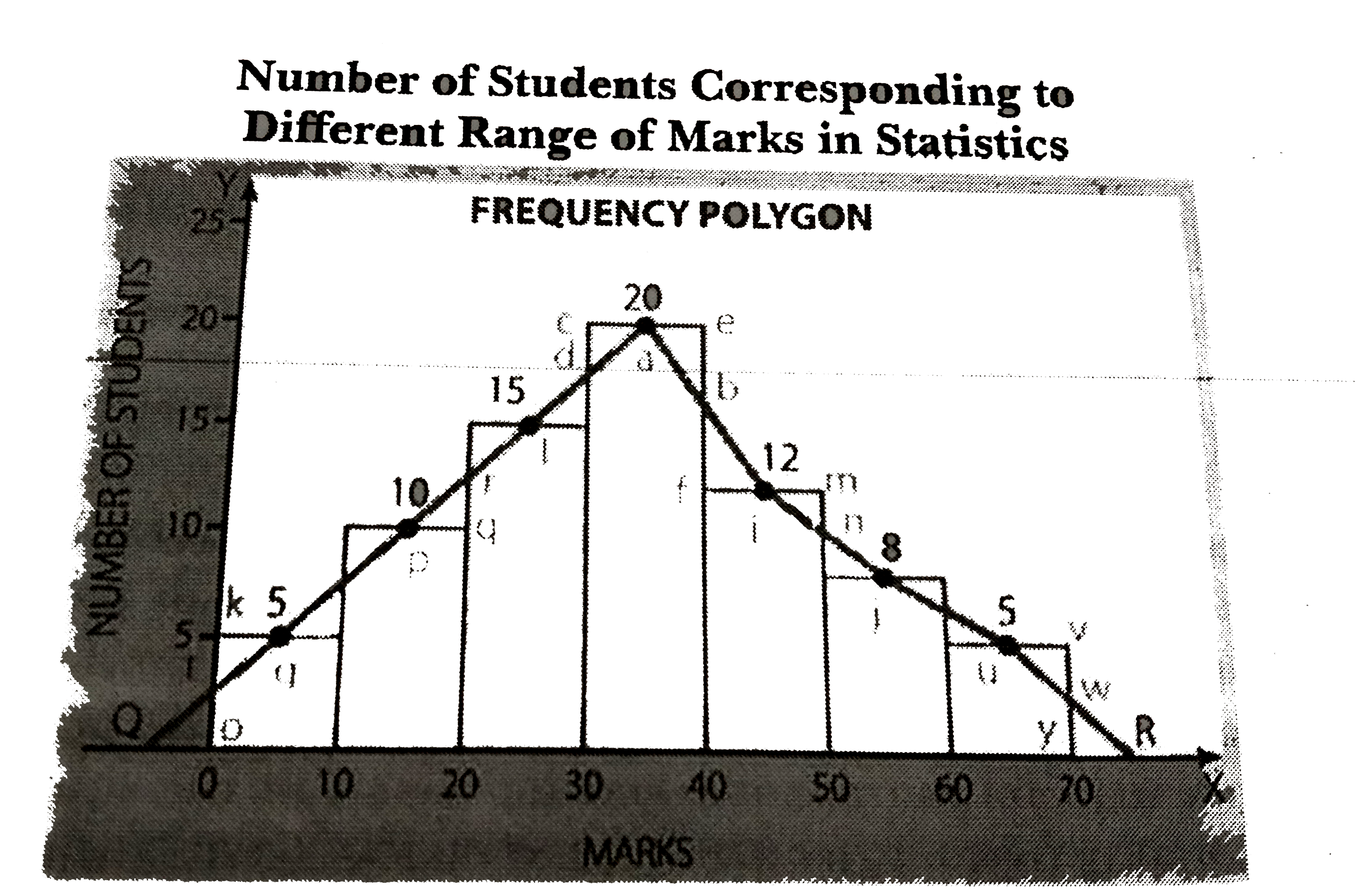
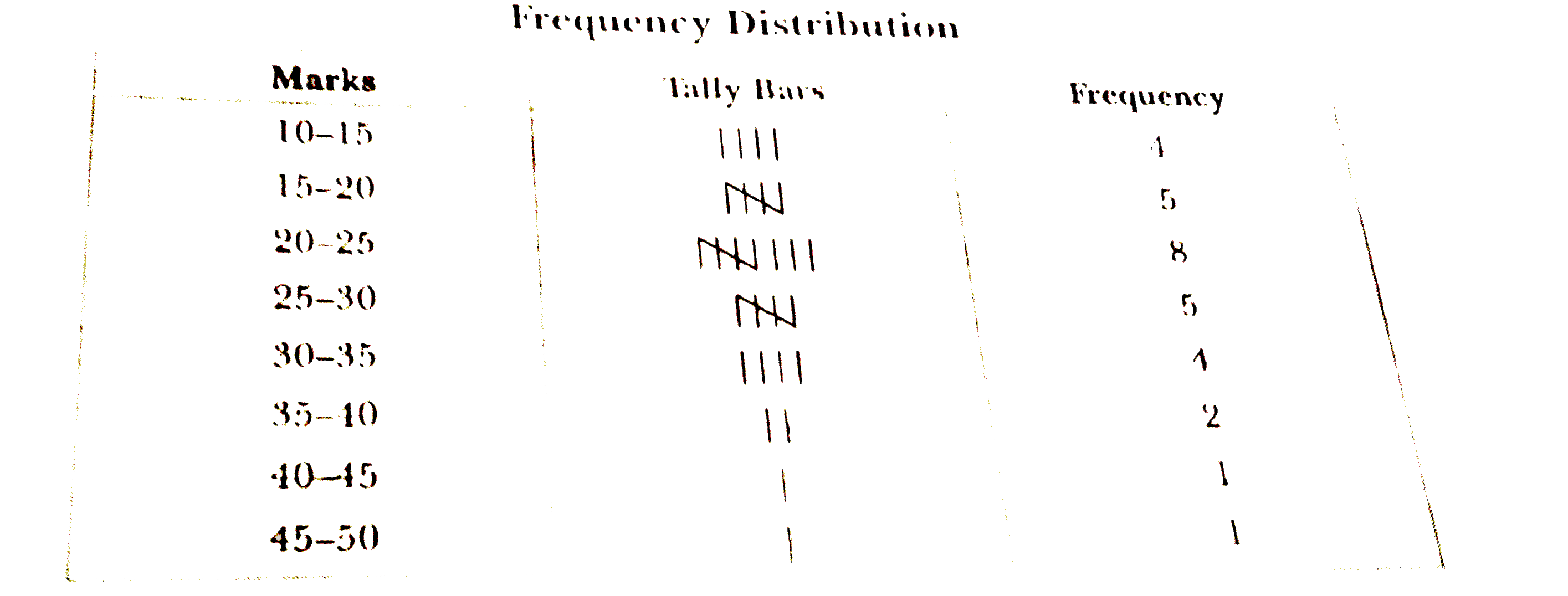
Following table shows number of students of a college corresponding to different range of marks in Statistics.Make a frequency polygon.

A frequency polygon of the above data is presented in the following graph. In this graph, data have been first presented in the form of a histogram. Mid-points of the tops of rectangles in the histogram have been marked and then joined using scale or foot rule. The endpoints of the polygon be joined to the immediate lower or higher mid-points (as the case may be) at zero frequency with the base-line. It is done to equate the area of polygon with the area of histogram. Here is an illustration of constructing a frequency polygon by making a histogram.
Frequency polygon can also be constructed without the help of histogram. Under this method, mid-points of various class intervals are taken and the corresponding frequencies to each mid-points are plotted. We can present the following data in the form of a frequency polygon without constructing a histogram.
Topper's Solved these Questions
- BOOK - TARUN JAIN & VK OHRICHAPTER - FREQUENCY DIAGRAMS - HISTOGRAM, POLYGON AND OGIVEEXERCISE - Miscellaneous Illustration8videos
FREQUENCY DIAGRAMS - HISTOGRAM, POLYGON AND OGIVE
- BOOK - TARUN JAIN & VK OHRICHAPTER - FREQUENCY DIAGRAMS - HISTOGRAM, POLYGON AND OGIVEEXERCISE - EXERCISE M.C.Q6videos
FREQUENCY DIAGRAMS - HISTOGRAM, POLYGON AND OGIVE
- BOOK - TARUN JAIN & VK OHRICHAPTER - DIAGRAMMATIC PRESENTATION OF DATA BAR DIAGRAMS AND PIE DIAGRAMSEXERCISE - NCERT Question (With Hints to Answers)3videos
DIAGRAMMATIC PRESENTATION OF DATA BAR DIAGRAMS AND PIE DIAGRAMS
- BOOK - TARUN JAIN & VK OHRICHAPTER - INDEX NUMBERSEXERCISE - NCERT Questions (With Hints to Answers)12videos
INDEX NUMBERS
Similar Questions
Knowledge Check
- Question 1 - Select One
The following table shows the number of students enrolled in different faculties in college.

The percentage of students studying in faculties other than Science is:A75%B80%C60%D20% - Question 2 - Select One
The data below shows the number of students in class A having secured different marks.
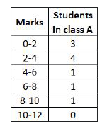
What is the mean marks of class A?A2B3.8C2.8D1.6
Show the following data by a frequency polygon.
 View Solution
Following table shows the number of students studying in four different schools in four years. Studying the table carefully and answer the questions that follow
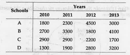
What is the total number of students studying in all the four schools together in the year 2012?View SolutionFollowing table shows the number of students studying in four different schools in four years. Studying the table carefully and answer the questions that follow
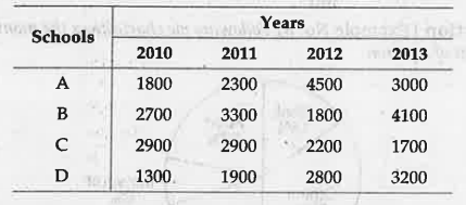
Which scholls has highest number of students in all the years together?View SolutionThe following table shows the classification of percentages of marks of students and the number of students. Draw a frequency polygon from the table.
 View Solution
The following table shows the classification of percentages of marks of students and the number of students.Draw a frequency polygen from the table.
 View Solution
Following table offers an illustration of a frequency distribution. The table shows different class intervals (each showing a range of marks in Statistics) and the corresponding frequencies (each showing the number of students).
 View Solution


