The line graph given above illustrates the maximum and minimum temperatures in the first ten days of June. Summarise the information by selecting and reporting the main features. Make comparisons where necessary.
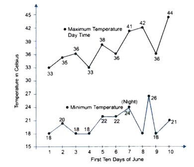
The line chart shown above presents the highest and the lowest temperatures from June 1 to June 10, a time period of ten days. The general trend is similar in the recorded maximum and minimum temperatures during the given period. With the passage of days, both kinds of temperatures show a constant rise. The only exceptions being June 4 where the maximum temperature showed a sudden fall from 36 to 33. Similarly, the minimum temperature 18 on 1st June remained almost steady till it continued rising till June 8 when it showed a sudden drop to 18∘ touching the same level as on June 1. 10 June was the hottest day of the ten-day period when the temperature shot up from 36∘C to 44∘C. It could be clearly observed that the maximum temperature showed more fluctuation than the minimum temperature during the period. The minimum temperature remained rather steady around 18∘C, the only exceptions are the days from June 5 to June 8 where it showed a remarkable rise. Hence, it can be safely concluded that from June 1 as the month progressed the maximum temperature showed a constant rise. The minimum temperature on other hand remained comparatively steady except showing a constant rise from June 5 to June 8.
Topper's Solved these Questions
- COMPOSITION - II (WRITING ANALYTICAL PARAGRAPH ON MAP/CHART/REPORT/ LINE GRAPH)BOOK - FULL MARKSCHAPTER - COMPOSITION - II (WRITING ANALYTICAL PARAGRAPH ON MAP/CHART/REPORT/ LINE GRAPH)EXERCISE - MAKING A BAR GRAPH/CHART
6 Videos
- COMPOSITION - II (WRITING ANALYTICAL PARAGRAPH ON MAP/CHART/REPORT/ LINE GRAPH)BOOK - FULL MARKSCHAPTER - COMPOSITION - II (WRITING ANALYTICAL PARAGRAPH ON MAP/CHART/REPORT/ LINE GRAPH)EXERCISE - PIE CHARTS
4 Videos
- CLOZE PASSAGEBOOK - FULL MARKSCHAPTER - CLOZE PASSAGEEXERCISE - Fill in the most appropriate option in each blank from those given below to complete the following passage.
112 Videos
- COMPOSITION-IBOOK - FULL MARKSCHAPTER - COMPOSITION-IEXERCISE - IV. OFFICIAL LETTERS ON ALL SITUATIONS (SOLVED EXAMPLES)
29 Videos
Similar Questions
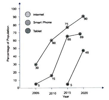
The graph shows the recent technological revolution in India in recent years. Summarises the information by selecting and reporting the main features. Make comparisons where necessary.
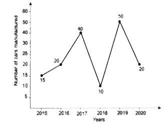
View SolutionThe line graph given below breaks down the number of cars produced in Standard Automobile Company from 2015 to 2020. Summarise the information by selecting and reporting the main features. Make comparisons where necessary.
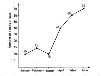
View SolutionThe line-graph chart given below breaks down the sales history of the famous Lifebuoy brand in soap in the first six months of the year, from January to June. Write an analytic paragraph in 150–200 words after selecting and reporting the main features. Make comparions where necessary.
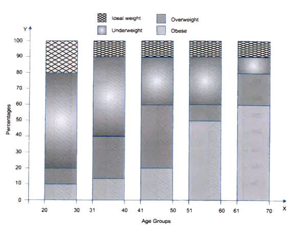
View SolutionThe chart given below illustrates the weight measurements of people in the United States of America in 2020. Summarise the information in an analytic paragraph of 150-200 words by selecting and reporting the main features. Make comparisons where relevant.
View SolutionThe Bar graph given above illustrates the popular games and sports that are played in India and Pakistan. Summarise by writing an analytic paragraph (150-200 words) selecting the main features and details. Compare wherever relevant.
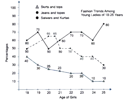
View SolutionThe line graph shown below illustrates the main trends in garments of young ladies of 18 to 25 years. Summarise and write an analytic paragraph in your own words highlighting the main features and details. Compare wherever relevant.
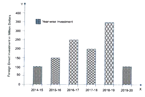
View SolutionThe bar chart given below illustrates the total Foreign Direct Investment (FDI) into India from all over the world. Summarise and write an analytic paragraph selecting the main features and giving all the necessary details. Compare where you find it relevant.
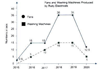
View SolutionThe line graph given below shows the number of Fans and Washing Machines produced by Ruby Electricals between 2015 and 2020. Summarise and write an analytic paragraph highlighting the main trends and the necessary details. Compare wherever relevant.
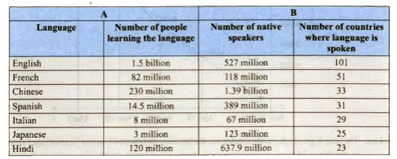
View SolutionThe table below gives information about some of the world's most studied languages. Give an analytic description in a paragraph highlighting and reporting the main features. Don't forget to make comparisons where relevant.
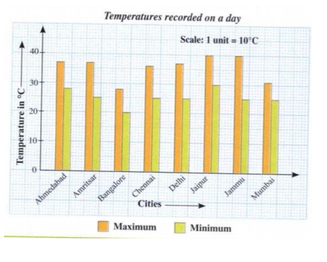
View SolutionThe following graph gives the minimum and maximum temperatures of various cities on a specific day. Read the graph and answer the following questions
Name the two cities where the maximum temperature of one city was less than the minimum temperature of the other city.
View Solution
