The line graph given below breaks down the number of cars produced in Standard Automobile Company from 2015 to 2020. Summarise the information by selecting and reporting the main features. Make comparisons where necessary.
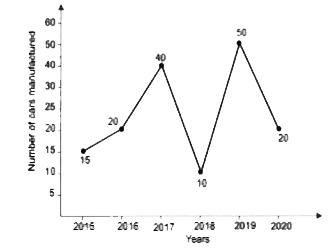
The line-graph given above lists the number of cars manufactured in a leading company, Standard Automobile Company for a time-period of six years from 2015 to 2020. The overall view represents the fluctuations that the company witnessed during these years in manufacturing cars. Making a modest beginning, the company produced just 15 lac cars in the year 2015. The production recorded an increase from 15 to 20 lacs. The rise was a significant 33 per cent. From 2016 to 2017, there was a huge rise of 20 lacs, doubling up the production from 20 to 40 lacs. From 2017, the company witnessed an unexpected huge climb down and in 2018 only 10 lac cars were produced. It marked the lowest point in the production of cars. The company made a dramatic turnaround and in 2019, the manufacturing of cars rocketed to a new height, 50 lacs. Naturally, the production reached at its climax in 2019. From 2019, again the production shows a remarkable fall taking the production of cars to a mere modest number of 20 lacs. The years 2016-2017 and 2018-2019 were the most productive years while the years 2017-2018 and 2019-20 were the least productive years. It can be safely concluded that the company showed sharp fluctuations in its manufacturing of cars. For some unseen reasons, the wonderful rise of 2016-17 and the incredible but dramatic growth in production couldn.t be maintained before and after those years.
Topper's Solved these Questions
- COMPOSITION - II (WRITING ANALYTICAL PARAGRAPH ON MAP/CHART/REPORT/ LINE GRAPH)BOOK - FULL MARKSCHAPTER - COMPOSITION - II (WRITING ANALYTICAL PARAGRAPH ON MAP/CHART/REPORT/ LINE GRAPH)EXERCISE - MAKING A BAR GRAPH/CHART
6 Videos
- COMPOSITION - II (WRITING ANALYTICAL PARAGRAPH ON MAP/CHART/REPORT/ LINE GRAPH)BOOK - FULL MARKSCHAPTER - COMPOSITION - II (WRITING ANALYTICAL PARAGRAPH ON MAP/CHART/REPORT/ LINE GRAPH)EXERCISE - PIE CHARTS
4 Videos
- CLOZE PASSAGEBOOK - FULL MARKSCHAPTER - CLOZE PASSAGEEXERCISE - Fill in the most appropriate option in each blank from those given below to complete the following passage.
112 Videos
- COMPOSITION-IBOOK - FULL MARKSCHAPTER - COMPOSITION-IEXERCISE - IV. OFFICIAL LETTERS ON ALL SITUATIONS (SOLVED EXAMPLES)
29 Videos
Similar Questions
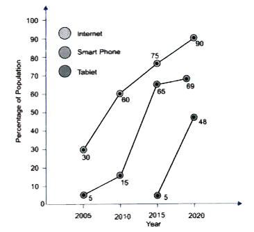
The graph shows the recent technological revolution in India in recent years. Summarises the information by selecting and reporting the main features. Make comparisons where necessary.
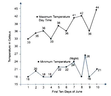
View SolutionThe line graph given above illustrates the maximum and minimum temperatures in the first ten days of June. Summarise the information by selecting and reporting the main features. Make comparisons where necessary.
View Solution
Knowledge Check
The line chart given blow shows the number of cars manufactured (in 000') by company X in year 2015 from the month of July to December.
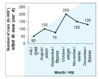
What is the percentage change in the number of cars manufactured in December to that in July?A130B80C160D140The line chart given blow shows the number of cars manufactured (in 000') by company X in year 2015 from the month of July to December.
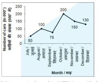
What is the average number of cars manufactured (in 000') by the company X from July to November?A105B100C115D141
The chart given below illustrates the weight measurements of people in the United States of America in 2020. Summarise the information in an analytic paragraph of 150-200 words by selecting and reporting the main features. Make comparisons where relevant.
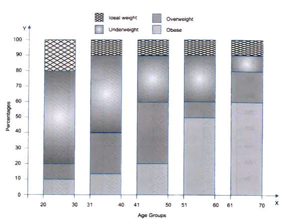
View SolutionThe line-graph chart given below breaks down the sales history of the famous Lifebuoy brand in soap in the first six months of the year, from January to June. Write an analytic paragraph in 150–200 words after selecting and reporting the main features. Make comparions where necessary.
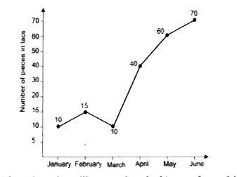
View SolutionThe line graph given below shows the number of Fans and Washing Machines produced by Ruby Electricals between 2015 and 2020. Summarise and write an analytic paragraph highlighting the main trends and the necessary details. Compare wherever relevant.
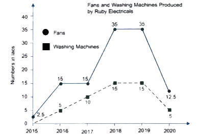
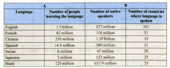
View SolutionThe table below gives information about some of the world's most studied languages. Give an analytic description in a paragraph highlighting and reporting the main features. Don't forget to make comparisons where relevant.
View SolutionThe given table records the number of employees working in Golden Automobiles in various departments from 2015 to 2019. Give an analytic description of the table in your own words. Also give necessary comparisons and contrasts wherever possible.

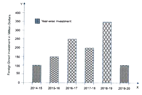
View SolutionThe bar chart given below illustrates the total Foreign Direct Investment (FDI) into India from all over the world. Summarise and write an analytic paragraph selecting the main features and giving all the necessary details. Compare where you find it relevant.
View Solution
