At time t=0, some radioactive gas is injected into a sealed vessel. At time T, some more of the same gas is injected into the same vessel. Which one of the following graphs best represents the variation of the logarithm of the activity A of the gas with time t?
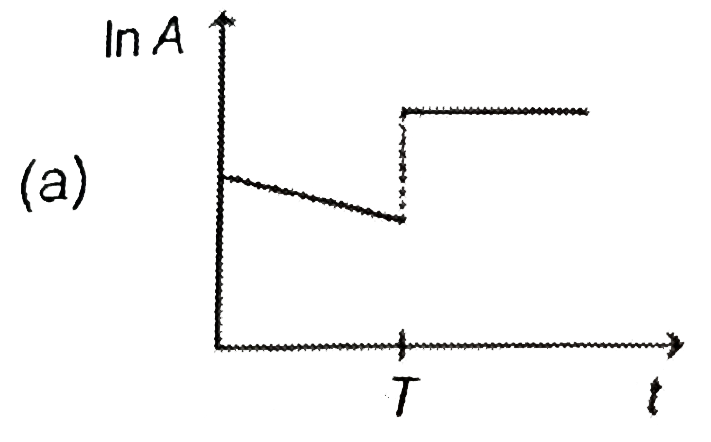
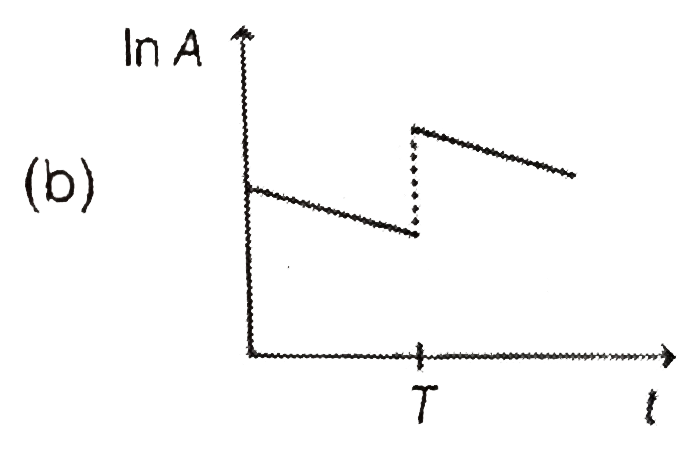
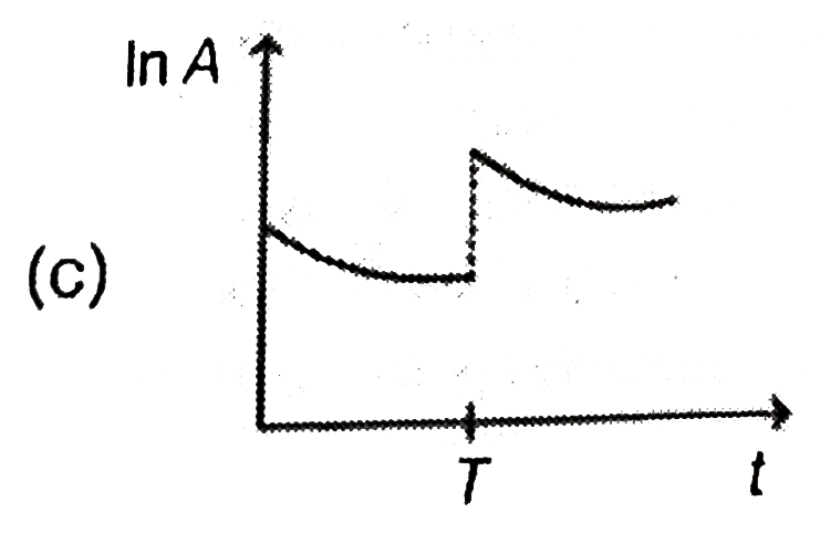
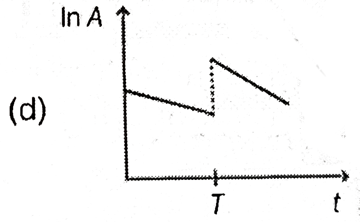
The correct Answer is:B
To solve the problem, we need to analyze the behavior of the activity A of a radioactive gas over time after two injections of gas into a sealed vessel. We will derive the relationship between the logarithm of the activity lnA and time t.
1. Understanding Radioactive Decay:
The activity A of a radioactive substance is given by the equation:
A(t)=A0e−λt
where A0 is the initial activity, λ is the decay constant, and t is time.
2. Taking the Natural Logarithm:
To analyze the relationship in logarithmic terms, we take the natural logarithm of both sides:
lnA(t)=lnA0−λt
This equation represents a straight line with a negative slope.
3. Behavior at Time t=0:
At t=0, the activity is at its maximum, A(0)=A0. Thus, lnA(0)=lnA0.
4. Second Injection at Time T:
At time T, when more gas is injected, the total activity will increase due to the additional radioactive gas. Let’s denote the new activity after the second injection as A1. The activity will still decay but will start from a new initial value:
A1(t)=A0e−λ(t−T)+A2e−λ(t−T)
where A2 is the activity contributed by the newly injected gas.
5. Logarithmic Representation After Second Injection:
After the second injection, the logarithmic activity can be represented as:
lnA(t)=ln(A0+A2e−λ(t−T))−λt
This indicates that after time T, the logarithm of the activity will show a different slope due to the contribution of the newly injected gas.
6. Graphical Representation:
The graph of lnA versus t will show a linear decrease until time T, and after T, it will show a different linear decrease, indicating a change in slope. The first part of the graph will have a slope of −λ, and after T, it will have a different slope, reflecting the new activity level.
Conclusion:
The correct graph will show a linear decrease in lnA until t=T and then a different linear decrease after T. The graph that best represents this behavior is option B.
The activity A of a radioactive substance is given by the equation:
A(t)=A0e−λt
where A0 is the initial activity, λ is the decay constant, and t is time.
To analyze the relationship in logarithmic terms, we take the natural logarithm of both sides:
lnA(t)=lnA0−λt
This equation represents a straight line with a negative slope.
At t=0, the activity is at its maximum, A(0)=A0. Thus, lnA(0)=lnA0.
At time T, when more gas is injected, the total activity will increase due to the additional radioactive gas. Let’s denote the new activity after the second injection as A1. The activity will still decay but will start from a new initial value:
A1(t)=A0e−λ(t−T)+A2e−λ(t−T)
where A2 is the activity contributed by the newly injected gas.
After the second injection, the logarithmic activity can be represented as:
lnA(t)=ln(A0+A2e−λ(t−T))−λt
This indicates that after time T, the logarithm of the activity will show a different slope due to the contribution of the newly injected gas.
The graph of lnA versus t will show a linear decrease until time T, and after T, it will show a different linear decrease, indicating a change in slope. The first part of the graph will have a slope of −λ, and after T, it will have a different slope, reflecting the new activity level.
The correct graph will show a linear decrease in lnA until t=T and then a different linear decrease after T. The graph that best represents this behavior is option B.
Topper's Solved these Questions
- MODERN PHYSICSBOOK - DC PANDEY ENGLISHCHAPTER - MODERN PHYSICSEXERCISE - for JEE Advanced (More than One Options is Correct )
1 Videos
- MODERN PHYSICSBOOK - DC PANDEY ENGLISHCHAPTER - MODERN PHYSICSEXERCISE - Metch the column
6 Videos
- MODERN PHYSICSBOOK - DC PANDEY ENGLISHCHAPTER - MODERN PHYSICSEXERCISE - Integer Type Questions
17 Videos
- MAGNETISM AND MATTERBOOK - DC PANDEY ENGLISHCHAPTER - MAGNETISM AND MATTEREXERCISE - Medical gallery
1 Videos
- MODERN PHYSICS - 1BOOK - DC PANDEY ENGLISHCHAPTER - MODERN PHYSICS - 1EXERCISE - Level 2 Subjective
23 Videos
Similar Questions
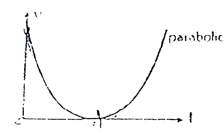
The graph shown the variation with times t of the velocity v of an object . Which one of the following graphs best represents the variation of acceleration a of the object with time t?
View SolutionWhich of the following graph(s) represent retardation ? [v : velocity, t : time, x : position]
View SolutionWhich of the following x-t graphs represents the distance-time variation of a body released from the top of a buiding?
View SolutionThe magnetic flux through a coil varies with timet as shown in the diagram. Which graph best represents the variation of the e.m.f. E induced in the coil with time t?
View SolutionAn alternating current I in an inductance coil varies with time t according to the graph as shown: Which one of the following graph gives the variation of voltage with time?
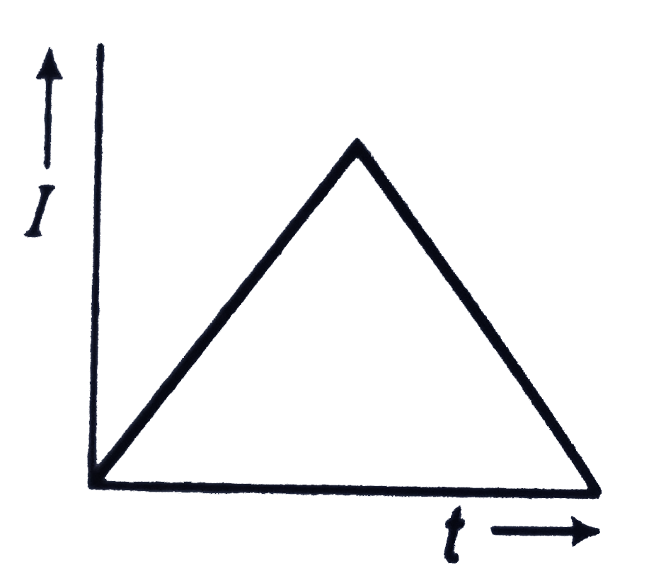
View SolutionAn alternating current I in an inductance coil varies with time t according to the graph as shown: Which one of the following graph gives the variation of voltage with time?

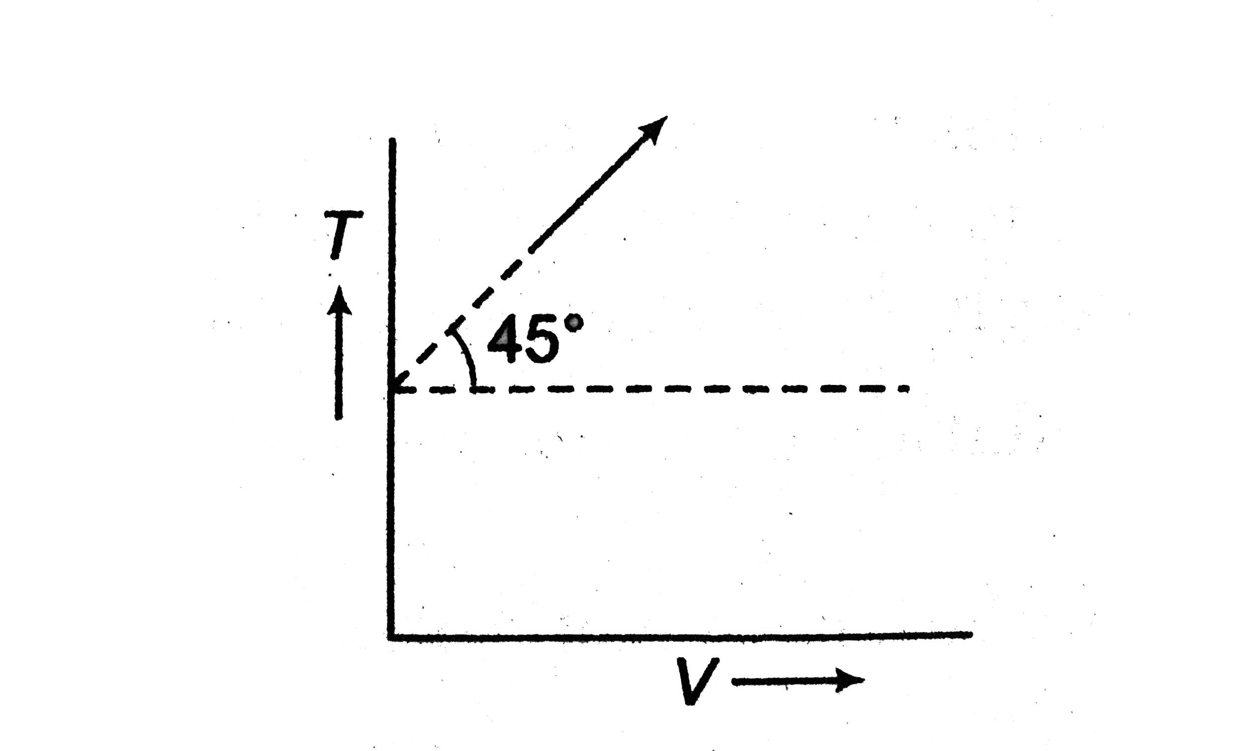
View SolutionThe given curve represents the variation of temperatue as a function of volume for one mole of an ideal gas. Which of the following curves best represents the variation of pressure as a function of volume ?
 .
.
View SolutionThe given curve represents the variation of temperature as a function of volume for one mole of an ideal gas. Which of the following curves best represents the variation of pressure as a function of volume?
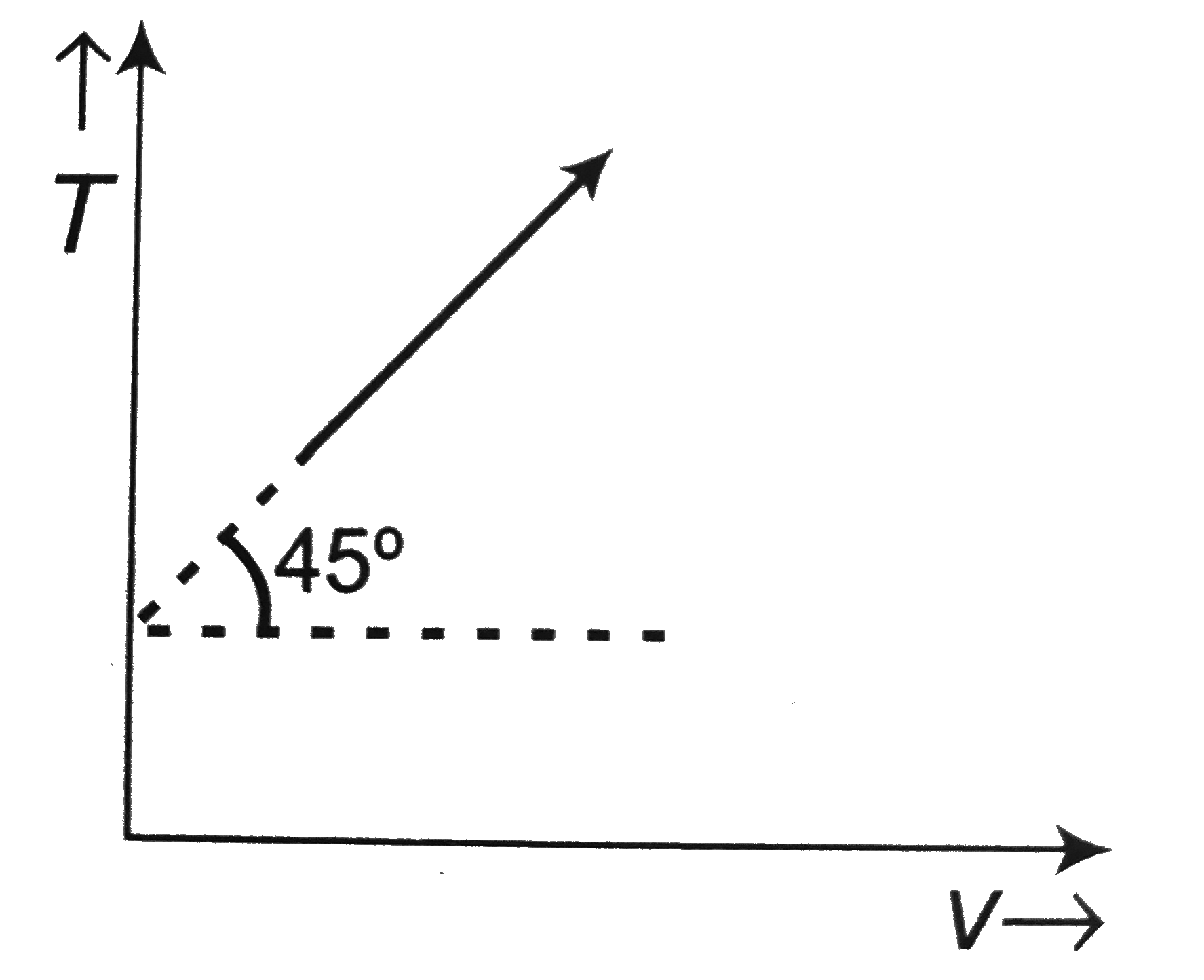
View SolutionThe given curve represents the variation of temperature as a function of volume for one mole of an ideal gas. Which of the following curves best represents the variation of pressure as a function of volume?

View SolutionThe given curve represents the variation of temperatue as a function of volume for one mole of an ideal gas. Which of the following curves best represents the variation of pressure as a function of volume ?
 .
.
View Solution
