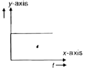
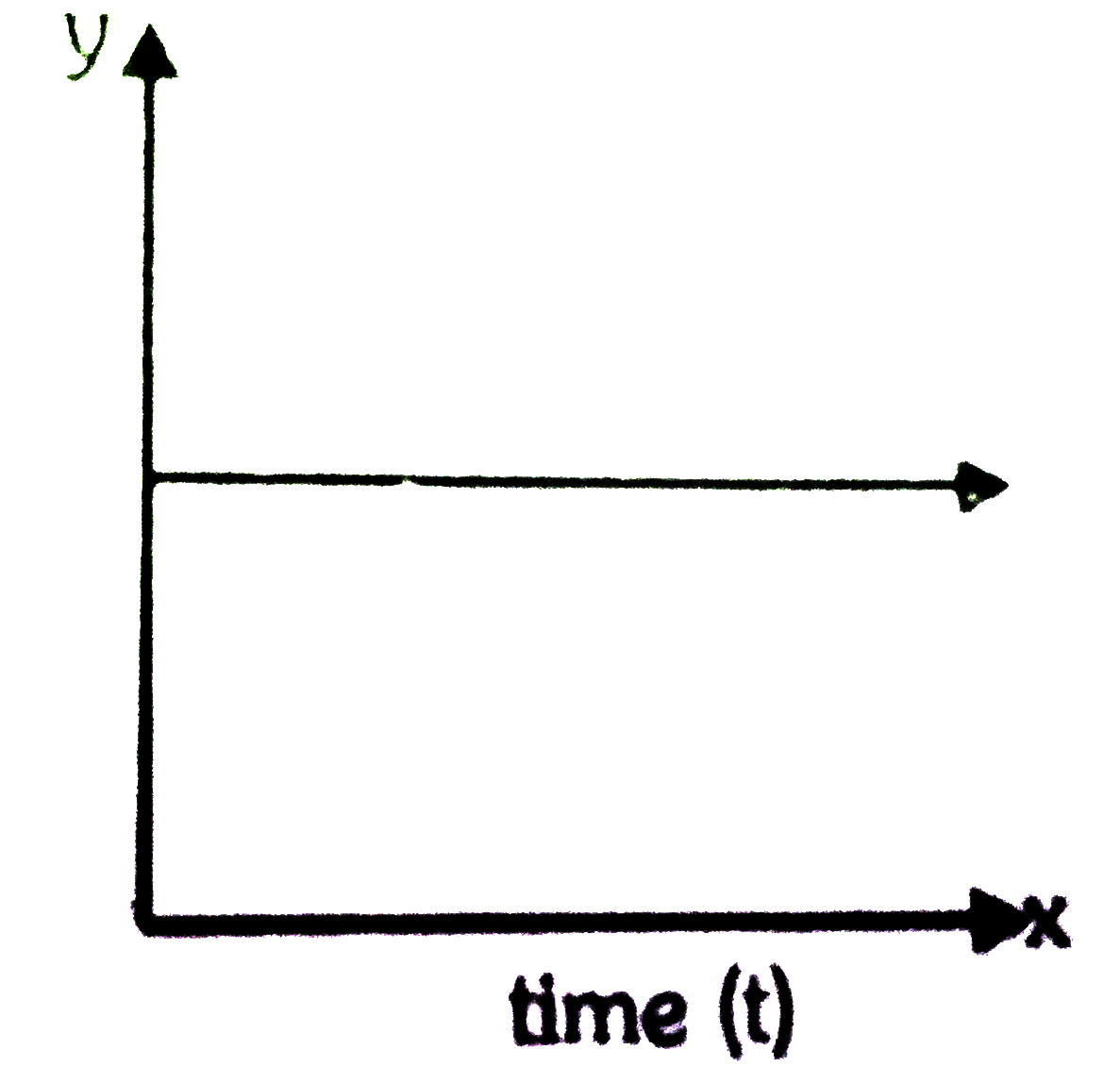
In the graph shown in fig. the time is plotted along x-axis. Which quantity associated with the projectile motion is plotted along the y -axis:-
Kinetic energy
Momentum
Horixzontal velocity
None of the above
The correct Answer is:C
Step by step video & image solution for In the graph shown in fig. the time is plotted along x-axis. Which quantity associated with the projectile motion is plotted along the y -axis:- by Physics experts to help you in doubts & scoring excellent marks in Class 12 exams.
Updated on:21/07/2023Topper's Solved these Questions
- MOTION IN A STRAIGHT LINE & PLANE BOOK - VMC MODULES ENGLISHCHAPTER - MOTION IN A STRAIGHT LINE & PLANE EXERCISE - IMPECCABLE
52 Videos
- MOTION IN A STRAIGHT LINE & PLANE BOOK - VMC MODULES ENGLISHCHAPTER - MOTION IN A STRAIGHT LINE & PLANE EXERCISE - ENABLE
50 Videos
- MOCK TEST 9BOOK - VMC MODULES ENGLISHCHAPTER - MOCK TEST 9EXERCISE - PHYSICS (SECTION 2)
5 Videos
- Motion in Straight Line BOOK - VMC MODULES ENGLISHCHAPTER - Motion in Straight Line EXERCISE - IN-CHAPTER EXERCISE-J
10 Videos
Similar Questions
Knowledge Check
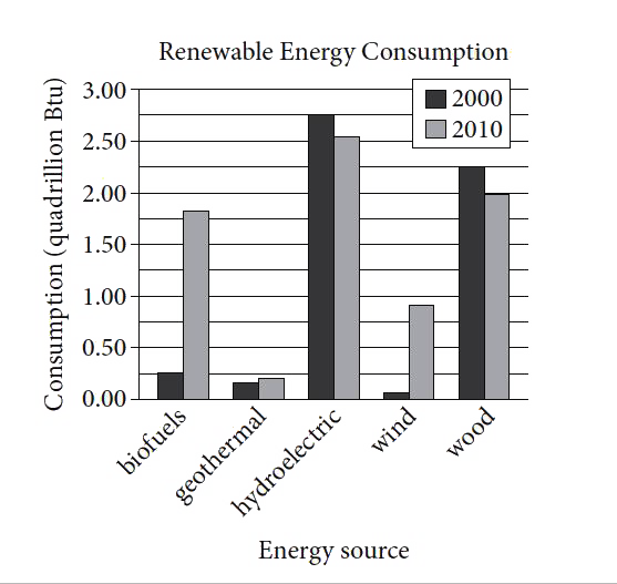
The bar graph above shows renewable energy consumption in quadrillions of British thermal units (Btu) in the United States, by energy source, for several energy sources in the years 2000 and 2010.
In a scatterplot of this data, where renewable energy consumption in the year 2000 is plotted along the x-axis and renewable energy consumption in the year 2010 is plotted along the y-axis for each of the given energy sources, how many data points would be above the line y=x ?A1B2C3D4
The bar graph above shows the verbal and math SAT scores for five students labeled A through E. If a scatterplot of the data in the bar graph is made such that the math SAT score for each student is plotted along the x-axis and their verbal SAT score is plotted along the y-axis, how many of the data points would lie above the line y=x?A1B2C3D4Scientists plotted data for two animal populations on a scatterplot: population A, which they graphed along the x-axis, and population B, which they graphed along the y-axis. The data showed a strong negative correlation. Which of the following statements is justified ?
AThe rise in population A caused the decline in population B.BThe decline in population B caused the rise in population A.CBecause the correlation is negative, there cannot be causation between the two populations.DThe rise in populatin A is correlated to the decline in population B, but causation is unknown.
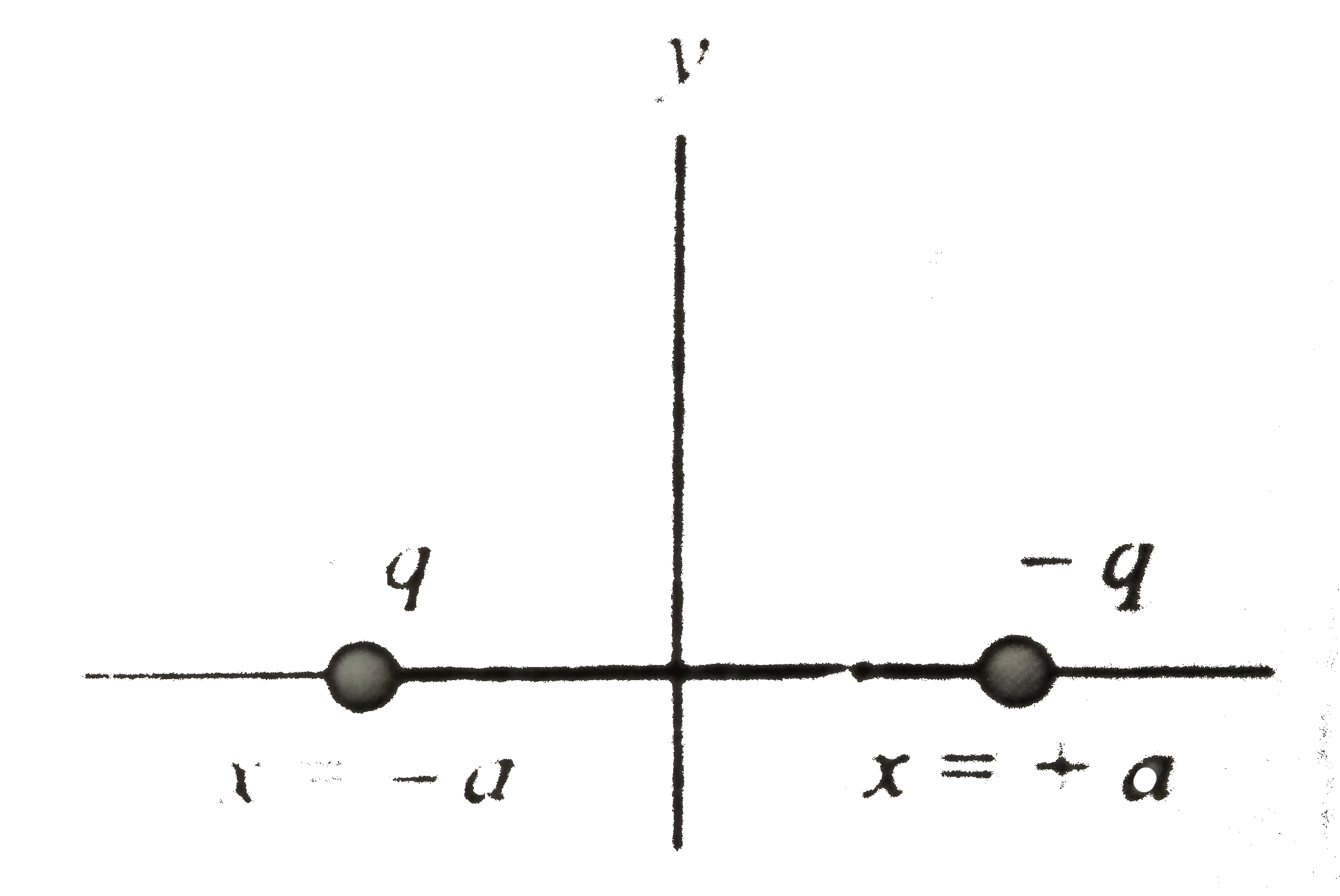
Two point charge ±q are placed on the axis at x=−a and x=+a, as shown in fig.
(i) Plot the variation of E along the x-axis.
(ii) Plot the variation of E along the y-axis.
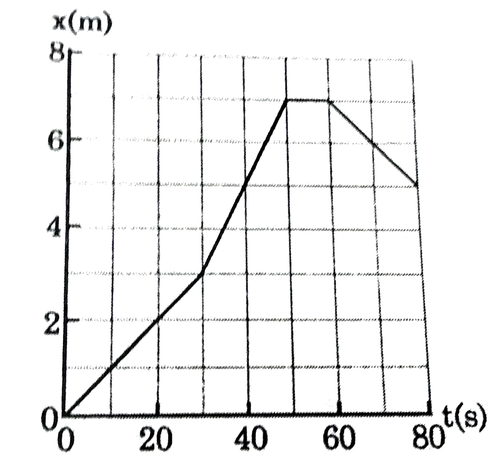
View SolutionGraph represents motion of an object along X-axis for 80 s :-
View SolutionA positively charged particle moving along x-axis with a certain velocity enters a uniform electric field directed along positive y-axis. Its
View SolutionIf a graph is plotted by taking spectral emissive power along y-axis and wavelength along X-axis then the area below the graph above wavelength axis is
View SolutionIn a graph of population, on x-axis time and on y-axis population is plotted. A parallel line to x-axis shows:
View Solution

