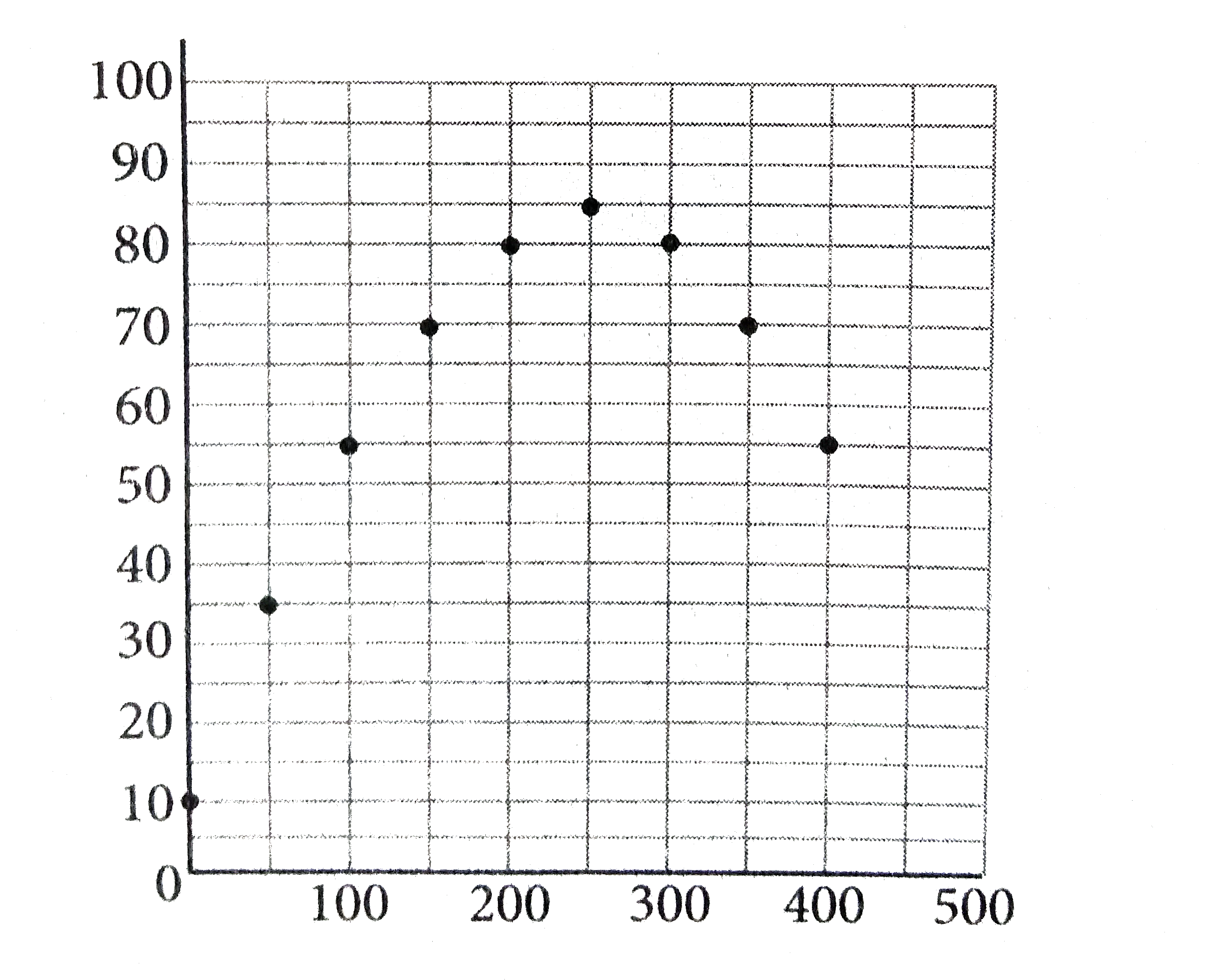
Nine data point were used to generate the scatterplot shown. Assuming all whole number values for the data points, which list correctly gives the domain of the data?
{10,35,55,70,80,85}
{100,200,300,400,500}
{0,50,100,150,200,250,300,350,400}
{0,10,20,30,40,50,60,70,80,90,100}
The correct Answer is:C
Difficult: Easy
Category: Problem Solving and Data Analysis/ Scatterplots
Strategic Advice: The domain of a set of data points is the set of inputs, which corresponds to the x-values of the data points when plotted on a graph. The set of the values that make up the range corresponds to the y-values. To remember this, think alphabetically: x-axis before y-axis, domain before range, so domain corresponds to x-values on a graph.
Getting to the Answer: You don''t need to write each point to find the domain. Just take note of where along the x-axis each of the points is plotted- there is a point on each grib-line between 0 and 400, and the grib-lines increase by 50, so the domain is {0,50,100,150,200,250,300,350,400}, which is (C).
Topper's Solved these Questions
Similar Questions
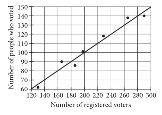
The scatterplot above shows the number of registered voters, x, and the number of people who voted in the last election, y, for seven districts in a town. A line of best fit for the data is also shown. Which of the following could be the equation of the line of best fit?View SolutionThe use of calculator is not permited.
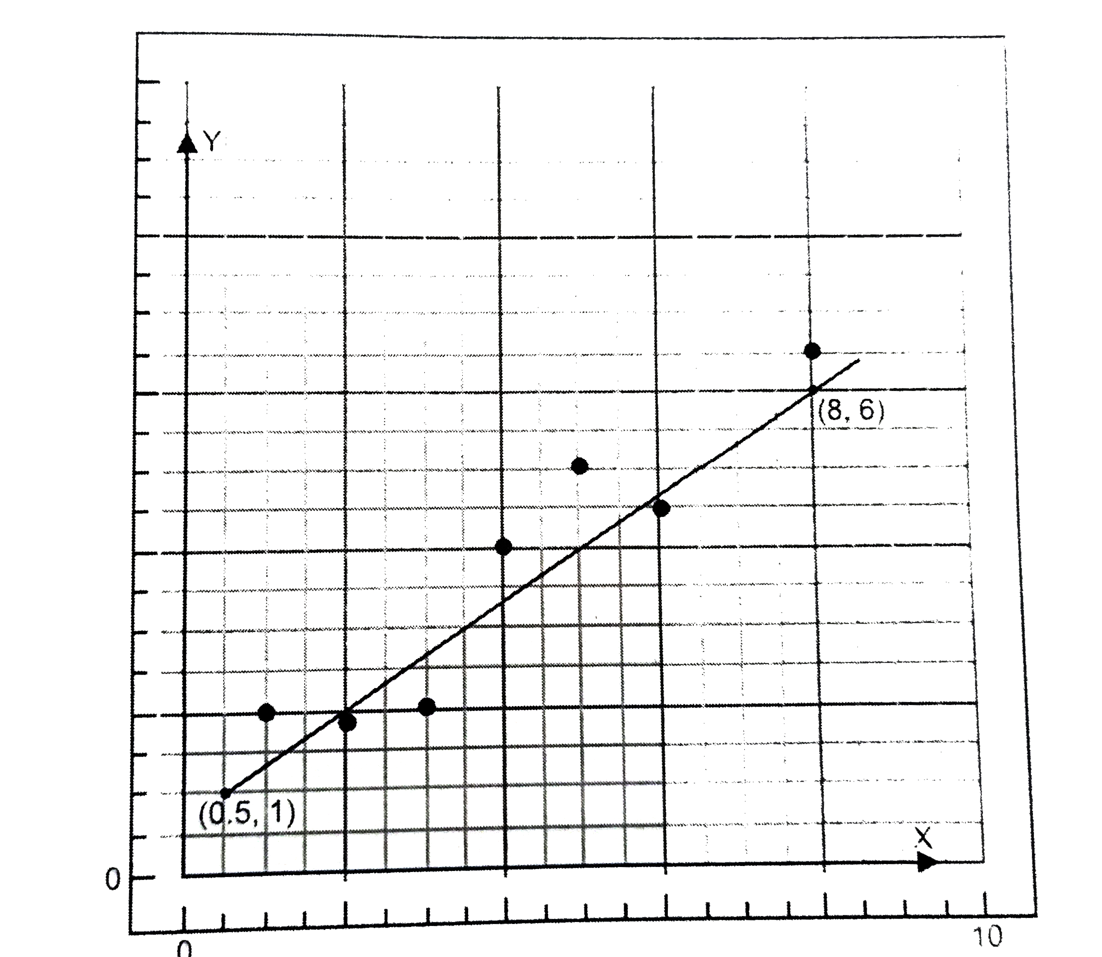
In the graph above ,a number of points are shown, and the line of best fit is also shown. What is the sum of the expected values of the Y coordinates of the points having X values 7 and 9?View Solution
Knowledge Check
- Question 1 - Select One
In the 1990s, the park rangers at Yellowstone National park implemented a program aimed at increasing the dwindling coyote population in Montana. Results of studies of the coyote population in the park are shown in the scatterplot below.
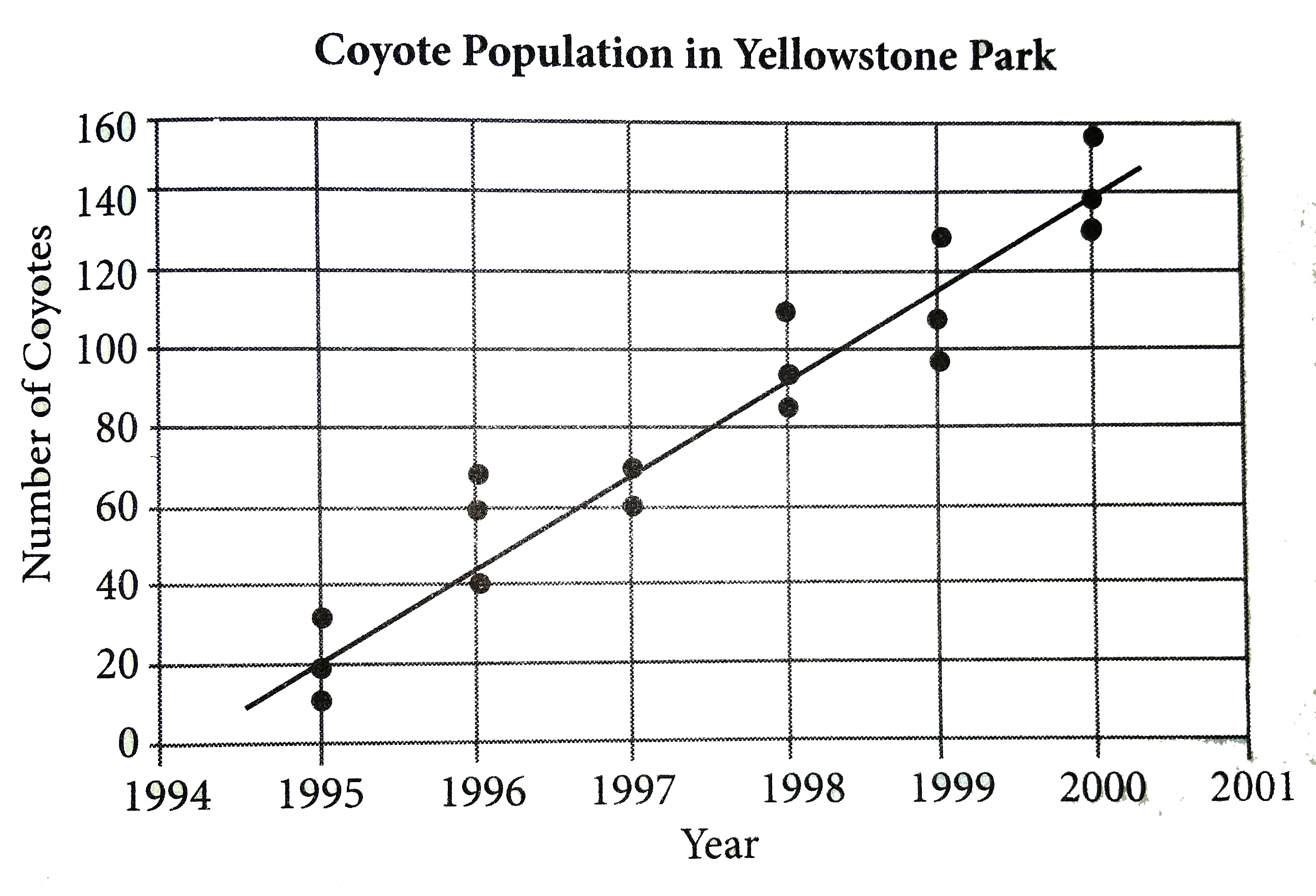
According to the data in the scatterplot, which of the following best represents the percent increase between the median of the results of the studies from 1995 and the median of the results of the studies from 1996?A0.5B1C1.5D2 - Question 2 - Select One
The table below shows the percents of U.S. citizens who had ever consumed Bob's soda , out of all soda consumers , for each year form 1986 through 2006.
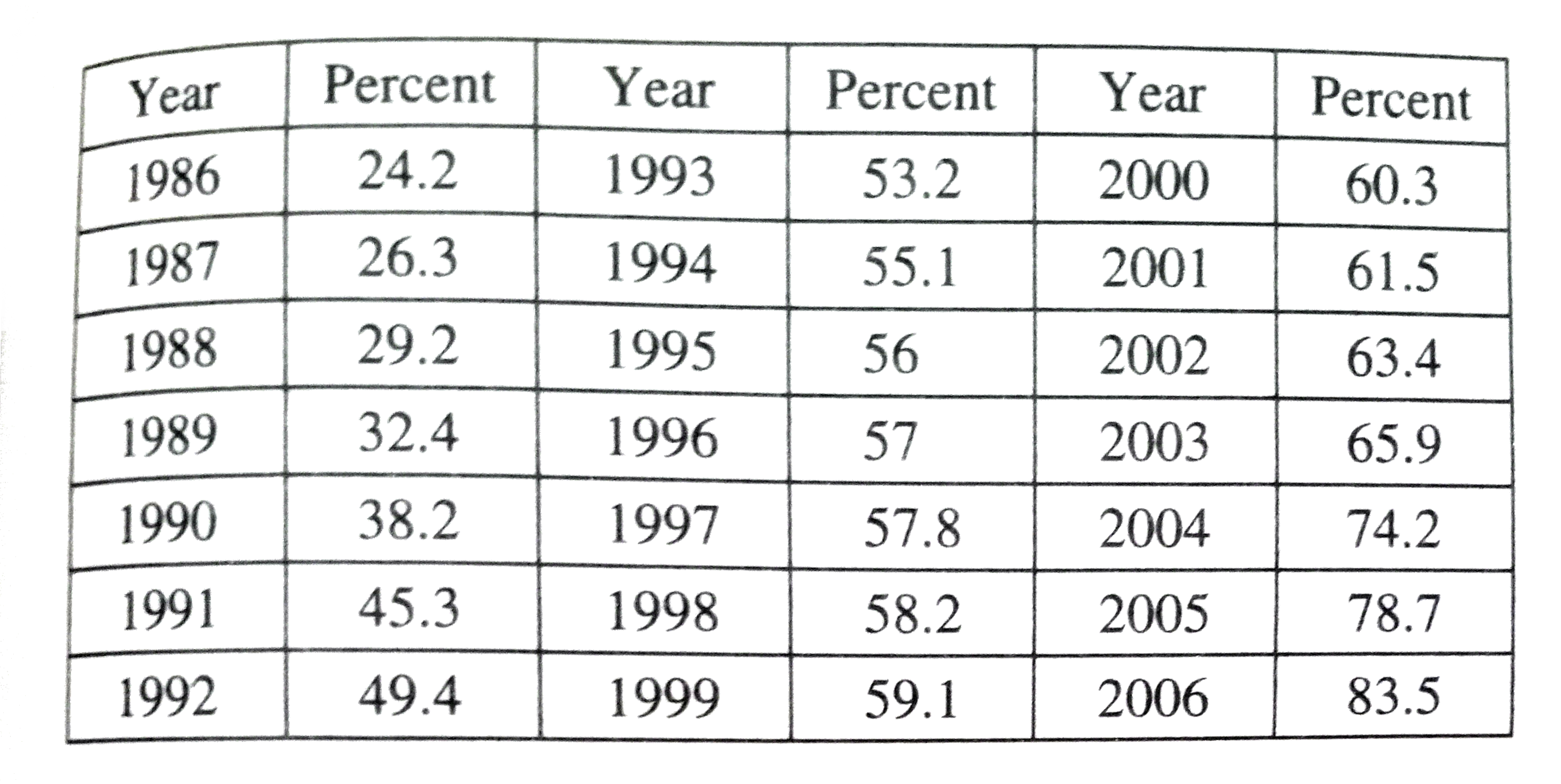
The figure below shows a scatterplot of the data in the table and solid lines that are possible modals for the data. Which of the 5 lines appears to be the best representation of the data ?
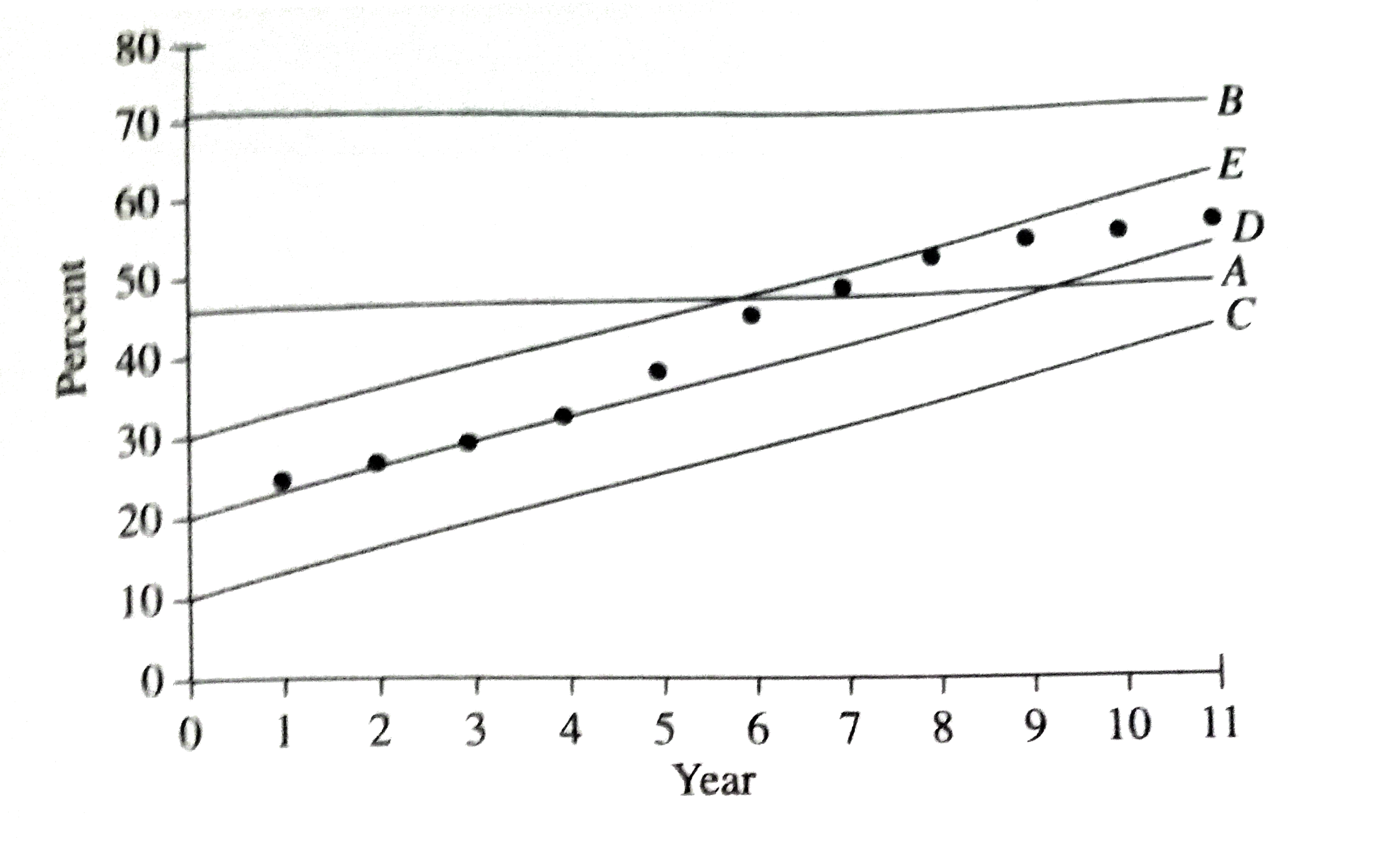 AABBCCDD
 - Question 3 - Select One
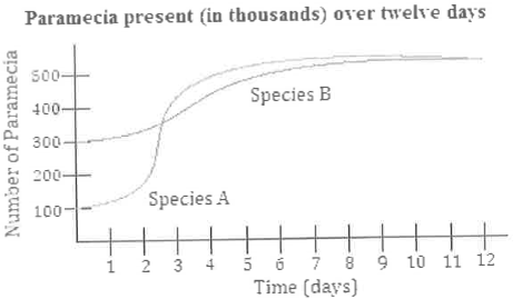
A small puddle is monitored by scientists for the number of paramecia present. The scientists are in two distinct species, let's call them ''species A'' and ''species B''. At time t = 0, the scientists measure and estimate the amount of species A and species B present in the puddle. They then proceed to measure and record the number of each species of paramecium present every hour for 12 days. the data for each species were then fit by a smooth curve, as shown in the graph above. Which of the following is a correct statement about the data above?AAt time t = 0, the number species B present is 150% greater than the number of species A presentBAt time t = 0, the number of species A present is 75% less than the number of species B presentCFor the first 3 days, the average growth rate of species B is higher than the average growth rate of species A.DThe growth rate of both rate of both species A and species B decreases for the last 8 days.
Student in a finance class surveyed 20 percent of the account holders at Docven Bank to determine whether the bank's "Stock Market Special" savings account actually paid account holders the promised 10 percent annual interest rate. The scatterplot above shows the data the students collected from account holders about how long ago they opened their accounts and their current balances. The students calculated a lone of best fit with the equation y=120(1+.0812)12x, whihc means that the bank was actually paying account holders only an 8 percent annual interest rate. Which of the following best explains how the number 120 in the equation relates to the scatterplot?
View SolutionIn a set of n date values, m represents the median. If each number in the set is decreased by 3, which expression represents the median of the revised set of data values?
View Solution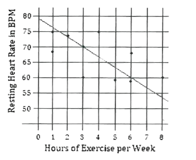
Ten 25 - years - old men were asked how many hours per week they exercise and their resting heart rate was taken in beats per minute (BPM). The results are shown as points in the scatterplot above, and the line of best fit is drawn. What is the resting heart rate, in BPM, of the men represented by the data point that is farthest from the line of best fit?View SolutionTen 25- year - old men were asked how many hours per week they exercise and their resting heart rate was taken in beats per minute (BPM). The results are shown as points in the scatterplot below, and the line of best fit is drawn.
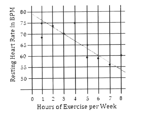
Which of the following is the best interpretation of the slope of the line of best fit in the context of this problem?View SolutionMost chickens reach maturity and begin laying eggs at around 20 weeks of age. From this point forward, however, as the chicken ages,its eges its egg production decreases. A farmer was given a flock of 100 chickens (all of which were the same age) and asked to meaure daily egg output for the entire flock at random intervals starting at maturity until the chickens were 70 weeks old. The data are recorded in the scatteplot below and the line of best fit has been drawn.
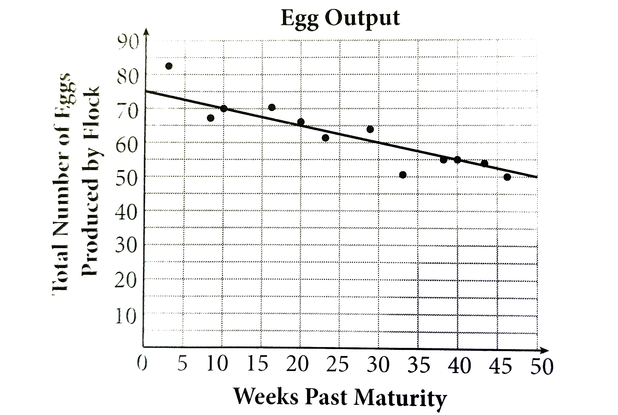
Based on the line of bast fit, what is the predicted number of eggs that will be produced by the flock when it is 33 weeks past maturity ?View Solution
