The graph shows the recent technological revolution in India in recent years. Summarises the information by selecting and reporting the main features. Make comparisons where necessary.
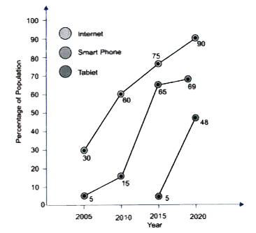
The line graph given above illustrates the sudden outburst of technological revolution in India from 2005 to 2020, over a period of fifteen years. Overall, there was widespread use of communication technology during this time – period. A dramatic rise was witnessed in the use of the Internet, the smart phone and the tablet. The internet and the smart phone started during the same time-period, the year 2005. The Tablet was the latest, the year of entry was 2015. The use of the Internet showed a sharp increase from 30 percent in 2005 to 60 per cent in 2010, a growth of 100 per cent. After a remarkable rise from 60 to 75 percent in 2015, it reached its peak at 90 per cent in 2020. It means that by 2020, nine out of ten Indians were using the Intermet. The Smart Phone made a modest beginnings at 5 per cent in 2005 and rising considerably it reached to 15 per cent in 2010. From there it made a dramatic rise and shot up from 15 per cent to 65 per cent. The Smart Phone showed a steady rise from 65 percent in 2015 to 69 per cent in 2020. The last to enter in this communication revolution was the Tablet. It made a late and modest entry in 2015. But then, it suddenly shot up to 48 percent by 2020. By 2020, one out of two was using the Tablet in India. To conclude, the communication revolution in India was sudden and fast. If it continues like this, every Indian will be a part of this revolution in near future.
Topper's Solved these Questions
- COMPOSITION - II (WRITING ANALYTICAL PARAGRAPH ON MAP/CHART/REPORT/ LINE GRAPH)BOOK - FULL MARKSCHAPTER - COMPOSITION - II (WRITING ANALYTICAL PARAGRAPH ON MAP/CHART/REPORT/ LINE GRAPH)EXERCISE - MAKING A BAR GRAPH/CHART
6 Videos
- COMPOSITION - II (WRITING ANALYTICAL PARAGRAPH ON MAP/CHART/REPORT/ LINE GRAPH)BOOK - FULL MARKSCHAPTER - COMPOSITION - II (WRITING ANALYTICAL PARAGRAPH ON MAP/CHART/REPORT/ LINE GRAPH)EXERCISE - PIE CHARTS
4 Videos
- CLOZE PASSAGEBOOK - FULL MARKSCHAPTER - CLOZE PASSAGEEXERCISE - Fill in the most appropriate option in each blank from those given below to complete the following passage.
112 Videos
- COMPOSITION-IBOOK - FULL MARKSCHAPTER - COMPOSITION-IEXERCISE - IV. OFFICIAL LETTERS ON ALL SITUATIONS (SOLVED EXAMPLES)
29 Videos
Similar Questions
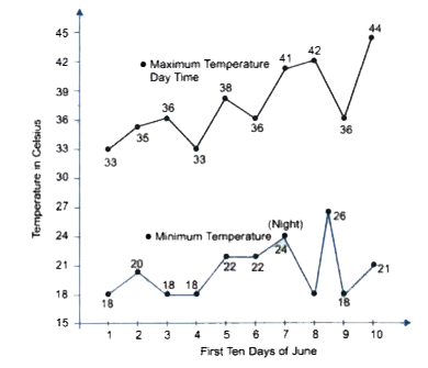
The line graph given above illustrates the maximum and minimum temperatures in the first ten days of June. Summarise the information by selecting and reporting the main features. Make comparisons where necessary.
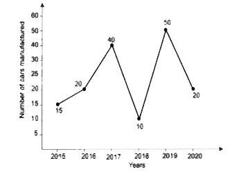
View SolutionThe line graph given below breaks down the number of cars produced in Standard Automobile Company from 2015 to 2020. Summarise the information by selecting and reporting the main features. Make comparisons where necessary.
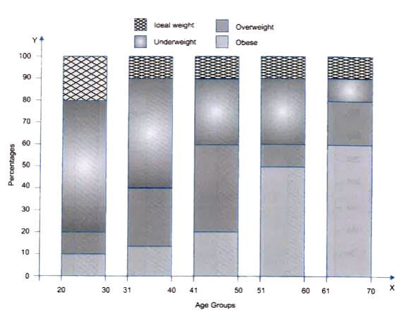
View SolutionThe chart given below illustrates the weight measurements of people in the United States of America in 2020. Summarise the information in an analytic paragraph of 150-200 words by selecting and reporting the main features. Make comparisons where relevant.
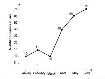
View SolutionThe line-graph chart given below breaks down the sales history of the famous Lifebuoy brand in soap in the first six months of the year, from January to June. Write an analytic paragraph in 150–200 words after selecting and reporting the main features. Make comparions where necessary.
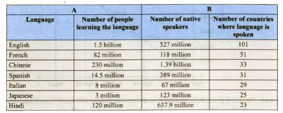
View SolutionThe table below gives information about some of the world's most studied languages. Give an analytic description in a paragraph highlighting and reporting the main features. Don't forget to make comparisons where relevant.
View SolutionThe Bar graph given above illustrates the popular games and sports that are played in India and Pakistan. Summarise by writing an analytic paragraph (150-200 words) selecting the main features and details. Compare wherever relevant.
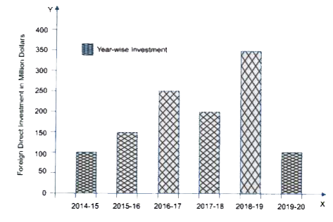
View SolutionThe bar chart given below illustrates the total Foreign Direct Investment (FDI) into India from all over the world. Summarise and write an analytic paragraph selecting the main features and giving all the necessary details. Compare where you find it relevant.
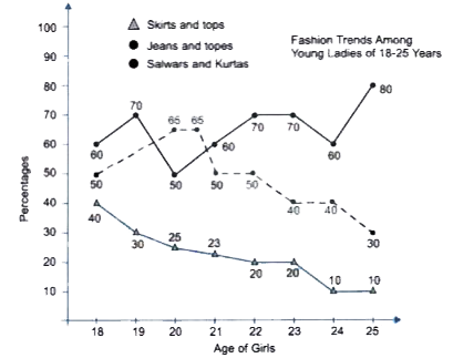
View SolutionThe line graph shown below illustrates the main trends in garments of young ladies of 18 to 25 years. Summarise and write an analytic paragraph in your own words highlighting the main features and details. Compare wherever relevant.
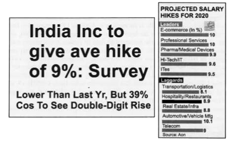
View SolutionThe given report presented by Times News Network illustrates the average salaries of India Inc. to its employees for 2020. Summarise by writing an analytic paragraph (150-200 words) highlighting the main features and details. Compare wherever relevant.
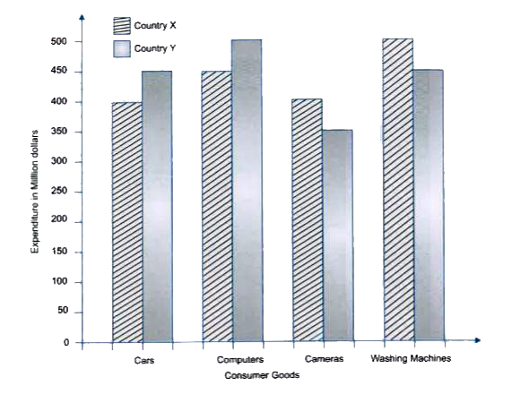
View SolutionThe chart below shows the expenditure of two countries X and Y on consumer goods in 2020 in US million dollars.
Summarise and write an analytic paragraph highlighting main features and necessary details in 150-200 words. Compare where relevant.
View Solution
