Given below is a table which shows the yearwise strength of a school. Represent this data by a bar graph.

Step by step video & image solution for Given below is a table which shows the yearwise strength of a school. Represent this data by a bar graph. by Maths experts to help you in doubts & scoring excellent marks in Class 9 exams.
Topper's Solved these Questions
- BOOK - RS AGGARWALCHAPTER - BAR GRAPH, HISTOGRAM AND FREQUENCY POLYGONEXERCISE - EXERCISE 17B16videos
BAR GRAPH, HISTOGRAM AND FREQUENCY POLYGON
- BOOK - RS AGGARWALCHAPTER - BAR GRAPH, HISTOGRAM AND FREQUENCY POLYGONEXERCISE - EXAMPLE11videos
BAR GRAPH, HISTOGRAM AND FREQUENCY POLYGON
- BOOK - RS AGGARWALCHAPTER - AREAS OF TRIANGLES AND QUADRILATERALSEXERCISE - Multiple Choice Questions (Mcq)16videos
AREAS OF TRIANGLES AND QUADRILATERALS
- BOOK - RS AGGARWALCHAPTER - CIRCLES EXERCISE - MULTIPLE CHOICE QUESTION(MCQ)37videos
CIRCLES
Similar Questions
Knowledge Check
- Question 1 - Select One
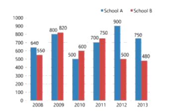
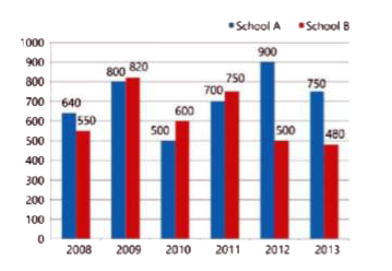
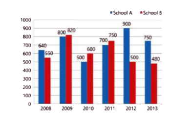
The given bar graph shows the number of students of two schools over a period of six years.

In the bar graph, what is the ratio of the average of the total students from school A to the average of the total students from school B ?A429:799B370:429C429:370D799:429
The following table shows the interest of students of a school in different games :

Represent the data by using a simple bar diagram.View SolutionThe given bar graph shows the number of students of two schools over a period of six years.

In the bar graph, in which year is the absolme difference of the students from schools A to B taken together, the maximum?View SolutionThe given bar graph shows the number of students of two schools over a period of six years.

In the bar graph, what is the ratio of the average of total students from school B to the average of total students from school A?View SolutionThe strength of a school form 2014 to 2018 are given below :
 View Solution
The following data shows the number of students who attended the school on weekdays. Draw a bar graph to represent information by using appropriate scale.
 View Solution
The table below shows the yield of jowar per acre.Show the data by hiostogram
 View Solution
Two hundred students of 6th and 7th class were asked to name their favourite colour so as to decide upon what should be the colour of their School Building. The results are shown in the following table. Represent the given data on a bar graph.
View Solution

