The following data gives the amount of loans (in crores of rupees) disbursed by a bank during some years: Year, 1992, 1993, 1994, 1995, 1996 Loan (in crores of rupees), 28, 33, 55, 55, 80 Represent the above data with the help of a bar graph. With the help of the bar graph, indicate the year in which amount of loan is not increased over that of the preceding year.
To solve the problem step by step, we will represent the data in a bar graph and identify the year when the loan amount did not increase compared to the previous year.
Step 1: Organize the Data
First, we need to organize the given data in a tabular format.
| Year | Loan Amount (in crores) |
|------|--------------------------|
| 1992 | 28 |
| 1993 | 33 |
| 1994 | 55 |
| 1995 | 55 |
| 1996 | 80 |
Step 2: Draw the Axes
Next, we will draw the axes for the bar graph.
- The x-axis will represent the years (1992, 1993, 1994, 1995, 1996).
- The y-axis will represent the loan amounts in crores. We will mark the y-axis with appropriate intervals (for example, 0, 10, 20, 30, 40, 50, 60, 70, 80, 90).
Step 3: Plot the Data
Now, we will plot the data on the bar graph.
- For 1992, the loan amount is 28 crores. Draw a bar that reaches just below 30 on the y-axis.
- For 1993, the loan amount is 33 crores. Draw a bar that reaches just above 30 on the y-axis.
- For 1994, the loan amount is 55 crores. Draw a bar that reaches up to 55 on the y-axis.
- For 1995, the loan amount is 55 crores (same as 1994). Draw a bar that also reaches up to 55 on the y-axis.
- For 1996, the loan amount is 80 crores. Draw a bar that reaches up to 80 on the y-axis.
Step 4: Analyze the Bar Graph
After plotting the bars, we need to analyze the graph to identify the year when the loan amount did not increase compared to the previous year.
- Looking at the bars, we can see that from 1994 to 1995, the loan amount remained the same (55 crores). Therefore, the amount of loan did not increase in 1995 compared to 1994.
Conclusion
The year in which the amount of loan did not increase over that of the preceding year is 1995.
---
First, we need to organize the given data in a tabular format.
|------|--------------------------|
| 1992 | 28 |
| 1993 | 33 |
| 1994 | 55 |
| 1995 | 55 |
| 1996 | 80 |
Next, we will draw the axes for the bar graph.
- The y-axis will represent the loan amounts in crores. We will mark the y-axis with appropriate intervals (for example, 0, 10, 20, 30, 40, 50, 60, 70, 80, 90).
Now, we will plot the data on the bar graph.
- For 1993, the loan amount is 33 crores. Draw a bar that reaches just above 30 on the y-axis.
- For 1994, the loan amount is 55 crores. Draw a bar that reaches up to 55 on the y-axis.
- For 1995, the loan amount is 55 crores (same as 1994). Draw a bar that also reaches up to 55 on the y-axis.
- For 1996, the loan amount is 80 crores. Draw a bar that reaches up to 80 on the y-axis.
After plotting the bars, we need to analyze the graph to identify the year when the loan amount did not increase compared to the previous year.
The year in which the amount of loan did not increase over that of the preceding year is 1995.
Topper's Solved these Questions
Similar Questions
Following pictograph shows the number of tractors in five villages. Observe the pictograph and answer the following questions. (i) Which village has the minimum number of tractors? (ii) Which village has the maximum number of tractors? (iii) How many more tractors village C has as compared to village B. (iv) What is the total number of tractors in all the five villages?
View SolutionGiven below are the ages of 25 students of class VIII in a school. Prepare a discrete frequency distribution. 15,16,16,14,17,17,16,15,15,16,16,17,15,16,16,14,16,15,14,15,16,16,15,14,15
View SolutionThe following data gives the amount of loans (in crores of rupees) disbursed by a bank during some years: Year, 1992, 1993, 1994, 1995, 1996 Loan (in crores of rupees), 28, 33, 55, 55, 80 Represent the above data with the help of a bar graph. With the help of the bar graph, indicate the year in which amount of loan is not increased over that of the preceding year.
View SolutionThe following data gives the amount of manure (in thousand tonnes) manufactured by a company during some years: Year, 1992, 1993, 1994, 1995, 1996, 1997 Manure (In thousand tonnes), 15, 35, 45, 30, 40, 20 Represent the above data with the help of a bar graph. Indicate with the help of the bar graph the year in which the amount of manure manufactured by the company was maximum. Choose the correct alternative: The consecutive years during which there was maximum decrease in manure production are: 1994 to 1995 (b) 1992 and 1993 1996-1997 (d) 1995 and 1996
View SolutionThe table given below represents the amount of education loan ( in Rs. Crores ) disbursed by 5 banks of a country over 5 years.

What is the percentage increase in education loan disbursed by Bank 2 from 2010 to 2014 ?
View SolutionThe table given below represents the amount of education loan ( in Rs. Crores ) disbursed by 5 banks of a country over 5 years.

Which banks show a continuous trend of increase /decrease in loan amount disbursed over 5 years ?
View SolutionThe table given below represents the amount of education loan ( in Rs. Crores ) disbursed by 5 banks of a country over 5 years.

What can be said about the two following ratios ?
I. Loan amount disbursed by Bank 1 in 2011/Loan amount disbursed by Bank 2 in 2014
II. Loan amount disbursed by Bank 3 in 2014/Loan amount disbursed by Bank 4 in 2011
View SolutionThe table given below represents the amount of education loan ( in Rs. Crores ) disbursed by 5 banks of a country over 5 years.

Which of the following is the correct order of percentage increase in loan amount disbursed by the given banks from 2010 to 2014 ?
View SolutionThe following data gives the amount of manure (in thousand tonnes) manufactured by a company during some years: year 1992 1993 1994 1995 1996 1997 Manure (in thousand tonnes) 15 35 45 30 40 20 (i) Represent the above data with the help of a bar graph. (ii) Indicate with the help of the bar graph the year in which the amount of manufactured by the company was maximum. (iii) Choose the correct alternative: The consecutive years during which there was maximum decrease in manure production are: (a 1994 and 1995 (b) 1992 and 1993(c) 1996 and 1997 (d) 1995 and 1996
View SolutionThe following data gives the amount of manure (in thousand tonnes) manufactured by a company during some years: Year 1992 1993 1994 1995 1996 1997 Production (in Thousand tonnes) 15 35 45 30 40 20 Represent the above data with the help of a bar graph. Indicate with the help of the bar graph the year in which the amount of manufactured by the company was maximum. Choose the correct alternative: The consecutive years during which there was maximum decrease in manure production are: 1994 and 1995 (b) 1992 and 1993 1996 and 1997 (d) 1995 and 1996
View SolutionThe following data gives the value (in crores of rupees) of the Indian export of cotton textiles for different years: Years, 1982, 1983-84, 1984-85, 1985-86, 1986-87 Value of Exports of Cotton Textiles (in corores of rupees), 300, 325, 475, 450, 550 Represent the above data with the help of a bar graph. Indicate with the help of a bar graph the year in which the rate of increase in exports is maximum over the preceding year.
View SolutionThe following data gives the amount of manure (in thousand tonnes) manufactured by a company during some years: Year, 1992, 1993, 1994, 1995, 1996, 1997 Manure (In thousand tonnes), 15, 35, 45, 30, 40, 20 Represent the above data with the help of a bar graph. Indicate with the help of the bar graph the year in which the amount of manure manufactured by the company was maximum. Choose the correct alternative: The consecutive years during which there was maximum decrease in manure production are: 1994 to 1995 (b) 1992 and 1993 1996-1997 (d) 1995 and 1996
View SolutionThe following data gives the amount of loans (in crores of rupees) disbursed by a bank during some years: Year, 1992, 1993, 1994, 1995, 1996 Loan (in crores of rupees), 28, 33, 55, 55, 80 Represent the above data with the help of a bar graph. With the help of the bar graph, indicate the year in which amount of loan is not increased over that of the preceding year.
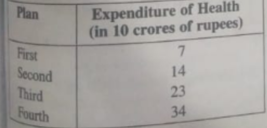
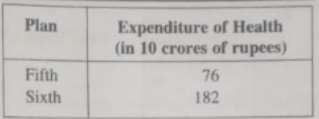
View SolutionThe expenditure(in 10 crores of rupees) on health by the Government of India during the various five year plan is shown below:
Construct a bar graph to represent the above data. .
. .
.
View SolutionNumber of sick industrial units in different years (xx 1000) and outstanding bank loan (xx 100) in crore rupees What was the difference (in Rs. crore) of bank loan amount in the year 1996 and 1997?
View Solution