Draw a labelled graph showing the variation of inductive reactance (XL) verses frequency (f)
To draw a labeled graph showing the variation of inductive reactance XL versus frequency f, we can follow these steps:
Step 1: Understand the Relationship
Inductive reactance XL is given by the formula:
XL=ωL
where ω is the angular frequency. Since ω=2πf, we can rewrite the equation as:
XL=2πfL
Step 2: Identify the Axes
- The x-axis will represent the frequency f.
- The y-axis will represent the inductive reactance XL.
Step 3: Determine the Slope
From the equation XL=2πLf, we can see that the slope of the graph is 2πL. This means that for every increase in frequency, the inductive reactance increases linearly.
Step 4: Draw the Graph
1. Draw a Cartesian coordinate system with the x-axis labeled as "Frequency (f)" and the y-axis labeled as "Inductive Reactance XL".
2. Since the relationship is linear, draw a straight line starting from the origin (0,0) and extending upward to the right. This line represents the direct proportionality between XL and f.
3. Label the line with the equation XL=2πLf to indicate the relationship.
Step 5: Label the Slope
Indicate that the slope of the line is 2πL on the graph. This shows how steep the line is, which depends on the inductance L.
Final Graph
The final graph will show a straight line passing through the origin, indicating that as frequency increases, inductive reactance also increases linearly.
---
Inductive reactance XL is given by the formula:
XL=ωL
where ω is the angular frequency. Since ω=2πf, we can rewrite the equation as:
XL=2πfL
- The x-axis will represent the frequency f.
- The y-axis will represent the inductive reactance XL.
From the equation XL=2πLf, we can see that the slope of the graph is 2πL. This means that for every increase in frequency, the inductive reactance increases linearly.
1. Draw a Cartesian coordinate system with the x-axis labeled as "Frequency (f)" and the y-axis labeled as "Inductive Reactance XL".
2. Since the relationship is linear, draw a straight line starting from the origin (0,0) and extending upward to the right. This line represents the direct proportionality between XL and f.
3. Label the line with the equation XL=2πLf to indicate the relationship.
Indicate that the slope of the line is 2πL on the graph. This shows how steep the line is, which depends on the inductance L.
The final graph will show a straight line passing through the origin, indicating that as frequency increases, inductive reactance also increases linearly.
Similar Questions
Knowledge Check
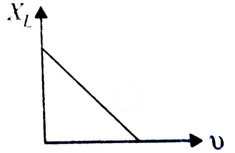
Which of the following graphs represent the correct variation of inductive reactance XL with frequency υ?
A B
B C
C D
D
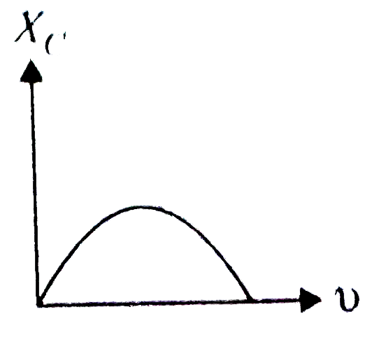
Identify the graph which correctly reperesents the variation of capacitive reactance XC with frequency
A B
B C
C D
D
Draw a labelled graph showing variation of relative intensity of X-rays versus their wavelength λ. Mark of λmin on the graph.
(ii) State how the value of λmin can be varied.
View SolutionThe figure shows the graphical variation of the reactance of a capacitor with frequency of ac source. (a) find the capacitance of the capacitor (b)an ideal inductor has the same reactance at 100 Hz frequency as the capacitor has the same frequency find the value of the inductor. (c) draw the graph showing the variation of the reactance of this inductor with frequency

View SolutionDraw a graph showing the variation of decay rate with number of active nuclei.
View SolutionExplain the term 'inductive reactance'.Show graphically the variation of inductive reactance with frequency of the applied alternating voltage.
An a.c. voltage E=E0sinωt is applied across a pure inductor L.Show mathematically that the current flowing through it lags behind the applied voltage by a phase angle of π/2.
View SolutionWhich of the following curves correctly represent the variation of capacitve reactance (XC) with frequency (f) ?
View SolutionIdentify the graph which correctly reperesents the variation of capacitive reactance XC with frequency
View Solution

