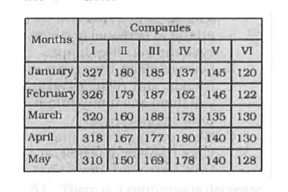
Direction: The following table shows the production of fertilizers (in lakh tonne) by six companies for 5 months (January to May)
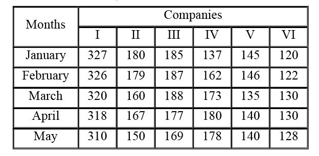
There is a continuous decrease in production over the months in:
Company IV/ कंपनी IV
Company III/ कंपनी III
Company I / कंपनी I
Company II/ कंपनी II
Step by step video & image solution for Direction: The following table shows the production of fertilizers (in lakh tonne) by six companies for 5 months (January to May) There is a continuous decrease in production over the months in: by Maths experts to help you in doubts & scoring excellent marks in Class 14 exams.
Updated on:21/07/2023Topper's Solved these Questions
Similar Questions
The following table shows the production of fertilizers (in lakh tonne) by six companies for 5 months (January to May). Study the table and answer the questions.
There is a continuous decrease in production over the months in:
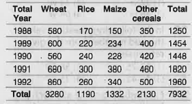
View SolutionDirection :- The following table shows the production of food grains (in million tonnes) in a state for the period 1988 to 1992. Read the table and answer the following questions.

View Solution
Knowledge Check
The following graph shows the production of cotton cloth (in lakh metres) by three companies A, B and C over the years.
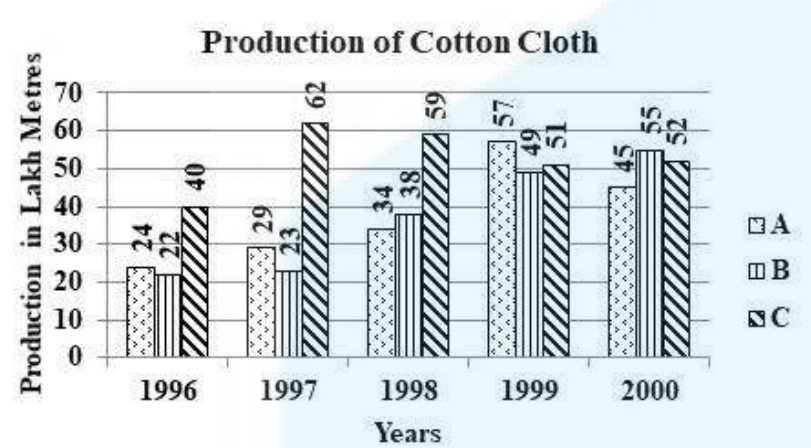
What is the ratio of the production of Company C in the years 1996 and 1997 to the production of Company B in the years 1999 and 2000?A3:11B51:52C11:3D52:51The following graph shows the production of wheat flour (in 1000 tonnes) by three companies X, Y and Z over the years. Study the graph and answer the questions.
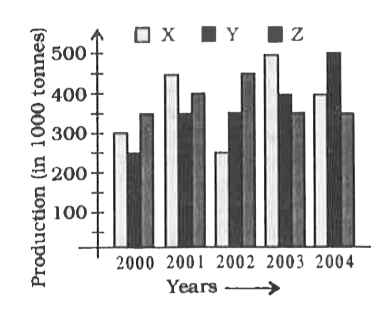
The average production for five years was maximum for which company ?A100B200C20D2
Direction :- The following table shows the production of food grains (in million tonnes) in a state for the period 1988 to 1992. Read the table and answer the following questions.
During 1990, the percentage of decrease in production of maize as against the previous year was
View SolutionThe following graph shows the production of wheat flour (in 1000 tonnes) by three companies X, Y and Z over the years. Study the graph and answer the questions.

The average production for five years was maximum for which company ?
View SolutionThe bar graph given below shows the data of the production of paper (in lakh tonnes) by three different companies P, Q and R over the years.
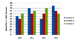
What is the percentage increase in the productionby company Q from 2010 to 2013?
View SolutionThe following graph shows the production of wheat flour (in 1000 tonnes) by three companies X, Y and Z over the years. Study the graph and answer the questions.
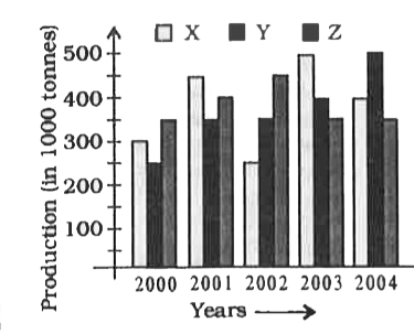
What is the percentage Increase in the production of company Y from 2002 to 2003?
View SolutionThe following graph shows the production of wheat flour (in 1000 tonnes) by three companies X, Y and Z over the years. Study the graph and answer the questions.
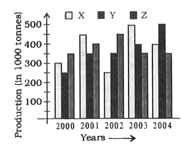
What is the difference between the production of company Z in 2004 and company Y in 2000 (in thousand tonnes)?
View SolutionThe following graph shows the production of wheat flour (in 1000 tonnes) by three companies X, Y and Z over the years. Study the graph and answer the questions.
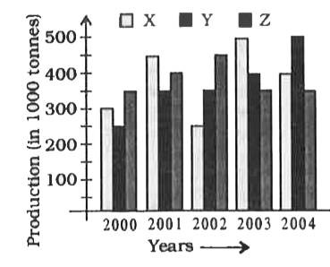
What is the ratio of the average production of company X in the period 2002-2004 to the average production of company Y in the same period ?
View Solution
