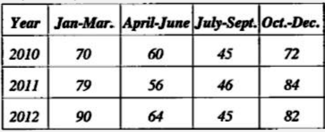
Production of passenger cars, U.S.A. (tens of thousands)

Calculate the 4-quarterly moving averages and then draw the graphs of the given series and the moving averages. Briefly comment on the general trend.
The correct Answer is:24.63,25.00,26.50,29.38,32.13,35.50,38.38,38.63. The general trend showed that the demand of cars was increasing year after year.
Topper's Solved these Questions
- MOVING AVERAGEBOOK - ICSECHAPTER - MOVING AVERAGEEXERCISE - CHAPTER TEST
5 Videos
- MOVING AVERAGEBOOK - ICSECHAPTER - MOVING AVERAGEEXERCISE - CHAPTER TEST
5 Videos
- MODEL TEST PAPERS 01BOOK - ICSECHAPTER - MODEL TEST PAPERS 01EXERCISE - Section C
8 Videos
- PARABOLABOOK - ICSECHAPTER - PARABOLAEXERCISE - CHAPTER TEST
8 Videos
Similar Questions
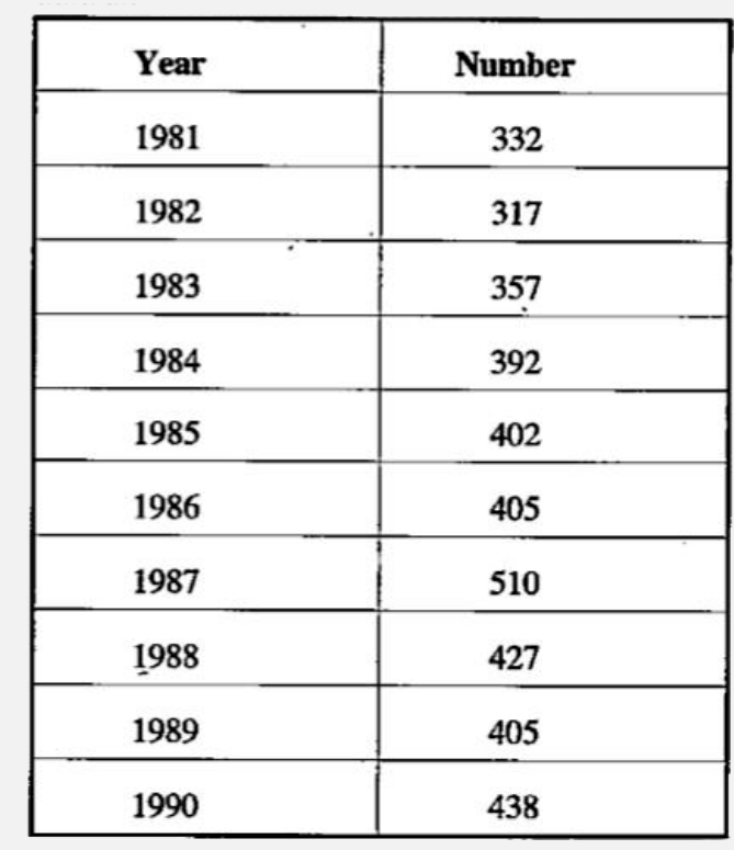
Calculate the 5 yearly moving averages of the following time series of steel production

View SolutionCalculate 4- yearly moving averages of the following time series of steel production :

Plot these and the original figures in the same graph.
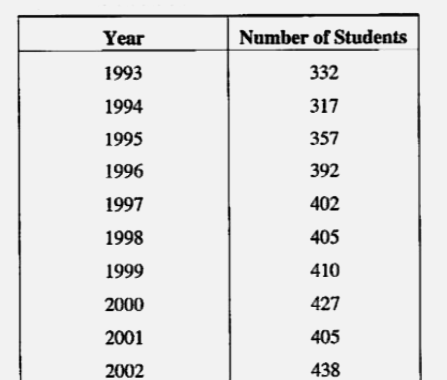
View SolutionCalculate five yearly moving average of the number of students of who have studied in a school given below.

View SolutionUsing the following data. Find out the trend using Quarterly moving average and plot them on graph

View SolutionCalculate the 5 yearly moving averages of the number of students in a College from the following data and plot them on a graph paper :

View SolutionThe table below gives details of the electricity generated in kilowatt hours in each quarter for the years 2012 to 2014

Calculate the four-quarterly moving averages and display these and the original figures on the same graph .
View SolutionFrom the details given below, calculate the five yearly moving averages of the number of students who have studied in a school.

View SolutionObtain trend values for data in Problem 1 using 4-yearly centered moving averages.
View SolutionThe number of road accidents in the city due to rash driving over a period of 3 years, is given in the following table :

Calculate four quarterly moving averages and illustrate them and original figures on one graph using the same axes for both.
View SolutionIn a typhoid epidemic ,the number of cases diagnosed were as follows. Calculate 6 days moving average and display them and the original figures on the same graph.

View Solution
