The following table shows the number of scooters produced by a company during six consecutive years. Draw a bar graph to represent this data

Step by step video & image solution for The following table shows the number of scooters produced by a company during six consecutive years. Draw a bar graph to represent this data by Maths experts to help you in doubts & scoring excellent marks in Class 7 exams.
Topper's Solved these Questions
- BOOK - RS AGGARWALCHAPTER - BAR GRAPHSEXERCISE - EXERCISE 2222videos
BAR GRAPHS
- BOOK - RS AGGARWALCHAPTER - ALGEBRAIC EXPRESSION EXERCISE - EXERCISE 6D31videos
ALGEBRAIC EXPRESSION
- BOOK - RS AGGARWALCHAPTER - COLLECTION AND ORGANISATION OF DATA (MEAN, MEDIAN AND MODE)EXERCISE - EXERCISE 21C5videos
COLLECTION AND ORGANISATION OF DATA (MEAN, MEDIAN AND MODE)
Similar Questions
The following table shows the number of toys sold by a mart during a week. Draw a line graph to represent the given data.
WeekMonTueWedThursFriSatSunNumber of Toys21101724101620View SolutionThe following table gives the data of number of schools (stage-wise) of a country in the year 2002.
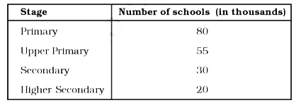
Draw a bar graph to represent the above data:View Solution
Knowledge Check
- Question 1 - Select One
Directions: The following table presents the number of units of the product produced and sold by a company during six years
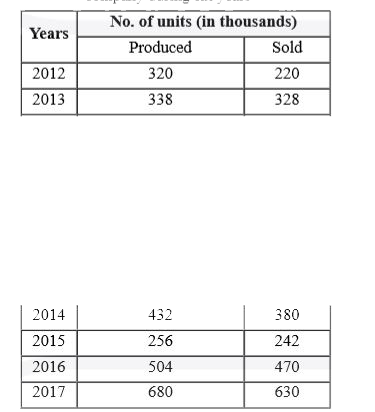
Find the ratio between total production and total salesA227 : 253B2530 : 2270C253 : 227D253 : 220 - Question 2 - Select One
The following table presents the number of units of a product produced and sold by a company during six years.
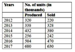
What is the ratio of the total number of units of the product sold in 2013 and 2015 to that prodcued in 2015 and 2016 ?A3:4B7:9C29:38D14:19 - Question 3 - Select One
The following table presents the number of units of a product produced and sold by a company during six years.
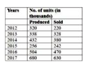
In which year, the production of units of the product is approximately 31.4% less than sale of units in 2017 ?A2012B2014C2016D2013
The following data shows the number of students who attended the school on weekdays. Draw a bar graph to represent information by using appropriate scale.
 View Solution
The given table shows the number of tourists who visited Taj Mahal during different months. Month

Draw a bar graph to represent the above information by using appropriate scale.View SolutionThe income of a family i different year are as follows. Draw a bar graph to represent the data
View SolutionGiven here is a bar graph showing the number of cycles produced in a factory during five consecutive weeks.
Observe the graph and answer the questions based on this graph.
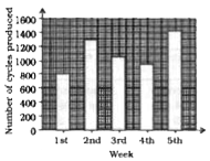
The number of cycles produced in the 5th week isView SolutionThe following table presents the number of units of a product produced and sold by a company during six years.
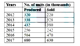
The number of units of the product sold in 2016 is approximately what percent more than the average production of the units in 2012 to 2016 ?View Solution

