Complete Solutions to All Questions of chapter GRAPHICAL REPRESENTATION OF STATISTICAL DATA of Class 9 book with complete answers and questions
| Class 9 | MATHS |
| Chapter | GRAPHICAL REPRESENTATION OF STATISTICAL DATA |
| Mathematics | All Questions |
| Number Of Questions | 68 |
| Academic Year | 2023-24 |
Represent the following data by means of historgram. Weekly wages (in Rs.)

View SolutionConstruct a frequency polygon for the following data: Age (in year) 0-2 2-4 4-6 4-8 8-10 10-12 12-14 14-16 16-18 Frequency 2 4 6 8 9 6 5 3 1
View SolutionThe marks scored by 750 students in an examination are given in the form of a frequency distribution table. Marks `600-640,640-680,680-720 and 720-760,760-800,800-840,840-880` No. of Students: 16 45 156 284 172 59 18 Represent this data in the form of a histogram and construct a frequency polygon.
View SolutionThe given table presents the number of illiterate males in the age group (10-34) in a town.

Draw a histogram to represent the above data.
View SolutionThe following are the scores of two groups of class IV students in a test of reading ability.
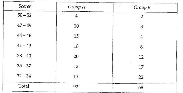
Construct a frequency polygon for each of these two groups on the same axes.
View SolutionFind the mode of the following distribution of marks obtained by 80 students: Marks obtained 0-10 10-20 20-30 30-40 40-50 No. of students 6 10 12 32 20
View SolutionThe following table gives the marks scored by 100 students in an entrance examination.

Represent this data in the form of a histogram.
View SolutionThe expenditure (in 10 crores of rupees) on health by the Govt. of India during the various five year plans in shown below:

Construct a bar graph to represent the above data.
View SolutionThe following data shows the average age of men in various countries in a certain year:

Represent the above information by a bar graph.
View SolutionThe results of pass percentage of Class X and XII in C.B.S.E. examination for 5 years are given in the following table:

Draw bar graphs to represent the data.
View SolutionThe investment (in ten crores of rupees) of the Life Insurance Corporation of India in different sectors are given below:
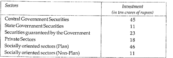
Represent the above data with the help of a bar graph.
View SolutionThe following data gives the amount of manure (in thousand tonnes) manufactured by a company during some years:

(i)Represent the above data with the help of a bar graph.
(ii)Indicate with the help of the bar graph the year in which the amount of manufactured by the company was maximum.
(iii)Choose the correct alternative: The consecutive years during which there was maximum decrease in manure production are:
(a) 1994 and 1995 (b) 1992 and 1993 (c) 1996 and 1997 (d) 1995 and 1996
View SolutionThe following data gives the number of students of Delhi state who went abroad for study during some years: year: 1995 1996 1997 1998 1999 2000 No. of Students 1400 1600 1250 1000 2000 2200 Represent the above data with the help of a bar graph.
View SolutionThe following is the distribution of weights (in kg) of 50 persons: Weight (in kg)

Draw a histogram for the above data.
View SolutionThe population of four major cities in India in a particular year is given below: City: Mumbai Kolkata Delhi Chennai No. of Students: 120 130 150 80 Construct a bar graph to represent the above data.
View SolutionIn a school, there are five sections of class IX. The number of students in each section is given below. Construct a bar graph representing this data: Section: A B C D E No. of Students 40 48 52 45 30
View SolutionThe following table gives the number of students in Class IX in a school during academic years 1996-1997 to 2000 - 2001.

Represent the above data by a bar graph.
View SolutionRead the bar graph shown in Figure and answer the following questions: What is the information given by the bar graph? What are the different number of the shoe-worn by the students? What is the number of students wearing shoe No.6? Which shoe number is worn by the maximum number of students? Also give its number Which shoe number is worn by the minimum number of students? Also given its number State whether true or false: The number of students wearing shoe no.10 is less than three times the number of students wearing shoe no.9.
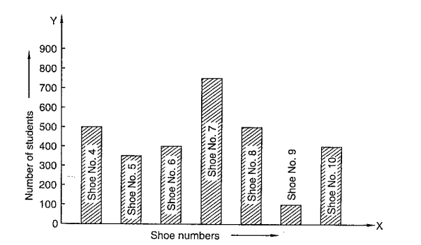
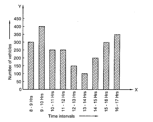
View SolutionThe following bar graph shows the number of vehicles passing through a road crossing in Delhi in different time intervals on a particular day. Read the bar graph and answer the following questions: What does the bar graph represent? Also give the maximum number of vehicles. When is the hourly traffic maximum? Also, give the minimum number of vehicles. When is the hourly traffic minimum? What is the total number of vehicles passing through a crossing during a particular day?
View SolutionRead the bar graph shown in Figure and answer the following questions: What is the information given by the bar graph? What is the order of the change of number of students over several years? State whether true or false. The enrolment during 1996-97 is twice that of 1995-96
View SolutionRead the following bar graph shown in Figure and answer the following questions: What is the information given by the bar graph? In which month was the sale of the book maximum? In which month was the sale of the book minimum? What is the total sale of the book during these five months?
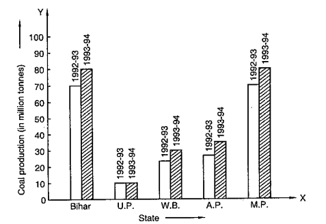
View SolutionRead the following bar graph given in Figure and answer the following questions: What information is given by this bar graph? Which two states have same production in 1993-94? Name the state having same production in both the years? Which state has minimum production?
View SolutionThe following table shows the daily production of T.V. sets in an industry for 7 days of a week:

Represent the above information by a pictograph
View SolutionThe following table shows the number of Maruti cars sold by five dealers in a particular month:

Represent the above information by a pictograph.
View SolutionThe population of Delhi State in different census years is as given below:

Represent the above information with the help of a bar graph.
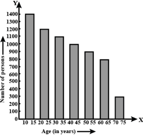
View SolutionStudy the bar graph representing the number of persons in various age groups in a town shown in Figure. Observe the bar graph and answer the following questions: What is the percentage of the youngest age-group persons over those in the oldest age group? What is the total population of the town? What is the number of persons in the age group 60-65? How many persons are more in the age-group 10-15 than in the age group 30-35? What is the age-group of exactly 1200 persons living in the town? What is the total number of persons living in the town in the age group 50-55? What is the total number of person living in the town in the age-groups 10-15 and 60-65? Whether the population in general increases, decreases or remains constant with the increase in the age-group.
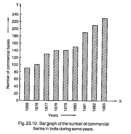
View SolutionRead the bar graph shown in Figure and answer the following questions: What is the information given by the bar graph? What was the number of commercial banks in 1977? What is the ratio of the number of commercial banks in 1969 to that in 1980? State whether true or false: The number of commercial banks in 1983 is less than double the number of commercial banks in 1969.
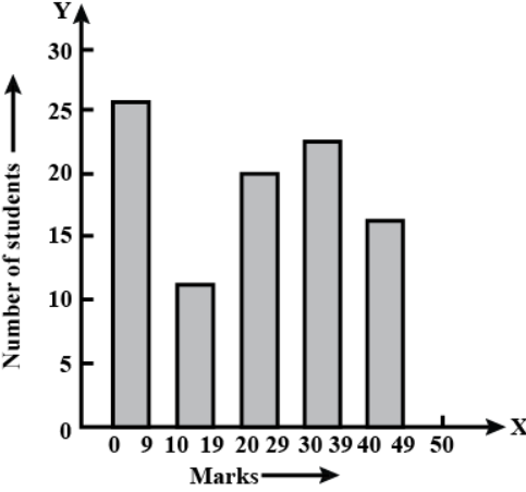
View SolutionGiven below Figure in the bar graph indicating the marks obtained out of 50 in mathematics paper by 100 students. Read the bar graph and answer the following questions: It is decided to distribute work books on mathematics to the students obtaining less than 20 marks, giving one workbook to each of such students. If a work book costs Rs. 5, what sum is required to buy the work books? Every student belonging to the highest mark group is entitled to get a prize of Rs. 10. How much amount of money is required for distributing the prize money? Every student belonging to the lowest mark-group has to solve 5 problems per day. How many problems, in all, will be solved by the students of this group per day? State whether true or false. 17% students have obtained marks ranging from 40 to 49. 59% students have obtained marks ranging from 10 to 29. What is the number of students getting less than 20 marks? What is the number of students getting more than 29 marks? What is the number of students getting marks between 9 and 40? What is the number of students belonging to the highest mark group? What is the number of students obtaining more than 19 marks?
View SolutionRead the following bar graph (Figure) and answer the following questions:
What is the information given by the bar graph?
State each of the following whether true or false.
The number of government companies in 1957 is that of 1982 is 1:9.
The number of government companies have decreased over the year 1957 to 1983
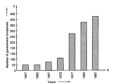
View SolutionRead the following bar graph and answer the following questions:
What information is given by the bar graph?
Which state is the largest producer of rice?
Which state is the largest producer of wheat?
Which state has total production of rice and wheat as its maximum?
Which state has the total production of wheat and rice minimum?
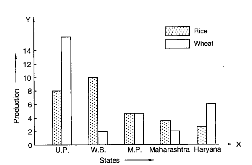
View SolutionRead the following bar graph (Figure) and answer the following questions: What information is given by the bar graph? What was the production of cement in the year 1980-81? What is the minimum and maximum productions of cement and corresponding years?
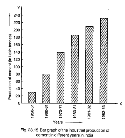
View SolutionRead the bar graph given in Figure and answer the following questions: What information does it give? In which part of the expenditure on education is maximum in 1980? In which part of the expenditure has gone up from 1980 to 1990? In which part of the gap between 1980 and 1990 is maximum?
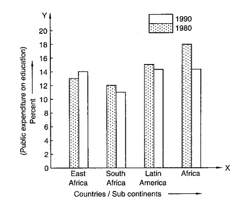
View SolutionRead the bar graph given in Figure and answer the following questions:
What information is given by the bar graph?
What was the expenditure on health and family planning in year 1982-83
In which year is the increase in expenditure maximum over the expenditure in previous year? What is the maximum increase?
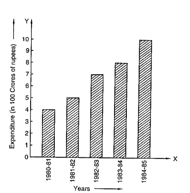
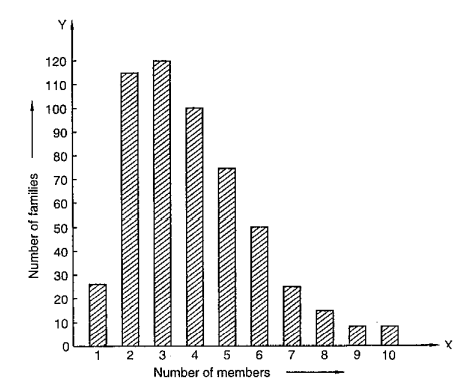
View SolutionRead the bar graph given in Figure and answer the following questions:
What is the information given by the bar graph?
What is the number of families having 6 members?
How many member per family are there in the maximum number of families? Also tell the number of such families.
What are the number of members per family for which the number of families are equal? Also, tell the number of such families?
View SolutionRead the bar graph given in Figure and answer the following questions:
What information is given by the bar graph?
Which Doordarshan centre covers maximum area? Also tell the covered area.
What is the difference between the areas covered by the centres at Delhi and Bombay?
Which Doordarshan centres are in U.P. State? What are the areas covered by them?

View SolutionThe following data gives the number of students of Delhi state who went abroad for study during some years:

Represent the above data with the help of a bar graph.
View SolutionIn a school, there are five sections of class IX. The number of students in each section is given below. Construct a bar graph representing this data:

View SolutionThe population of four major cities in India in a particular year is given below:

Construct a bar graph to represent the above data.
View SolutionThe results of pass percentage of Class X and XII in C.B.S.E. examination for 5 years are given in the following table:

Draw bar graphs to represent the data
View SolutionRead the following bar graph and answer the following questions: What information is given by the bar graph? In which year the export is minimum ? In which year the import is maximum ? In which year the difference of the values of export and import is maximum?

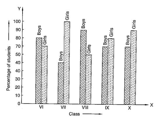
View SolutionThe following bar graph shows the results of an annual examination in a secondary school. Read the bar graph (Figure) and choose the correct alternative in each of the following:
The pair of classes in which the results of boys and girls are inversely proportional are:
(a) VI, VIII (b) VI, IX (c) VIII, IX (d) VIII, X
The class having the lowest failure rate of girls is
VII (b) X (c) IX (d) VIII
The class having the lowest pass rate of students is
VI (b) VII (c) VIII (d) IX
View SolutionThe production of saleable steel in some of the steel plants of our country during 1999 is given below: Plant, Bhilai, Durgapur, Rourkela, Bokaro Production (in thousand tonnes), 160, 80, 200, 150 Construct a bar graph to represent the above data on a graph paper by using the scale 1 big divisions = 20 thousand and tonnes.
View SolutionThe following table gives the route length (in thousand kilometres) of the Indian Railways in some of the years: Year, 1960-61, 1970-71, 1980-81, 1990-91, 2000-2001 Route length (In thousand km), 56, 60, 61, 74, 98 Represent the above data with the help of a bar graph
View SolutionThe following data gives the amount of loans (in crores of rupees) disbursed by a bank during some years: Year, 1992, 1993, 1994, 1995, 1996 Loan (in crores of rupees), 28, 33, 55, 55, 80 Represent the above data with the help of a bar graph. With the help of the bar graph, indicate the year in which amount of loan is not increased over that of the preceding year.
View SolutionThe following table sows the interest paid by a company (in lakhs): Year, 1995-96, 1996-97, 1997-98, 1998-99, 1999-2000 Interest (In lakh of Rs.), 20, 25, 15, 18, 30 Draw the bar graph to represent the above information.
View SolutionThe following data shows the average age of men in various countries in a certain year: Country, India, Nepal, China, Pakistan, U.K., U.S.A. Average age (in years), 55, 52, 60, 50, 70, 75 Represent the above information by a bar graph.
View SolutionThe following data gives the production of foodgrains (in thousand tonnes) for some years:

Represent the above data with the help of a bar graph.
View SolutionThe following data gives the demand estimates of the Government of India, Department of Electronics for the personnel in the Computer sector during the Eights Plan period (1990-95):

Represent the data with help of a bar graph. Indicate with the help of the bar graph the course where estimated requirement is least.
View SolutionThe investment (in ten crores of rupees) of the Life Insurance Corporation of India in different sectors are given below:

Represent the above data with the help of a bar graph.
View SolutionThe following data gives the value (in crores of rupees) of the Indian export of cotton textiles for different years:

Represent the above data with the help of a bar graph. Indicate with the help of a bar graph the year in which the rate of increase in exports is maximum over the preceding year.
View SolutionThe production of oil (in lakh tonnes) in some of the refineries in India during 1982 was given below: Refinery, Barauni, Koyali, Mathura, Mumbai, Florida Production of oil (in lakh tonnes), 30, 70, 40, 45, 25 Construct a bar graph to represent the above data so that the bars are drawn horizontally.
View SolutionThe expenditure (in 10 crores of rupees) on health by the Government of India during the various five year plans is shown below: Plans:, I, II, III, IV, V, VI Expenditure on helath (in 10 crores of rupees), 7, 14, 23, 34, 76, 182 Construct a bar graph to represent the above data.
View SolutionThe following table gives the marks scored by 100 students in an entrance examination.

Represent this data in the form of a histogram.
View SolutionThe following is the distribution of weights (in kg) of 50 persons: Marks:, 50-55, 55-60, 60-65, 65-70, 70-75, 75-80, 80-85, 85-90 No. of Person, 12, 8, 5, 4, 5, 7, 6, 3 Draw a histogram for the above data.
View SolutionRepresent the following data by means of historgram.

View SolutionDraw a histogram for the marks of students given below :

View SolutionThe given table presents the number of illiterate males in the age group (10-34) in a town.

Draw a histogram to represent the above data.
View SolutionFor the following data, draw a histogram and a frequency polygon:

View SolutionConstruct a histogram for the following data:

View SolutionDraw a histogram for the daily earnings of 30 drug stores in the following table:

View SolutionThe monthly profits (in Rs.) of 100 shops are distributed as follows:

Draw a histogram for the data and show the frequency polygon for it.
View SolutionWhich one of the following is not the graphical representation of statistical data:
a)bargraph
(b) Histogram
c]Frequencypolygon
(d) Comulative frequency distribution
View SolutionIn a frequency distribution, ogives are graphical representation of
1)Frequency
2)Relative frequency
3)Cumulative frequency
(d)Raw data
View SolutionA frequency polygon is constructed by plotting frequency of the class interval and the
1)upper limit of the class
2)lower limit of the class
3)mid value of the class
4)any values of the class
View SolutionIn a histogram the area of each rectangle is proportional to
1)the class mark of the corresponding class interval
2)the class size of the corresponding class interval
3)frequency of the corresponding class interval
4)cumulative frequency of the corresponding class interval
View SolutionIn a histogram the class intervals or the groups are taken along (a)Y-axis (b) X-axis (c)both of X-axis and Y-axis (d) in between X and Y axis
View SolutionA histogram is a pictorial representation of the grouped data in which class intervals and frequency are respectively taken along.
1)vertical axis and horizontal axis
2)vertical axis only
3)horizontal axis only
4)horizontal axis and vertical axis.
View SolutionIn a histogram, each class rectangle is constructed with base as frequency (b) class intervals range (d) size of the class
View Solution
All Questions questions and complete solutions for chapter GRAPHICAL REPRESENTATION OF STATISTICAL DATA of RD SHARMA MATHS (HINGLISH) of Class 9